Dear friends of type. Please enjoy our first newsletter and see more of the work of type designer Ludwig Übele.
|
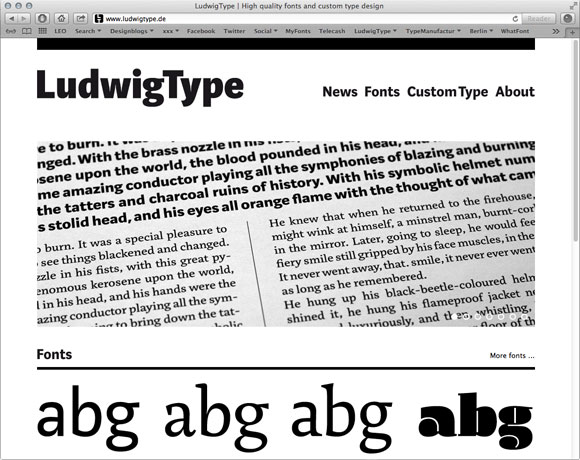
New Webpage: ludwigtype.de
|
View webpage
|
 |
|
We are proud and happy to introduce you to our new webpage. The page is fully rebuilt, with new contents and design. We have also added new functions such as Type in Use or TypeShow. Enjoy!
|
|
|
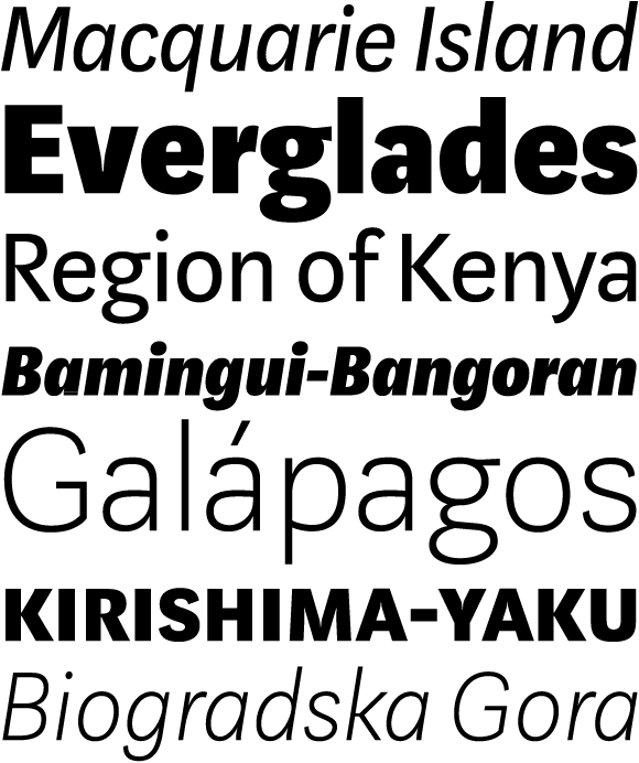
Our latest addition, Marat Sans, is a clean but lively sans serif typeface which combines Rational and Humanist ideas in a very practical way. It is characterized by both strong personality and excellent legibility. The entire family contains 27 styles and weights and includes a wide range of OpenType features.
|
|
|
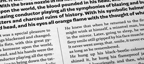
Marat Sans is the perfect companion for Marat, a soft and elegant serif typeface. We have recently updated the popular Marat type family and added new weights. Marat and Marat Sans are also available for use on the web. All our webfonts have been manually cleartype hinted for best on-screen performance.
|
|
|
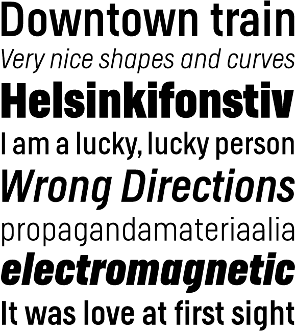
We completely updated our popular Helsinki typefamily, expanded the character set and also added italics. Helsinki is inspired by the Finnish traffic sign typeface. It is based on geometric shapes, with technical and masculine forms. Helsinki is rather narrow, which makes it well suited to headlines and short text. Get 50% off until the end of august.
|
|
|
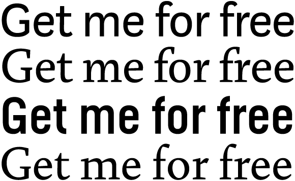
We are happy to announce that you can now get free demo fonts of all of our typefaces. Demo fonts contain the basic characters (A-Z, a-z, 0-1), but no punctuation or special characters. You can use the demo fonts for testing in your layouts, but not for the final artwork. Get the demo fonts here.
|
|
Like always, we really appreciate to hear your thoughts and feedback. For a more steady flow of updates make sure to follow us on Twitter and like our page on Facebook.
We are also on Behance and Pinterest.
Best regards,
Ludwig Übele, LudwigType
|
|