Altana
Logotype redesign
Altana AG is a German chemical company. Its roots reach back to the year 1873, when Dr. Heinrich Byk began producing chemicals. Today it is a global leader in specialty chemicals and comprises several divisions. In 2006 Interbrand Zintzmeyer & Lux redesigned and unified the corporate identity and asked Ludwigtype to redesign the wordmark. The name of a company is an important element of its communication. It should not just be there next to the logo, but it is an essential part of the logo. Symbol and name should combine into one.

Alatana’s wordmark takes the aesthetics and shapes of the symbol and subtly integrates them into the letterforms. The six characters have no curves by nature, while the symbol consists only of curves. To alleviate this contrast, we have added a subtle roundness to the letter A. The letter A is an important letter in this wordmark, it appears 3 times at relatively even intervals, creating a strong rhythm. The shape created by the rounding in combination with the tapered white interior at the top of the A is reminiscent of the delicate connection between the individual shapes of the symbol.


The old logos of Altana and its divisions.
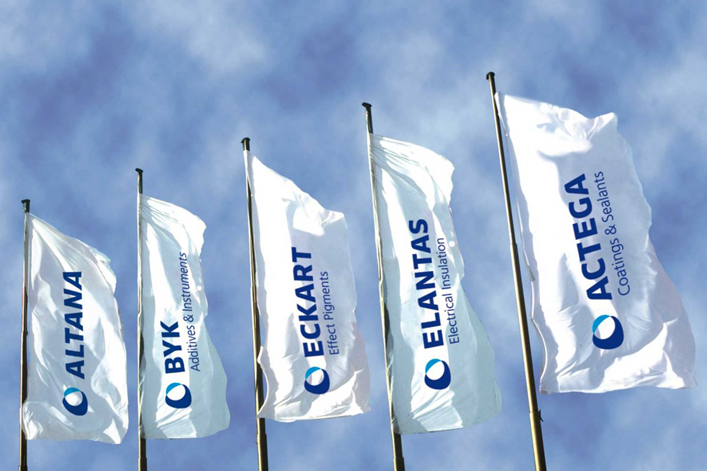
The Altana group comprises several associated companies, each of which previously had its own design identity (top). The analysis of the brand architecture led to the conclusion that it makes the most sense to unite all areas under one design. They form a strong community that is quite clearly recognized. And yet they are perceived as acting independently. All divisions now have the same symbol. Also the wordmarks have been unified accordingly. They are now part of one brand system instead of forming 5 brand systems (bottom).