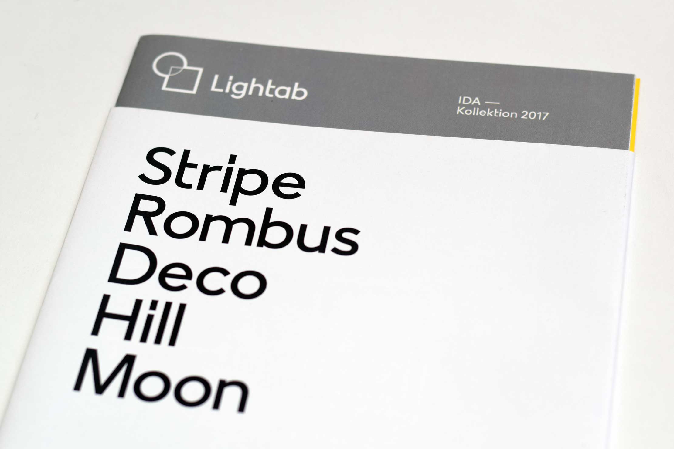
There will be light
A custom typeface for the Swedish company Lightab
Lightab is a Swedish lighting company whose focus is optimal lighting experience. The concept is based on products in systems with pre-installed drivers and flexible plug-and-play solutions, that are adapted to the needs of each area. Lightab provides quality lighting products with stylish design, new technology and multifunctional upgrades.
The typeface is based on Lightab’s logo and was created in close collaboration with Swedish designer Peter Sellberg.


The typeface adopts the main elements of the logo, such as the circle, the monolinear stroke, the hard edges, the clear lines and the reduced shapes. In this way, the symbol, logotype and custom font fit well together and create a harmonious unity. The predominant shape is the circle, and all the round letters of the typeface are based on the circle.

Particularl characteristics are the elongated dot of i and j, the one-sided crossbars of f and t, and the descenders of Q, j and y. These subtle adjustments give the typeface a character all its own, making it unique and distinct. These shapes emphasize the vertical and contrast nicely with the rather broad forms of the rest of the alphabet.