Peter Hahn
Logotype redesign for a retail clothing company
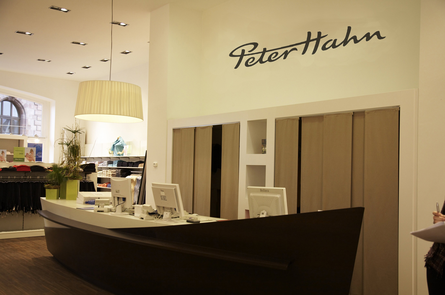
Peter Hahn is a mail-order firm selling mainly women’s clothing made from natural fibre. On behalf of JoussenKarliczek I redesigend the handwritten-like logotype. I simplyfied the outline and added a more dynamic drive to it. To keep it crisp and distinctive I added corner points and opened the more complex characters.


Old logo

New logo
For me, a good logotype should be clear, distinct, harmonious and contain interesting details. The original logotype has some weaknesses: It lacks a clear modulation of the stroke. The sweeps could be more lively and fluid. In some areas too much happens and it becomes too tight. Some shapes are bumpy, and the rounded corners make the whole logotype a bit blurry. I reworked all the curves so that they radiate a vital tension. The whole logotype became more open and airy. The brushstrokes got a harmonious tension and end pointedly. The opened characters e and a are interesting details, give the logo uniqueness and open these complex shapes. By reducing the right and left sides, the lettering becomes less wide overall and therefore appears larger. By reducing the two shapes on the right and left, the wordmark becomes less wide overall and therefore appears larger. The new logotype is livelier, clearer and more harmonious.

Comparison old and new logo


