stern
Logotype for a news magazine
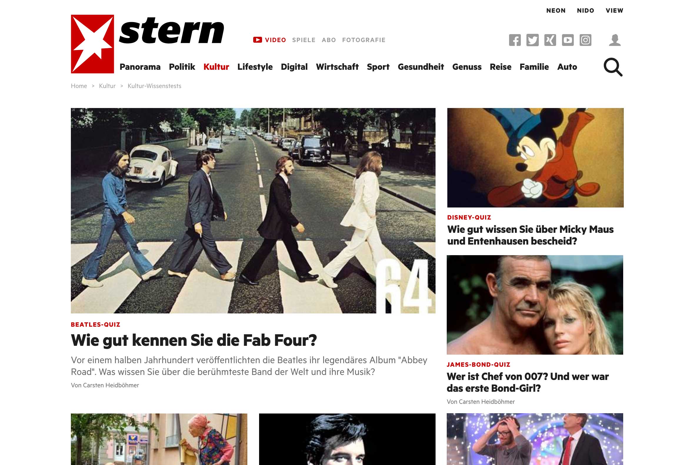
Stern (‘Star’) is Germany’s most widely read magazine and one of the world’s best news weeklies. Founded in 1948, Stern is published by Gruner + Jahr and has a weekly circulation of 1 million with total readership of about 8 million. It mixes serious journalism about politics and social issues with softer features on celebrities, home life and travel. The publication is perhaps best known for its award-winning photojournalism. In collaboration with art director Johannes Erler I developed the new logotype for the magazine’s title. My typeface FF Tundra is used for the magazine’s body text.
“The redesign includes an update of the iconic Stern masthead. The magazine’s famous white star logo remains unchanged, but the accompanying wordmark has been redrawn to appear stronger, friendlier and more modern, with softer curves and fuller letterforms. The logotype was revised by Ludwig Übele, who also designed the Tundra typeface.” (Pentagram, who were involved with the redesign.)
Read more about the new redesign of the magazine at Pentagram.


Old logo

New logo
We didn’t touch the magazine’s famous white star logo, but redrew the wordmark to make it stronger and friendlier. To give it a softer and less technical appearance, we reduced the angle of slope and removed the squarish shapes of the letters. We also opened up the characters, giving them a more humanistic look. Compared to the old logo, the new design looks more distinct, warmer and more modern.

When we revise a wordmark, we first start from the existing logotype. Even subtle changes alter the character of the wordmark. In the course of the process, we move further and further away from the existing design and try out completely different forms. This usually results in a large number of different designs, from which we then select the ones that come closest to the design goal. In close cooperation with the customer, we can find the most suitable design in this way.


We not only designed the masthead, but also supplied the body font for the entire magazine. FF Tundra is a highly legible typeface, especially for small sizes. It seems to cope particularly well with the distortions caused by fast gravure printing.