Aspen
Design Concept
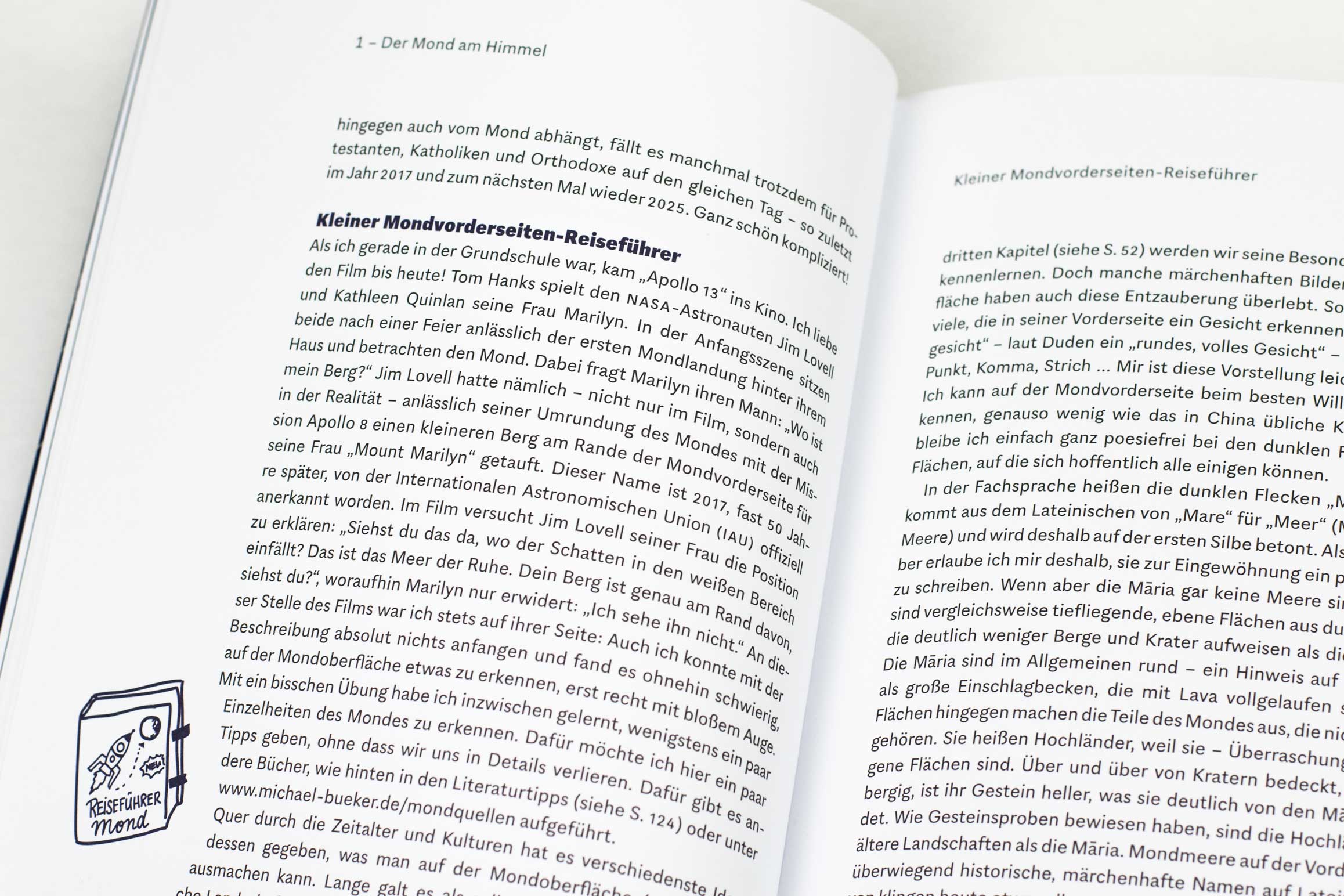
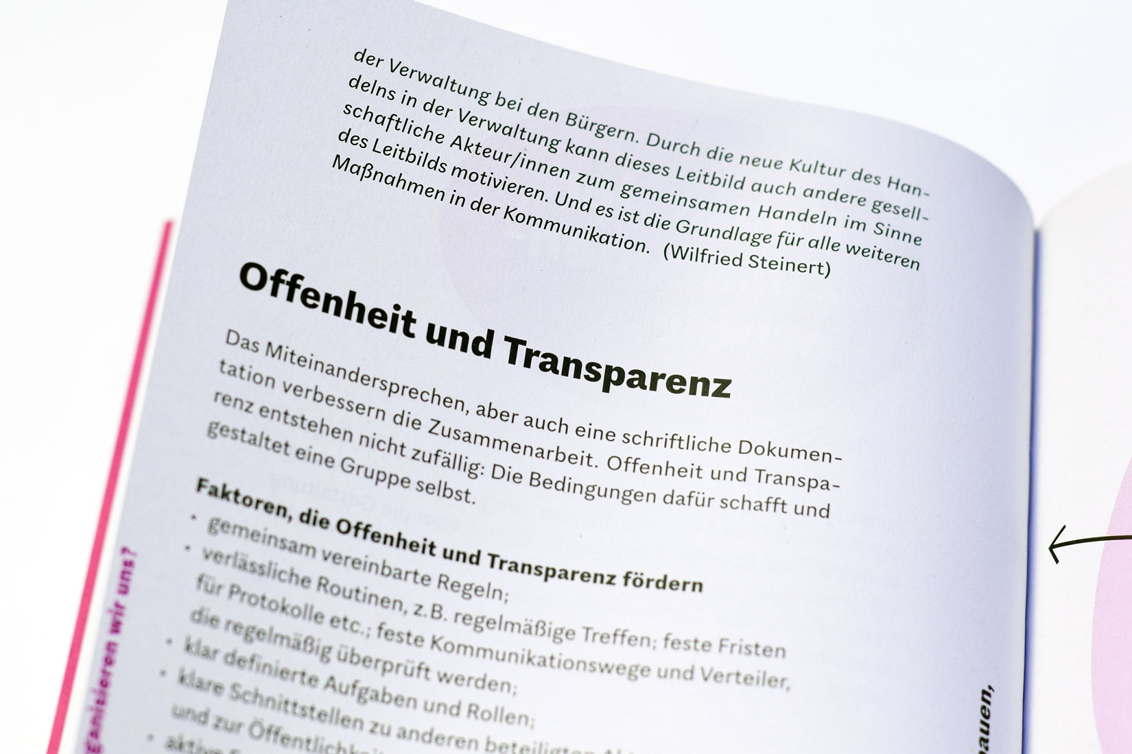
I always loved News Gothic or Morris Fuller Benton’s other Gothics for ATF in the early 20th century. Aspen grew from this sympathy for these American sans serifs, but rather than replicate old shapes it breaks new ground while breathing the spirit of those that came before. You can see the traces of the American sans serifs in the fairly narrow proportions, the angled terminals, or the two-story ‘a’ and ‘g’. Still, during the design process I discovered that I subconsciously integrated elements of the European Grotesque, which lead to an interesting mix and creates a very unique text image.
Alongside similarities to the early sans serifs, however, significant differences exist: The proportions of the characters tend to the classic model, where letter widths vary considerably. This creates a more diversified and compelling rhythm, and improves legibility. The long ascenders and descenders are also atypical but give the typeface an airy feel. Aspen’s characters are friendlier and more organic compared to the early grotesques which could be bulky and rigid. Circular dots used for i and punctuations. Also the simplified, round G is untypical to early Gothics.
Aspen contains an alternate ‘a’ and ‘g’, which can dramatically change the text image, creating a much cleaner, firmer and more uniform look (bottom).
Worth emphasizing is the lively italic. Grotesques italics are often simply slanted variants rather then ‘true’ italics. Aspen’s however is based on true cursive writing, which adds a very fresh and agile touch.


