Brenta

Design Concept
Brenta began as an experiment with the letter ‘n’, where the bottom line of the top serif and the shoulder had to line up exactly. All other forms evolved from this base requirement: the shoulders became comparatively strong and the terminals had to reflect these bold and flat forms. The junctures of the shoulders and stems became very fine, while the serifs became bold. The result is a typeface with a lively contrast of very fine and bold components, which makes it crisp and pointed, but also graceful.

The pronounced and open forms of serifs, shoulders and terminals strengthen two important zones of a typeface: the base line and the x-height. This emphasis form a pleasant counter movement to the vertical stems and help to guide the eye along the line. Open forms also permit more interaction between the letters. All these elements help to create even lines that make reading easy and comfortable.

Brenta contains alternative ‘stencil’ characters with disconnected drops in all styles and weights. These special characters are accessable via the OpenType feature or the glyph palette.
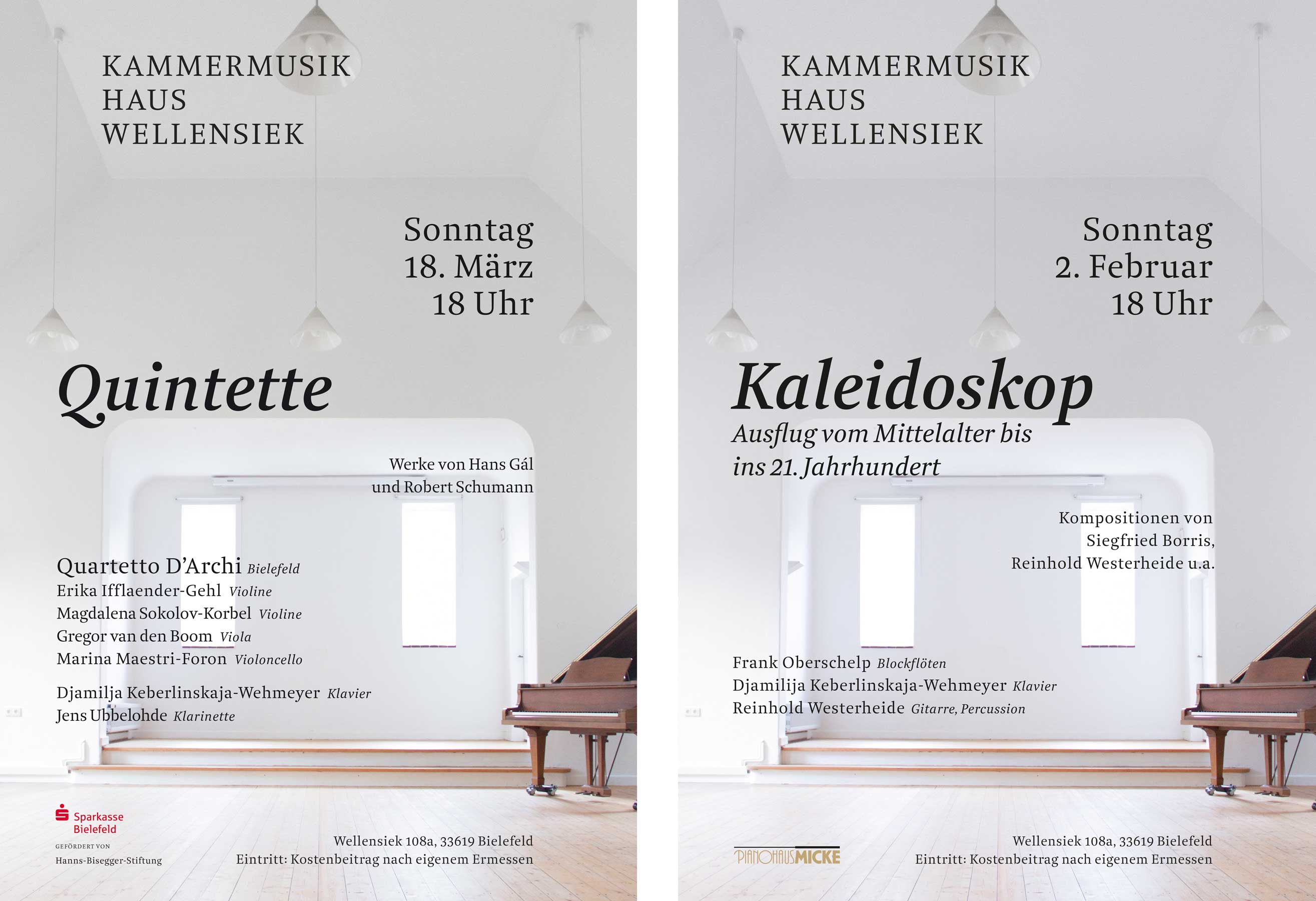
In Use