Kakadu
Design Concept
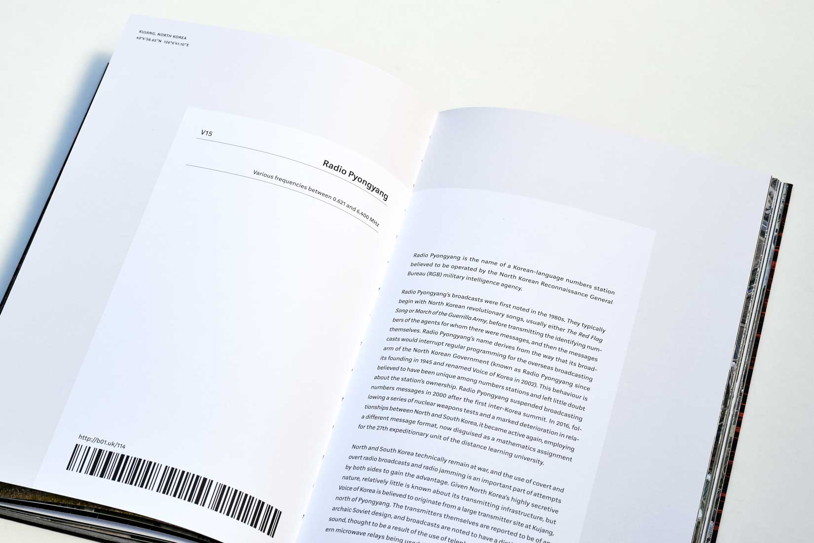
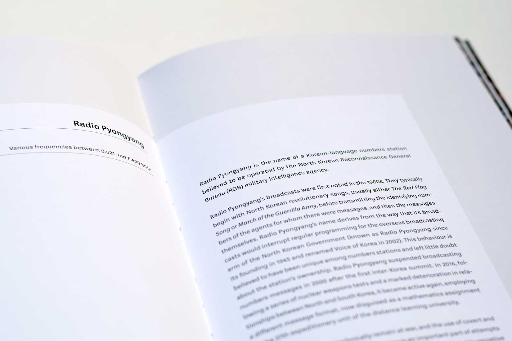
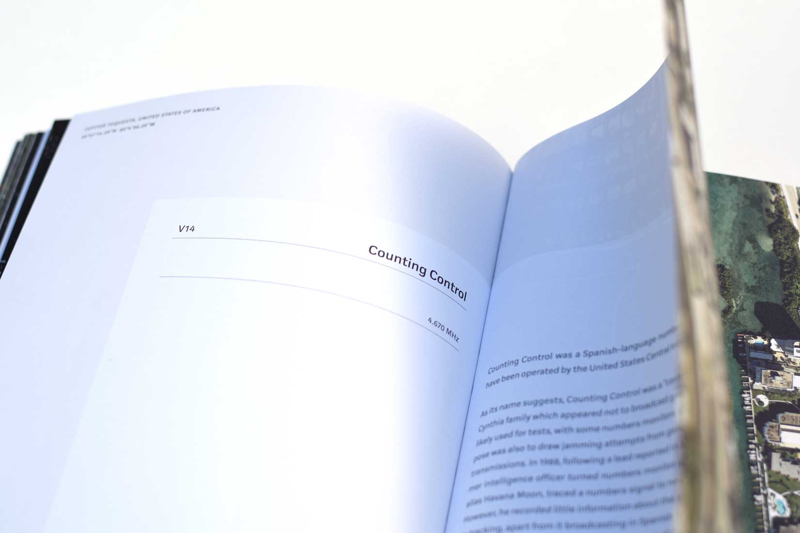
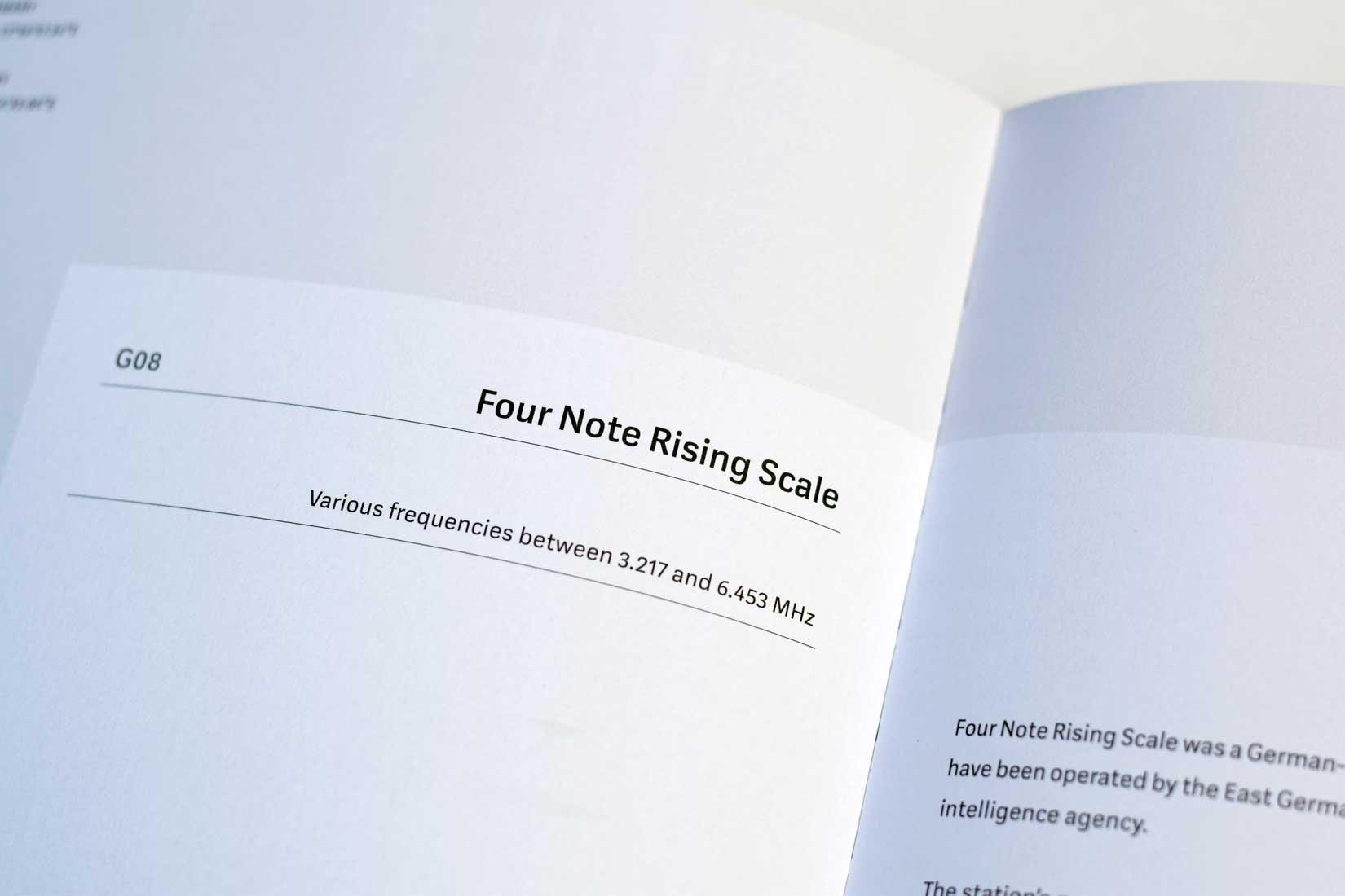
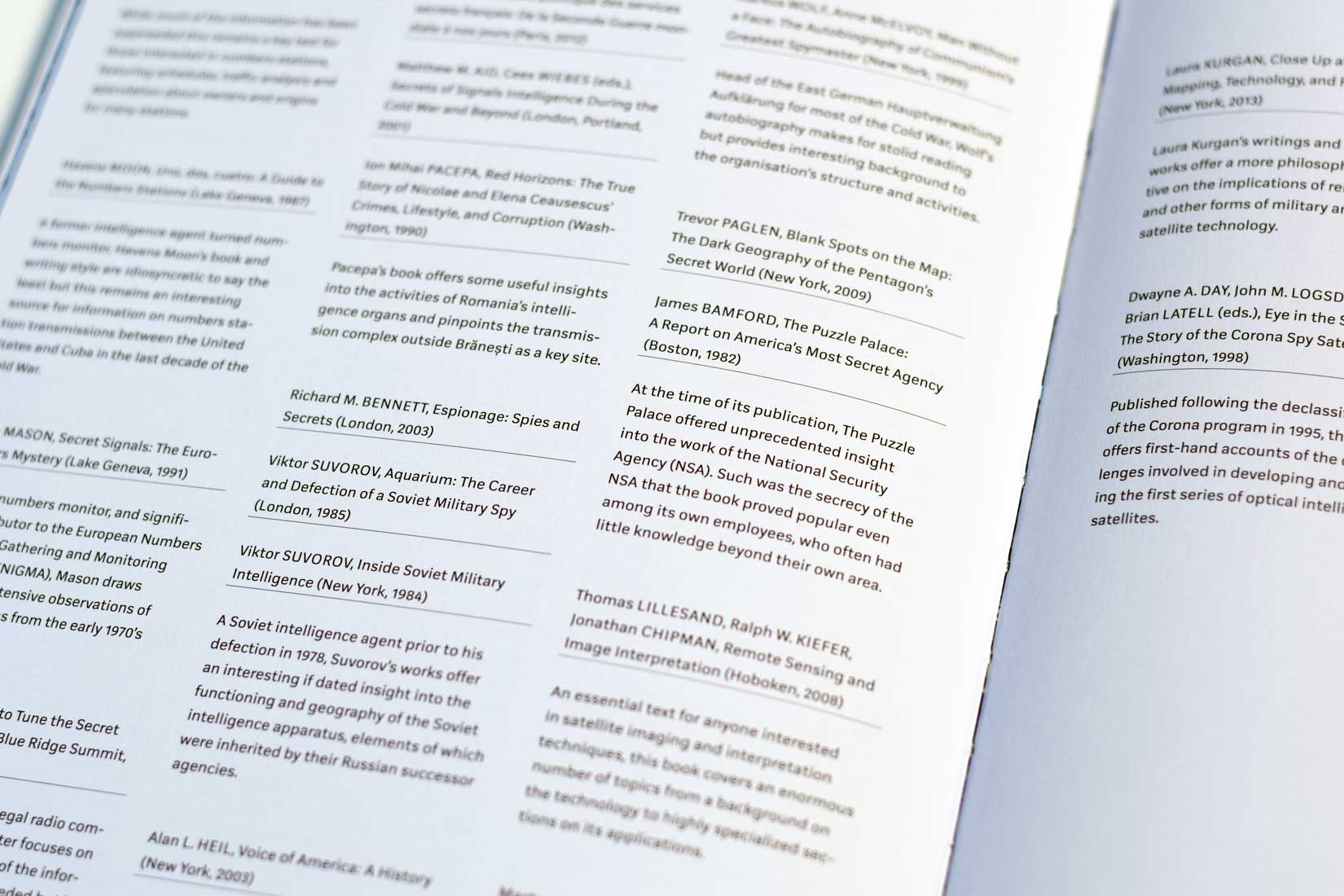
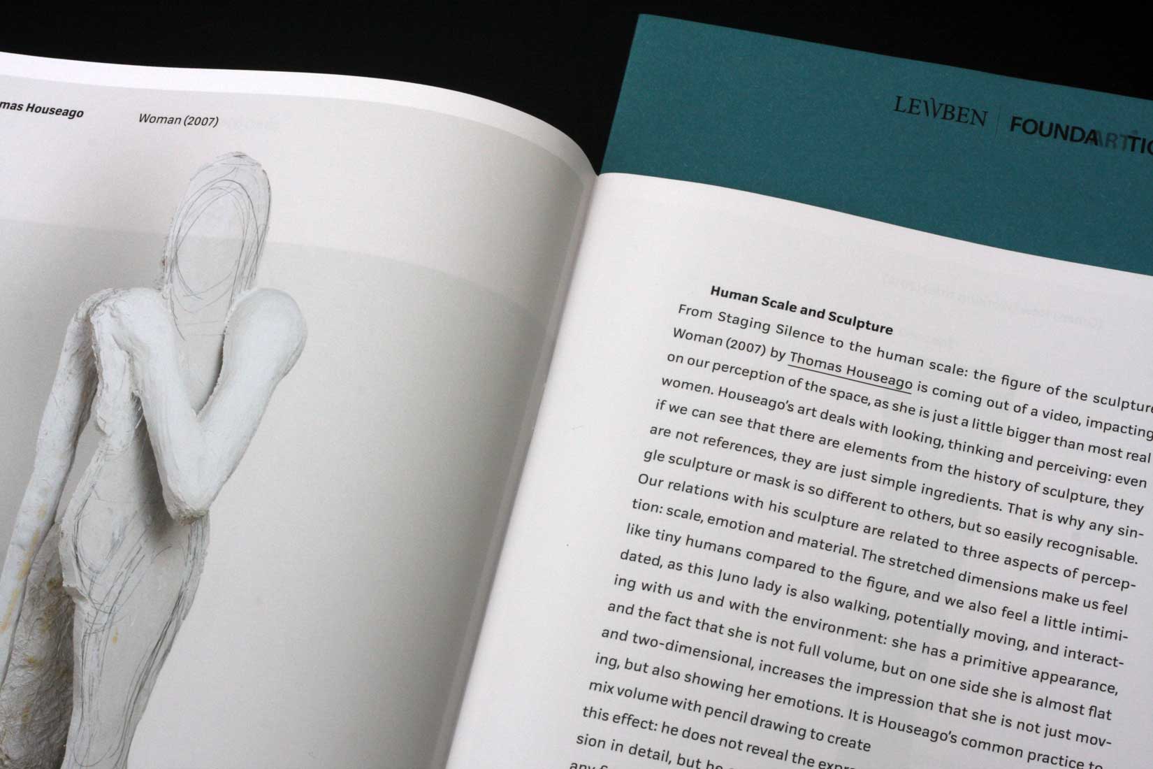
Kakadus most evident characteristic is its squarish letterforms. Evolved from a skeletal structure in which all curves were composed of straight lines. This initial idea is only rudimentarily visible in the final typeface. Kakadu is intended for reading, so it does not deviate too much from our usual habits.
Kakadu exudes a certain solidness and rationality although, the squarish forms also radiate a certain rigor, which is deliberately counteracted by softer shapes. For example, the rounded transitions of shoulder and stems, the curves in the diagonals of K, k and R, or the circular dots used for i and punctuations. Though the squarish, technical character of the typeface is restrained, it also emits a certain softness that is a real pleasure to read. Thanks to clean and open letterforms and a high x-height Kakadu stays sharp and clear even in small sizes.
Characteristics of Kakadu are the squarish, consistently structured letterforms, which are similar in proportion, subtle ink traps, and squarish shaped terminals with a spiky ending.
Kakadu Regular and Kakadu Bold by comparison. While Kakadu is not a uniwidth design, it takes up nearly the same space throughout all weights. This makes it very useable for interfaces on screen, rollovers in particular.


