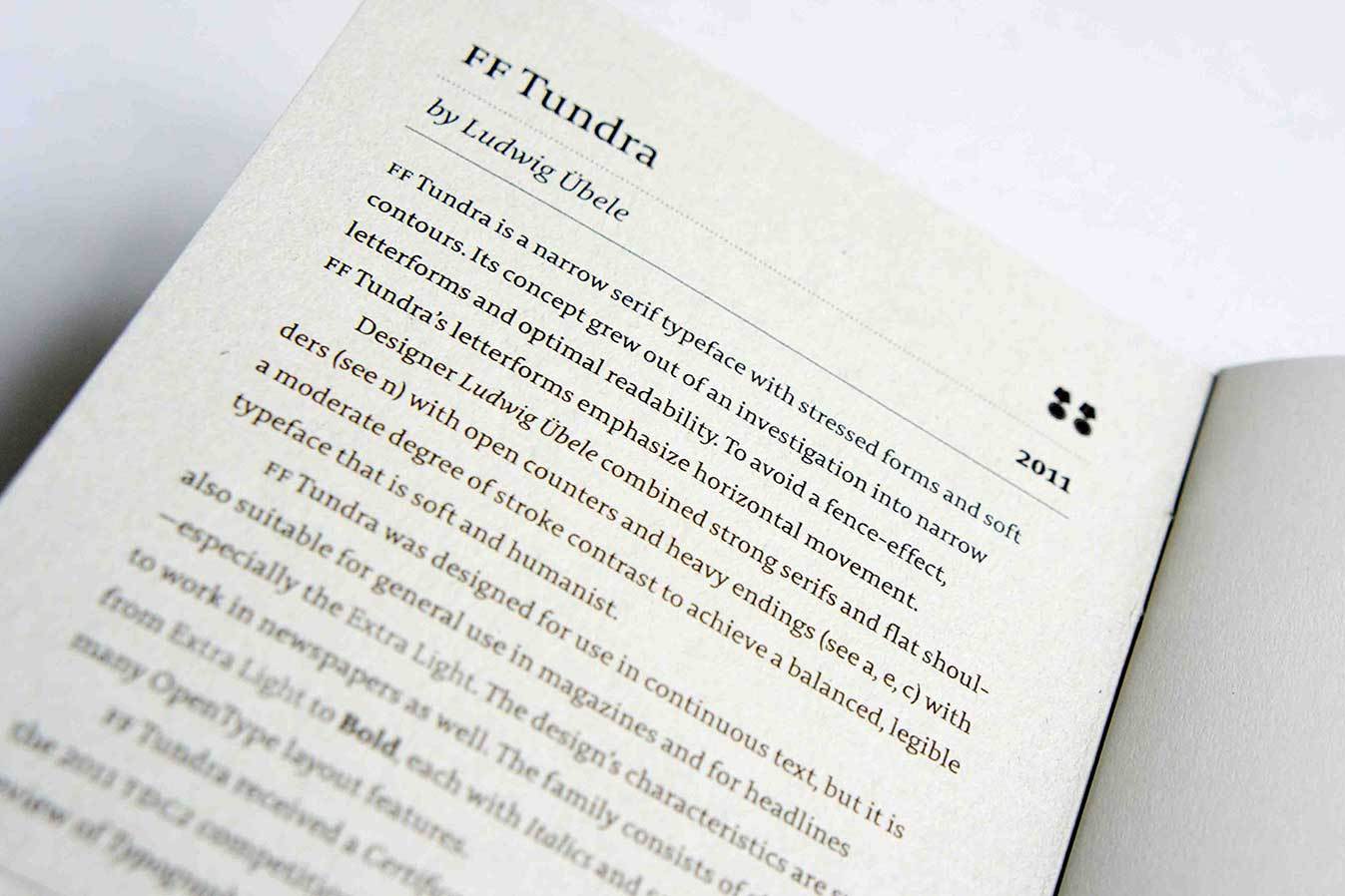
Tundra

Design Concept
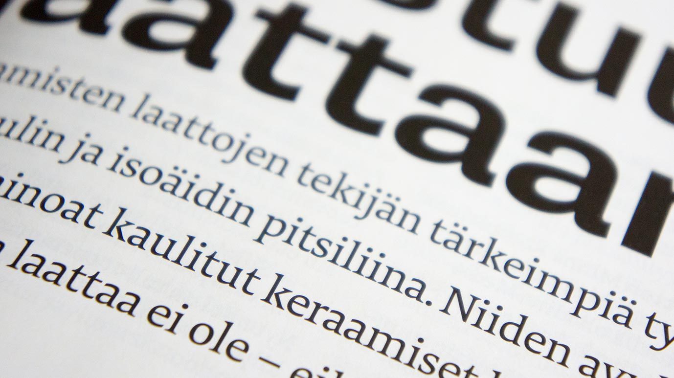
FF Tundra is a compact serif typeface with stressed forms and soft contours. Its concept grew out of an investigation into narrow letterforms and optimal readability. To avoid a fence-effect, FF Tundra’s letterforms emphasise horizontal movement. Strong serifs and flat shoulders (see n) are combined with open counters and heavy endings (see a, e, f) with a moderate degree of stroke contrast to achieve a balanced, legible typeface that is soft and Humanist.
FF Tundra was designed for use in continuous text, but it is also suitable for general use in magazines and for headlines – especially the Extra Light. Short ascenders and descenders make it suit to headlines, subheads, and columns. The design’s characteristics are sure to work in newspapers as well. The family consists of six weights from Extra Light to Bold, each with Italics and Small Caps and many OpenType layout features.
The Making of FF Tundra on I love typography.
Review by Caren Litherland on Typographica.

When I first saw this page I was stunished by the even image of text and the balanced and reader-friendly lines. The page was printed in 1925 and the typeface is called Antiqua der Bremer Presse, presumably designed by Anna Simons, a student of Edward Johnston. It led me to the question of how a typeface should be designed to guide the eye best along the line, and it had quite an impact on the development of FF Tundra.

What’s happening in these two areas is most important for reading: baseline and the x-height.

A clear stroke and low contrast seems especially suitable for thin font weights.

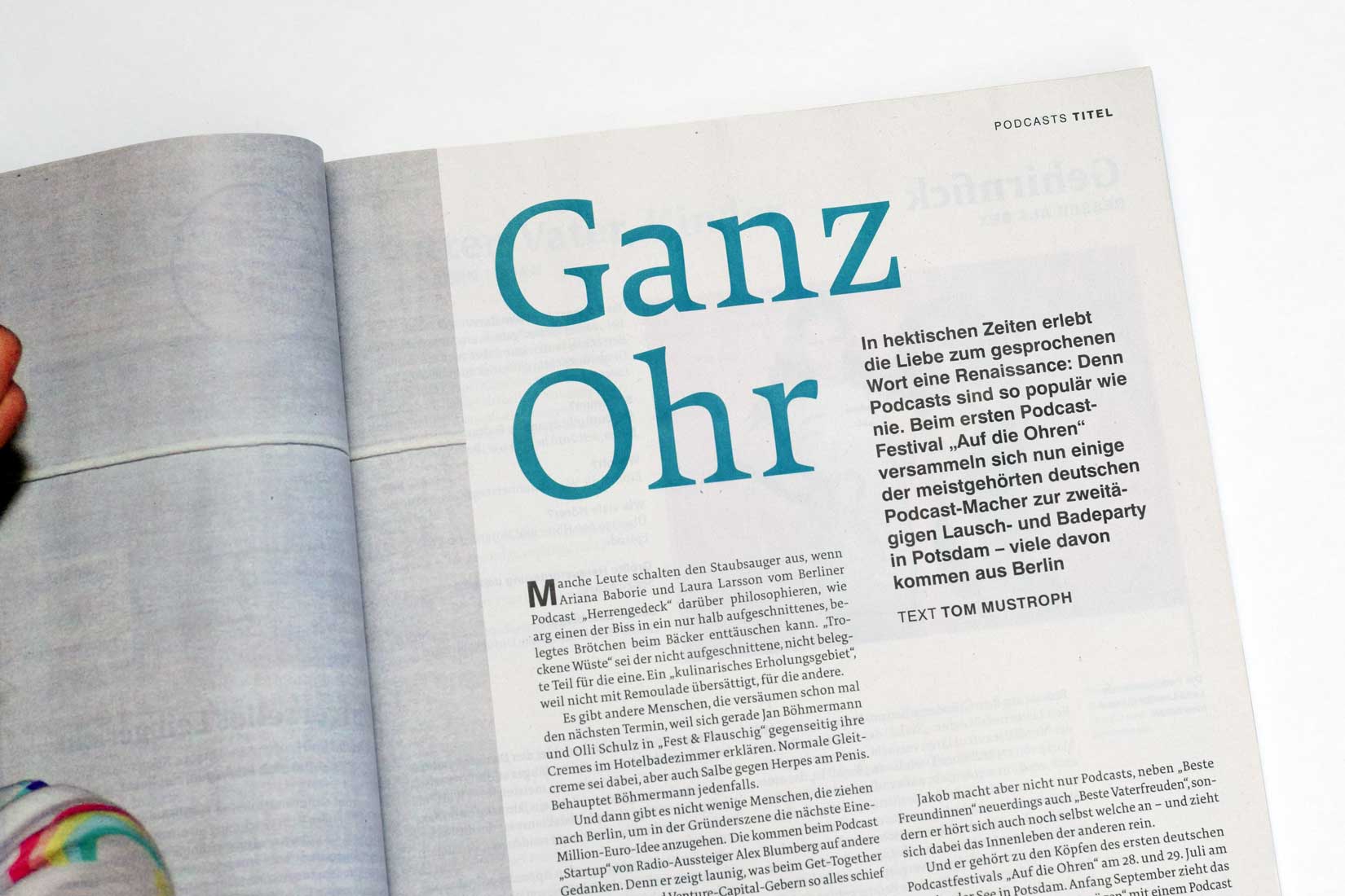
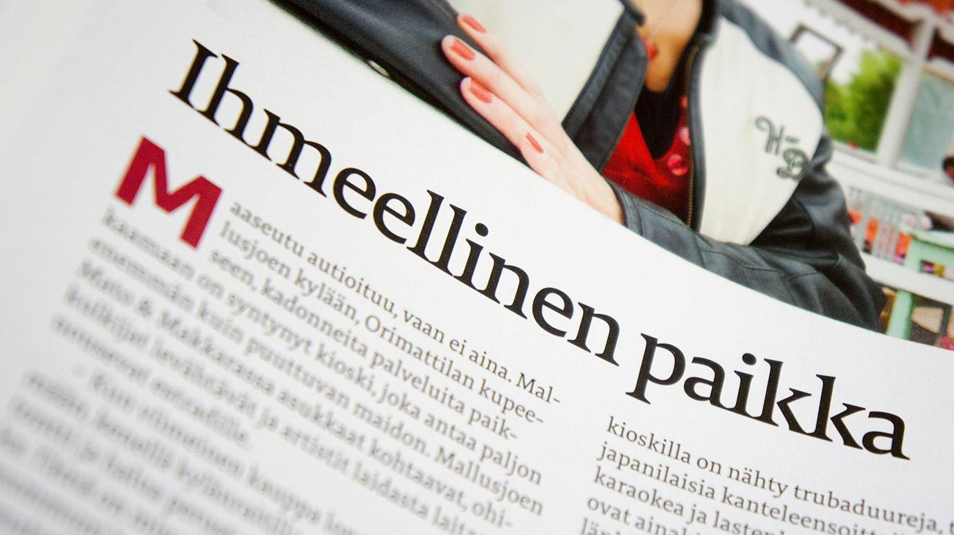
FF Tundra is a very usable and legible typeface. It is used by various magazines for body text. It seems to be coping particularly well with the distortions caused by gravure printing.
In Use