Dear friends of type, I am happy to introduce
|
|
|
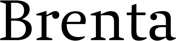
Brenta is a new serif typeface family by Ludwig Übele. Its name refers to a range of mountains in northern Italy which belong to the famous dolomites. Like its namesake, Brenta is characterized by sharp-edged and sturdy forms, but also by its clarity and elegance.
|

|
|
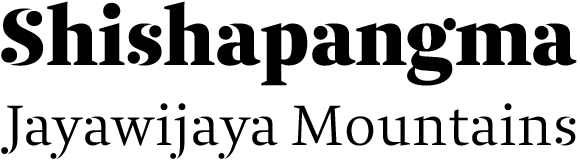
Strong serifs, open counters and compact proportions make the typeface a good choice for books, newspapers, posters and magazines. Brenta is highly legible at small text sizes and very distinctive in display sizes. Especially the extreme weights Thin and Black are a real blast.
|
|
|
Brenta contains alternate »stencil« characters with disconnected drops in all styles and weights. These special characters are accessible via OpenType features.
|
|
|
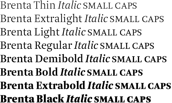
The Brenta type family contains 24 styles and weights, covers all major languages using Latin characters, and includes a wide range of OpenType features. Brenta fonts come for both desktop and web.
|
|
|
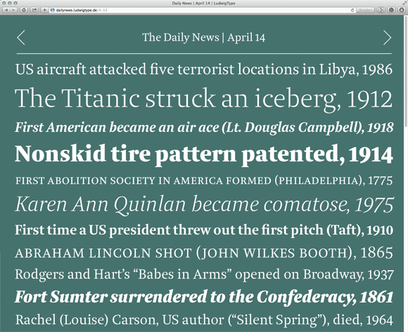
This little mini site shows the Brenta web fonts in action. Enjoy!
Get free demo fonts
Introductory offer: 50% off for a limited time
|
Follow up: Diogenes Decorative
|

|
|
In my previous newsletter I introduced Diogenes, an elegant and crisp text typeface which quickly gained recognition. Now, few month later, I’m happy to present you Diogenes Decorative, the ornate sister of Diogenes. Diogenes Decorative comes in 5 weights, each containing 7 different styles, which makes a total of 35 fonts. Each font contains lots of swash characters, alternates and separate swashes. Diogenes Decorative can be used independently or in combination with Diogenes, e.g. for initials or headlines. Please visit my webpage for some nice examples.
|
|
Like always, we really appreciate to hear your thoughts and feedback. For a more steady flow of updates make sure to follow us on Twitter and like our page on Facebook.
We are also on Behance and Pinterest.
Best regards,
Ludwig Übele, LudwigType
|
|