Dear friends of type. It’s me again. And my latest typeface.
|

|
|
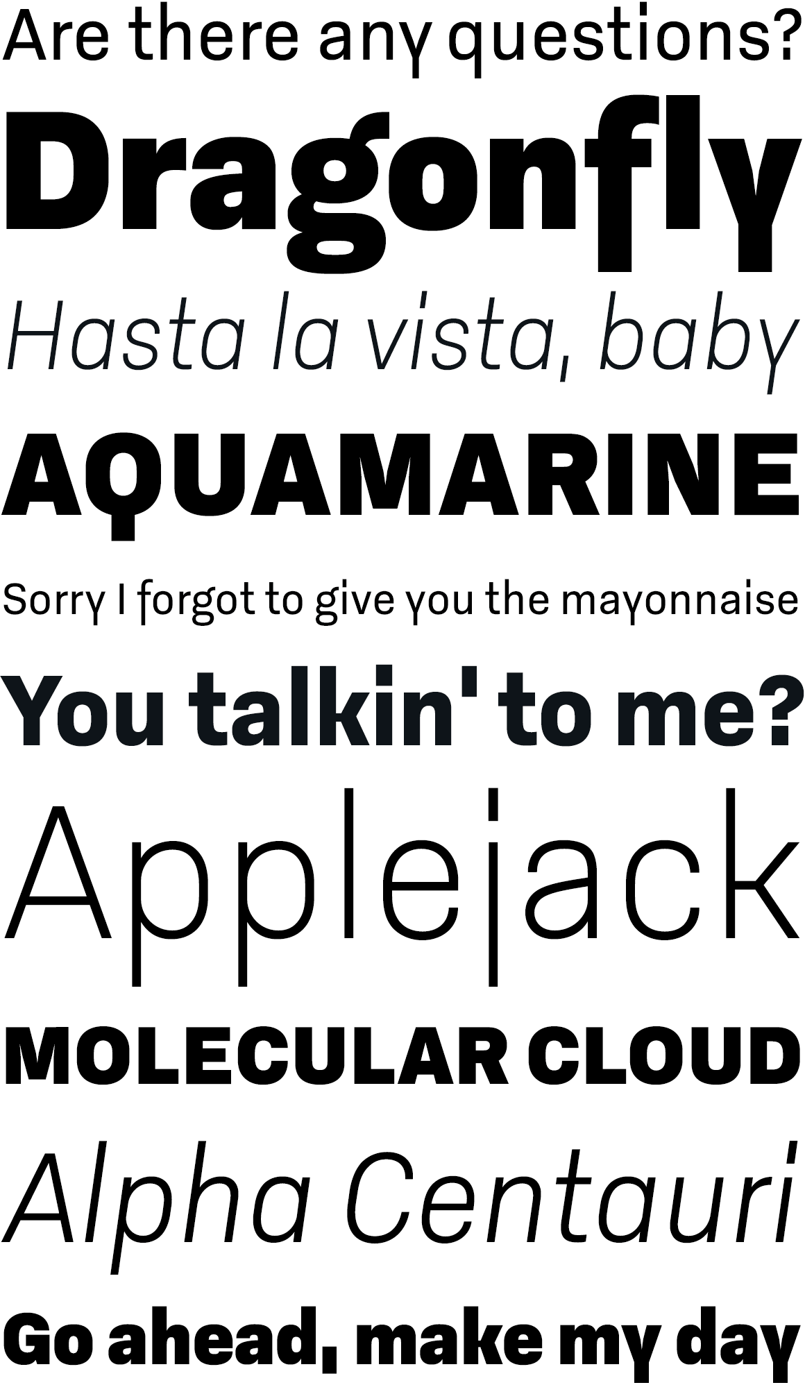
I began work on Godfrey more then two years ago. Unusually for me, I started with the design of the capital letters, with the consistent proportions and straight faces on the round letters giving the typeface a very technical and structured impression. I added comparatively compact lowercase characters, that are particularly striking in the descenders of ‘f’, ‘j’ and ‘y’, not to mention the extended dots of the ‘i’ and ‘j’.
|
|
|
Godfrey’s personality is solid and reliable. It’s a very practical typeface, with sturdy, legible forms. Godfrey is expressive without being distracting, perfectly suited to creating a clean, versatile and distinctive typographic system.
|
|
|
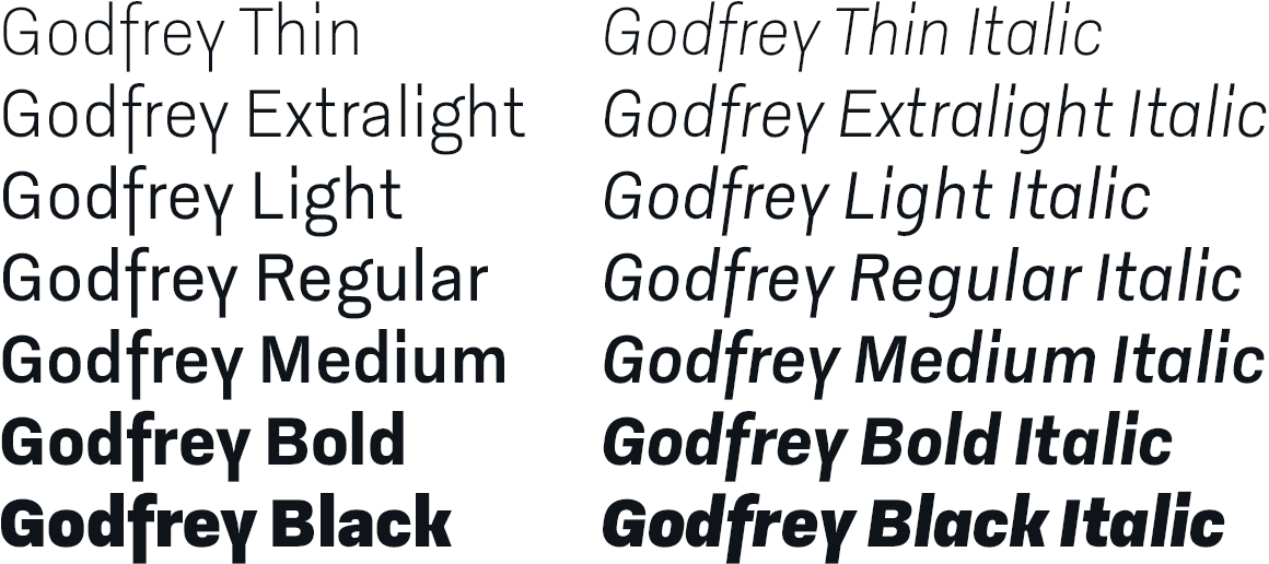
The Godfrey type family contains 14 styles and weights, covers all major languages using Latin characters, and includes a wide range of OpenType features. Godfrey fonts come for both desktop and web. We also offer special Office packages suited for corporate applications, particularly Windows Office.
|
|
|
This little mini site shows the Godfrey web fonts in action. Enjoy!
Get free demo fonts
Best of all: As an early Christmas present you can get the entire family for incredible 49€. Only for a limited time!
|
|
Like always, we really appreciate to hear your thoughts and feedback. For a more steady flow of updates make sure to follow us on Twitter and like our page on Facebook.
We are also on Behance and Pinterest.
Best regards,
Ludwig Übele, LudwigType
|
|