Helsinki
Design Concept
Like most countries Finland uses for the official road signs a typeface created by engineers. Designed with a ruler and compass, industrial practicability is preferred over aesthetic demands. Despite this, or maybe just because of this, the typeface exerts a certain charm. This may be due to the structure obtained by the consistent mathematical clarity and a certain bulkiness of the forms that give them character and originality.
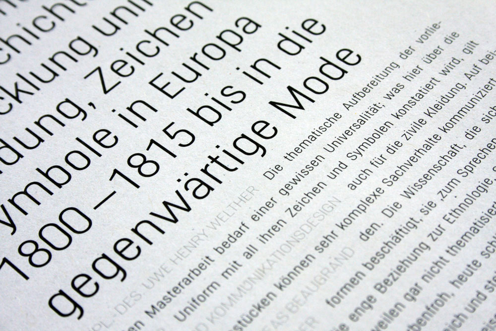
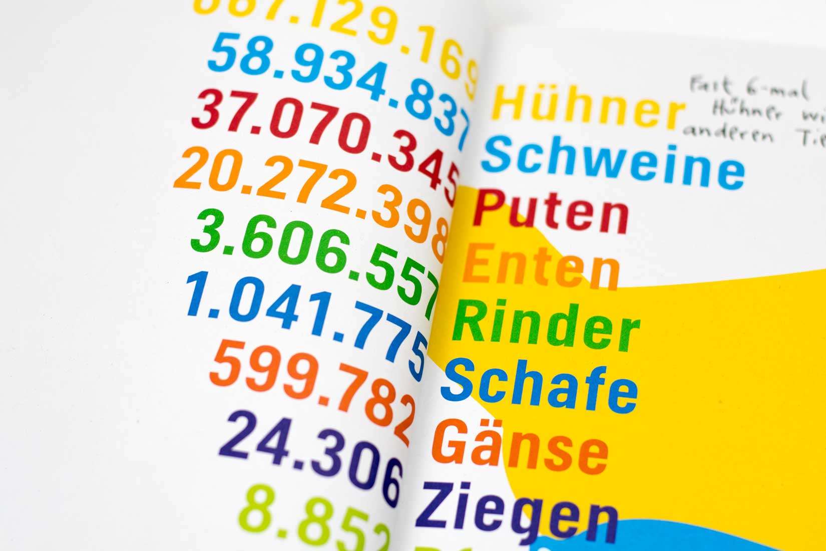
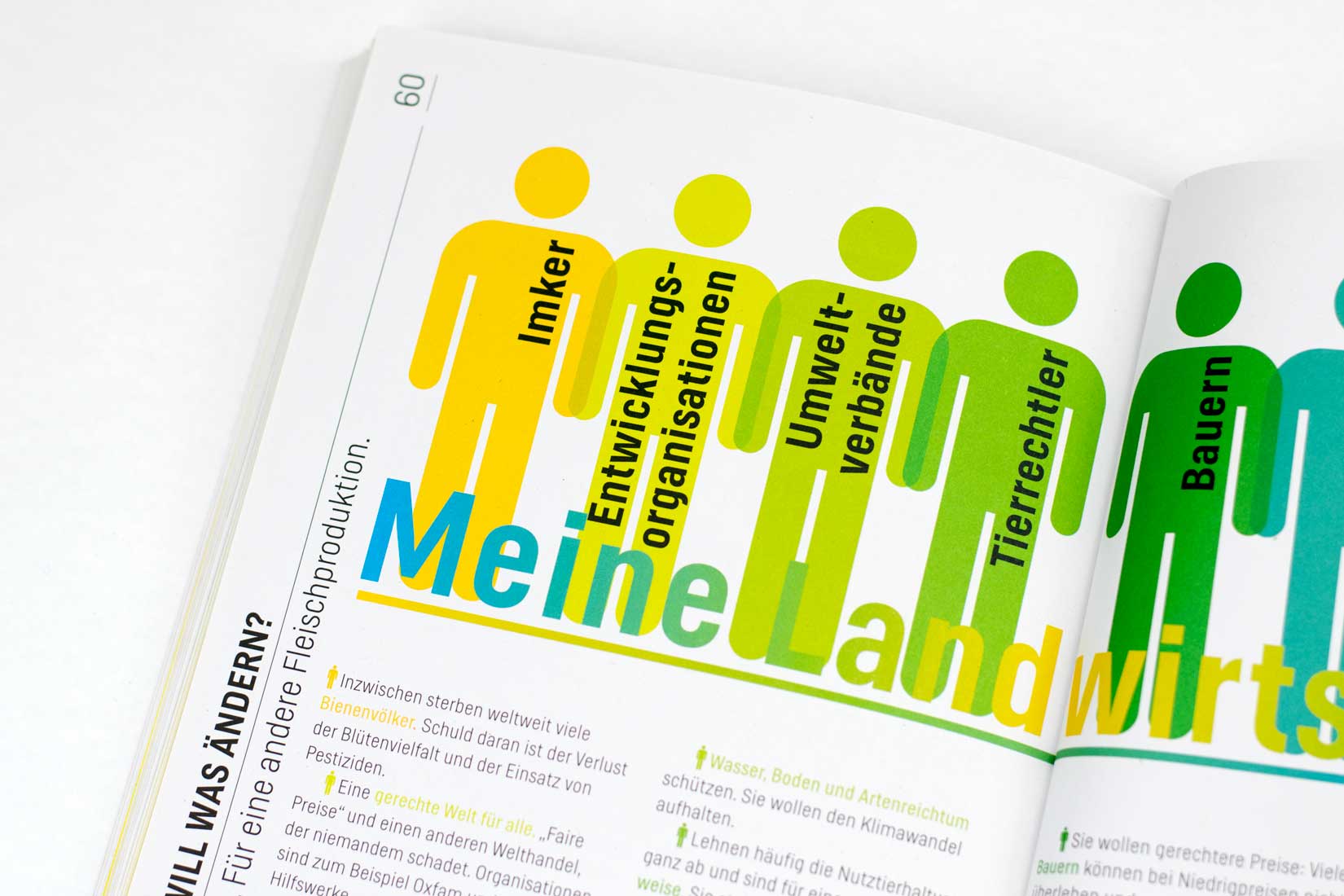
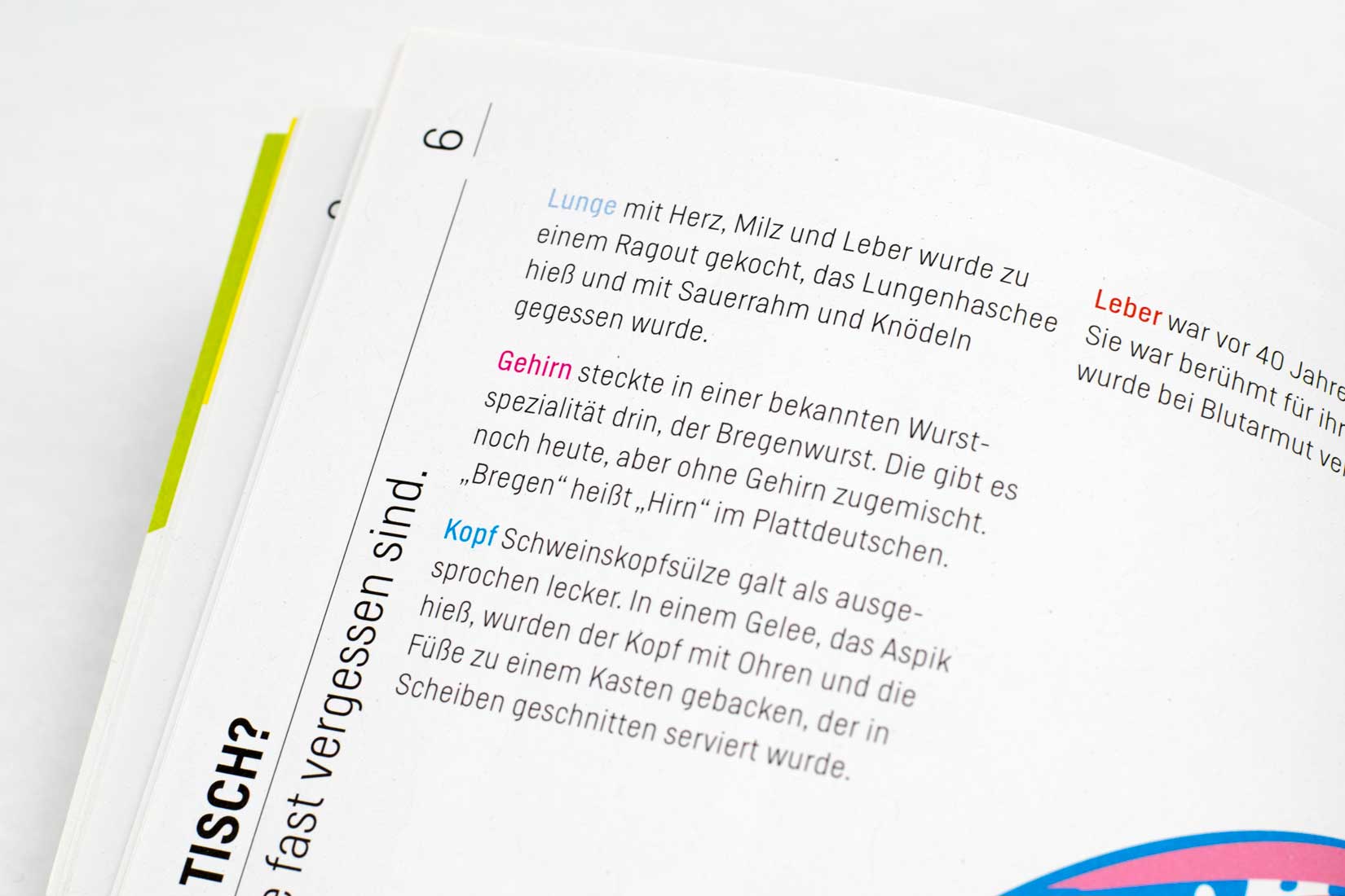
Geometrically constructed fonts like the Finnish road sign typeface are composed of circles and rectangles without regard to optical rules. In my interpretation, on one hand I tried to keep as much as possible of the original constructed character. On the other hand, to satisfy my demands on readability and aesthetics. In the first version, which I designed more than 15 years ago, I kept pretty close to the original. The new version is optically more balanced, without losing the specific character of the typeface. A lot of details were changed to make it more pleasant for the human eye.

Helsinki is inspired by the Finnish road sign typeface.

Me in Finland, 1998.
Various OpenType features provide advanced typographic performance such as different numerals and alternate characters.


