|
|
One of the most significant and diverse type designers of our time
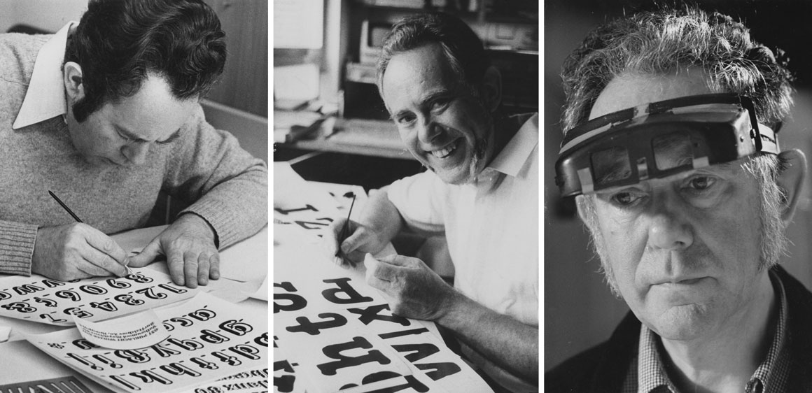
With a storied career spanning over 60 years and hundreds of original fonts that speak to the aesthetics of an era, type designer Georg Salden is one of the most significant and diverse type designers of our time. Despite much of his work having a lasting influence on type culture, Salden remains relatively unknown internationally. That is why we are especially happy to offer his typefaces now on LudwigType. We start with eight typeface families and will add more typefaces to our font library in the future.
|
|
“I try to bring clarity and beauty to the font. A clear, beautiful typeface is always legible.”
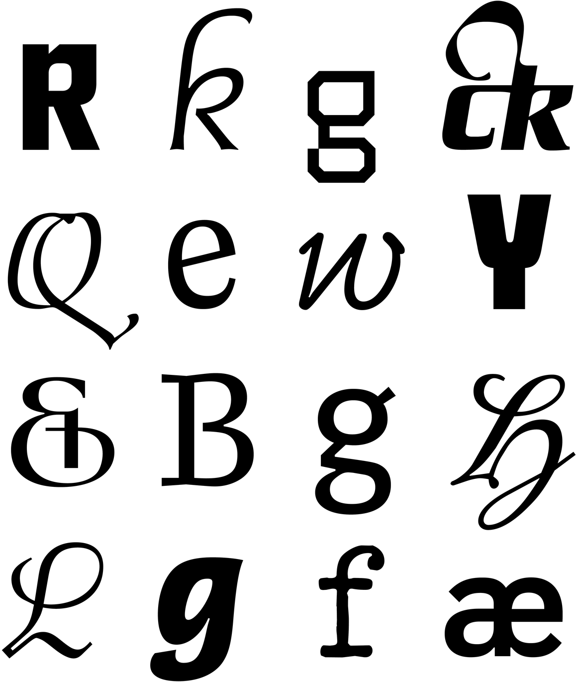
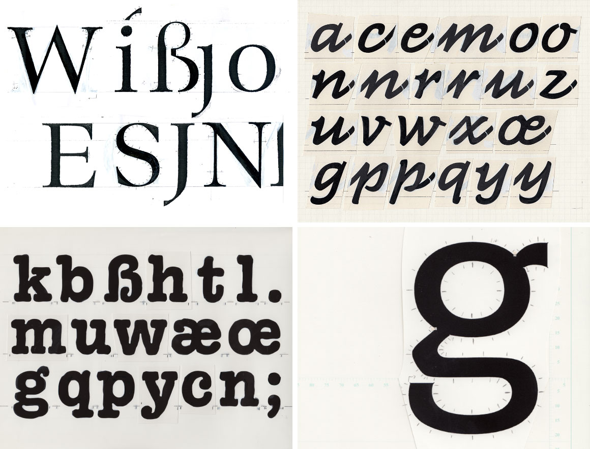
As a designer, his belief is that good typefaces should contain a balance of legibility, harmony and beauty. Nevertheless, Salden’s approach is not as traditional as it would seem. Each of his designs is refreshingly new, as Salden finds the idea of borrowing from other people’s work abhorrent. A moderniser in his field, who pushed the boundaries to new limits, he designed many typefaces which were innovations when first published and are still fresh today. His typefaces can most accurately be described as functional: their shapes always arise from the type’s function, and even an initially unfamiliar form is bound to a meaning.
|
|
|
Salden has designed about 40 type families with more than 600 weights and styles – quite an achievement considering that each character is drawn by the designer’s own hand in a solitary process. This year he will celebrate his 90th birthday. Reason enough to pay new attention to his great typefaces.
|
Eight typefaces new on LudwigType, and more will follow soon.
We are very happy to offer the typefaces of Georg Salden on LudwigType. We start with eight typeface families and will add more typefaces to our font library in the near future. On this occasion we offer you 50% off all typefaces by Georg Salden.
|
|
|
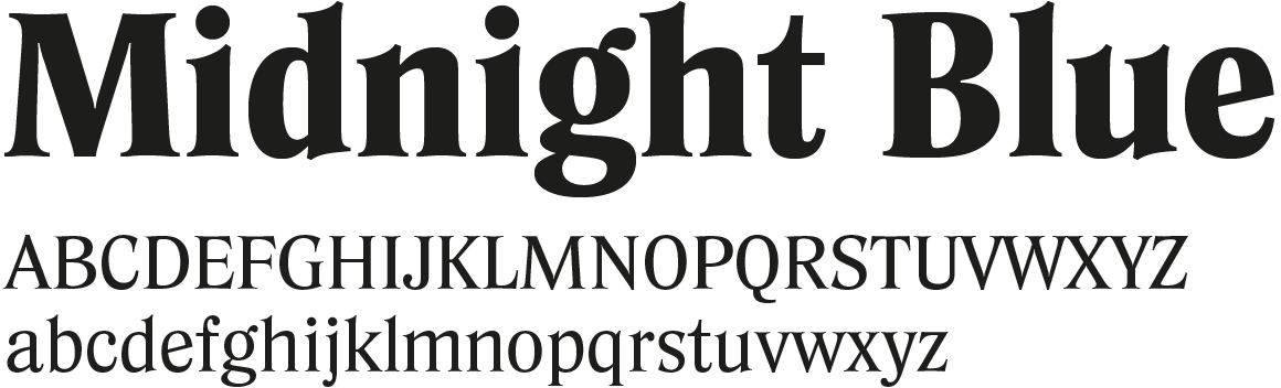
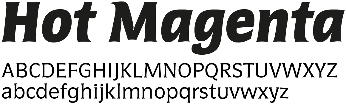
Basta is extremely legible in small sizes, with a large x-height and narrow proportions. To counteract a fence effect, all letterforms are characterised by a certain softness. The upper case letters, for example, are rounded from the shoulders to the front strokes. The soft flow of the lines is supported by the manner in which the weight of the “e” and “c” is shifted almost into the horizontal. For more ...
Get the Basta fonts with a 50% discount for a limited time only.
|
|
|
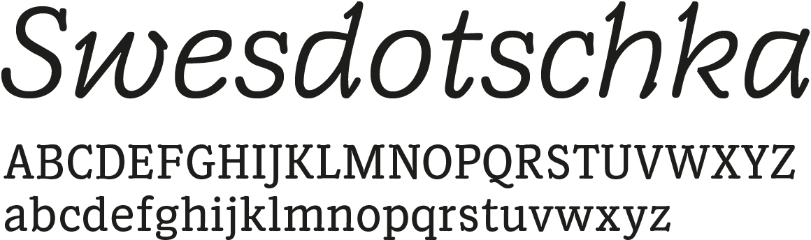
Brasil combines the qualities of both a grotesque and a roman. It has very expressive curves and the verticals meet the base line with pronounced emphasis. Together these create a more closed line formation while remaining vibrant, something purely grotesque typefaces usually fail to deliver. For more ...
Get the Brasil fonts with a 50% discount for a limited time only.
|
|
|
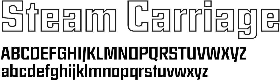
Carree it was actually intended for large words and slogans, it also has decorative possibilities in running text. It comes in five styles and weights, including an outline version. For more ...
Get the Carree fonts with a 50% discount for a limited time only.
|
|
|
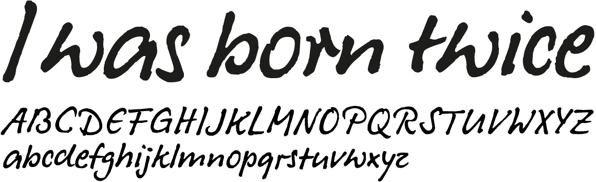
Dalli preserves a rough contour and uses irregularities to produce fluid and harmonious lines. The Dalli fonts are equipped with alternate characters and ligatures that enhance the impression of handwriting. For more ...
Get the Dalli fonts with a 50% discount for a limited time only.
|
|
|
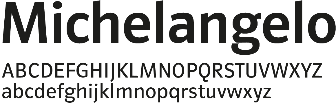
Gordon may be described as a slab serif. Indeed, very early prints, which were printed on slightly moist hand-made paper, have similarly low stroke contrasts and rounded corners. That’s what makes this typeface so communicative and mannerly. Gordon’s aesthetic appeal arises from the lively movement of the letters’ lines. The accompanying italics are highly idiosyncratic, original creations, almost with a handwritten style. For more ...
Get the Gordon fonts with a 50% discount for a limited time only.
|
|
|
Planet is a fresh alternative to the inflationary geometric fonts and a real workhorse of a typeface. Its small round letters are circular and the curve-endings also follow a circle. The characters h, m, n, u, by way of contrast, have a rather narrow inner surface thereby permitting a tighter line of letters. For more ...
Get the Planet fonts with a 50% discount for a limited time only.
|
|
|
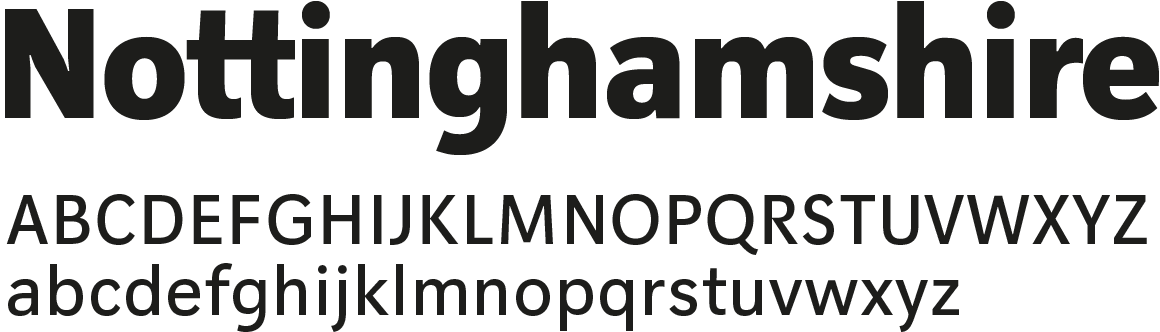
Polo is Georg Salden’s most popular and influential typeface. It combines the purposeful charisma of a grotesque with the harmonious legibility of a roman typeface. It is undoubtedly one of the most important so-called humanistic sans serif typefaces. For more ...
Get the Polo fonts with a 50% discount for a limited time only.
|
|
|
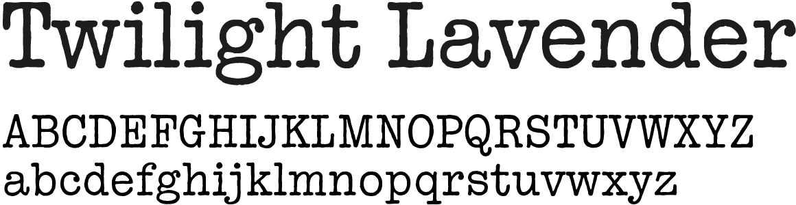
Tap was designed in 1979 to mimic the style of old typewriters. Unlike real typewriter fonts, however, the characters of Tap are not uniform. Georg Salden drew each letter by hand. He says that he deliberately drew every hump and dent. For more ...
Get the Tap fonts with a 50% discount for a limited time only.
|
Don’t miss this unique opportunity and get 50% off all typefaces by Georg Salden. Only for a limited time! We also offer free trial fonts.
If you have questions or concerns about licensing our fonts, please get in touch. As always, your thoughts and feedback are greatly appreciated. For a more steady flow of updates, make sure to follow us on Twitter and to like our page on Facebook.
You can also find us on Behance and Pinterest.
Best regards,
Ludwig Übele, LudwigType
|