Dear friends of type. It’s been a while since my last newsletter, and I’m excited to share what I’ve been up to recently.
|
|
First of all, let me apologize for taking so long to write another newsletter. Things have been busy over here, and you know how it goes! If you have no idea who I am and why you are getting this message, click here to unsubscribe. Otherwise, read on!
|
Newest additions and bespoke designs
|
|
As you know, LudwigType focuses on innovative and high-quality fonts as well as branding, logotypes and custom typeface design. So I’m all the more pleased to have had the opportunity to develop a corporate typeface for the legendary Braun company. But first, let me show the latest additions to our font library.
|
|
|
|
 |
|
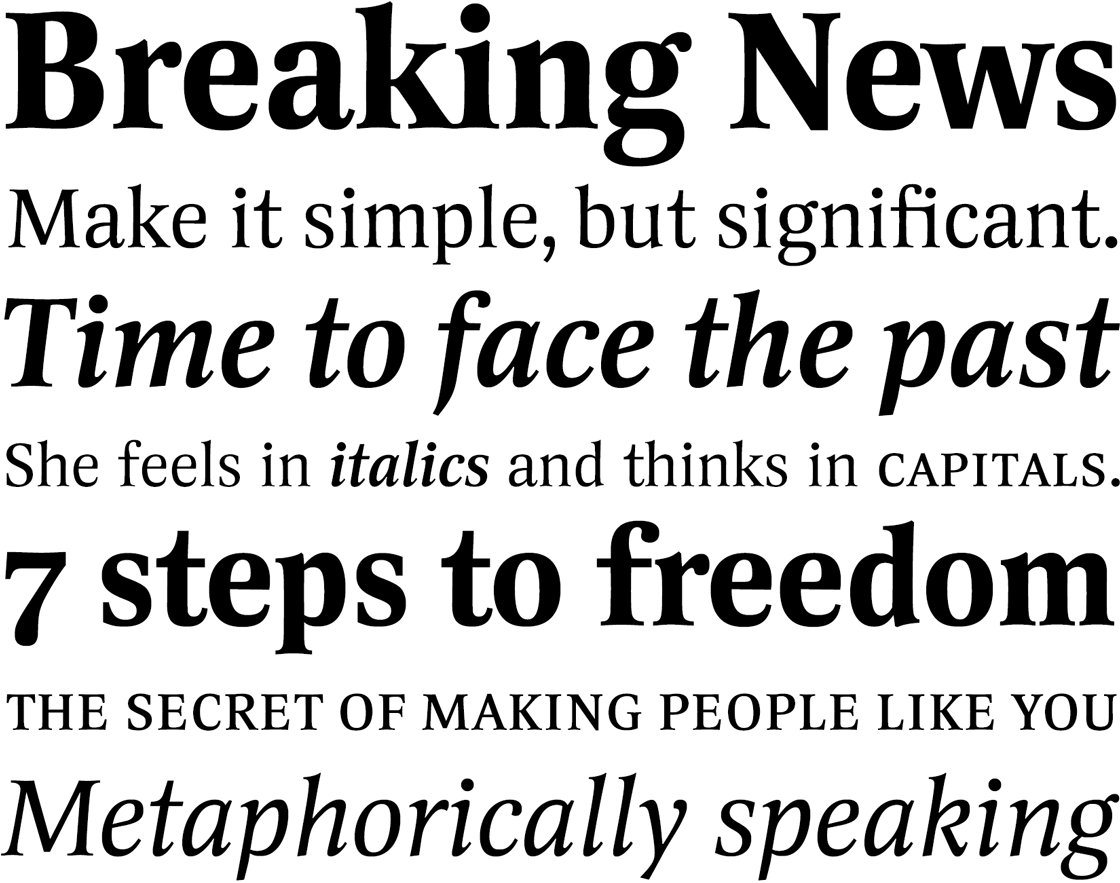
Votum is a friendly and exceptionally legible serif typeface well suited for large bodies of text. It offers an excellent alternative to the omnipresent Times New Roman. Its generous x‑height and compact letterforms allow Votum to perform exceptionally well in small font sizes and narrow columns, as well as tight headlines.
See more or download the trial fonts.
|
|
|
|
 |
|
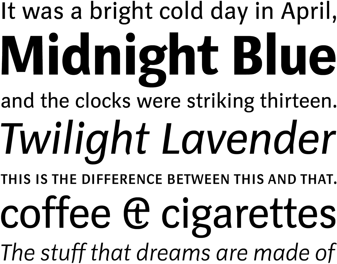
Axiom is a curious grotesque. Its horizontal strokes and curves are lighter than the verticals. Diagonally rising strokes are also noticeably leaner. This makes the figures dynamic, space-saving and lends this highly usable sans serif a very distinctive character. Axiom is drawn differently for small and larger sizes; it is available in 4 weights, and comes with an equally charming italic.
See more or download the trial fonts.
|
|
|
|
 |
|
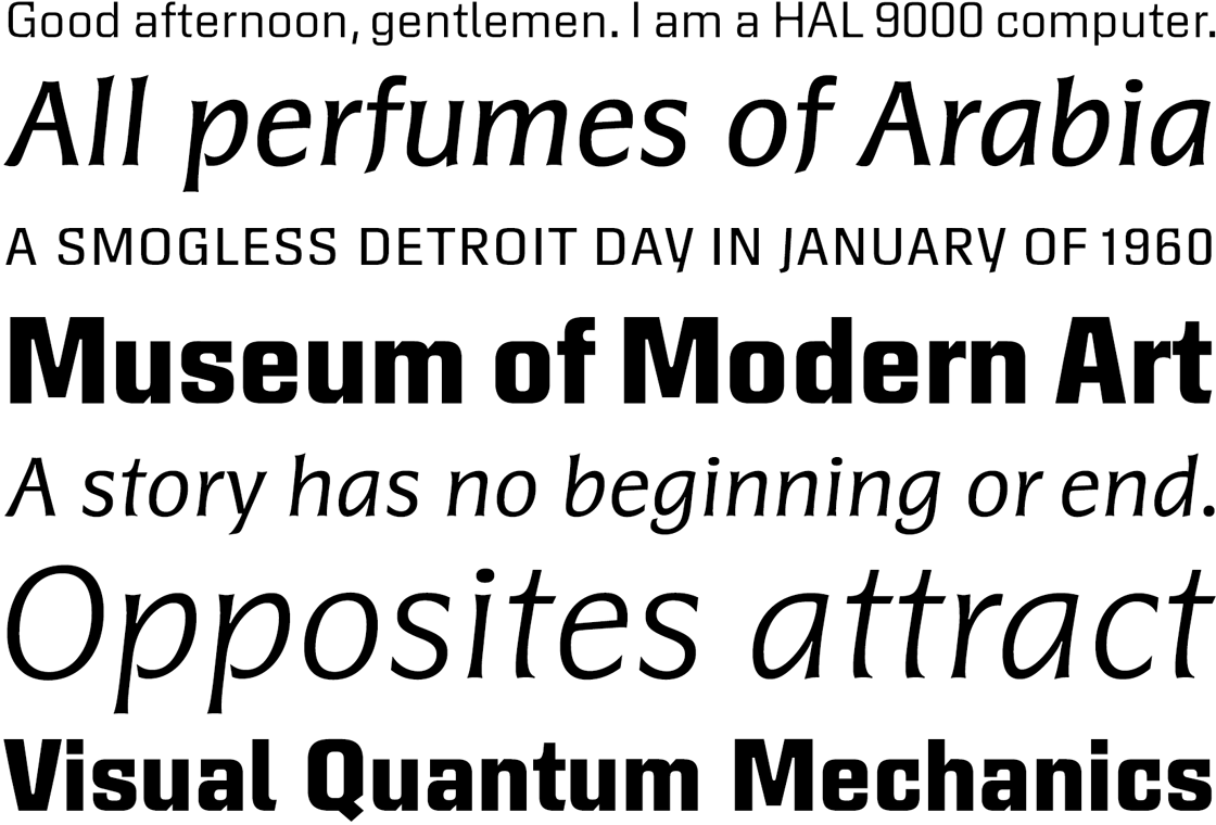
Rolls is a square sans serif accompanied by a calligraphic italic, creating an exhilarating contrast. Typically, upright and italic styles are designed to harmonize seamlessly. However, with Rolls this norm is challenged. The cursive styles form the most pronounced contrast: the robust and masculine upright is juxtaposed with a delicate, calligraphic italic. This results in an exceptionally captivating combination that opens up a wide range of design possibilities and endows Rolls with expressive versatility as a type family.
See more or download the trial fonts.
|
|
|
|
Less but better. A new corporate typeface for the Braun company
|
|
|
|
|
|
|
|
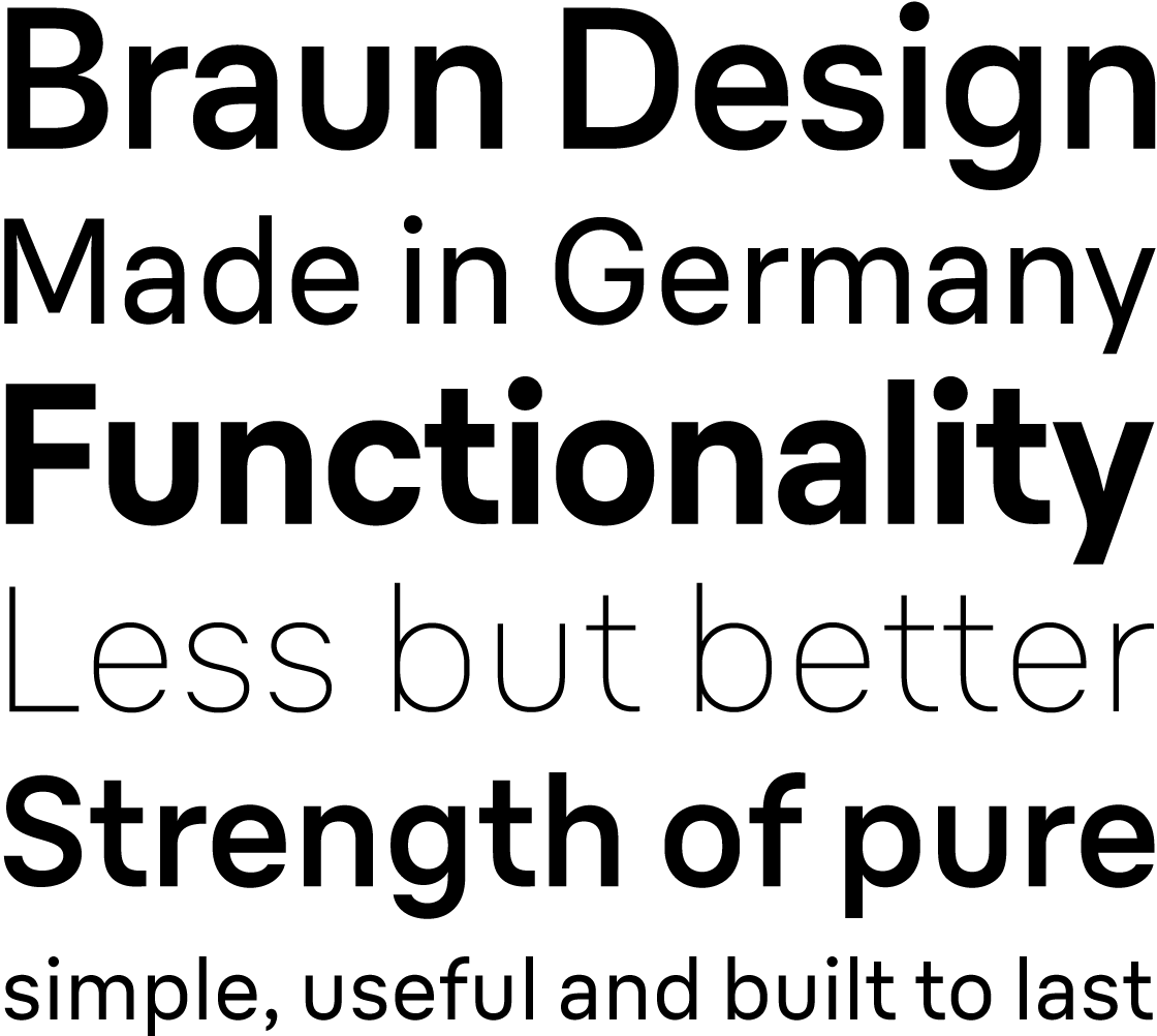
The name Braun is synonymous with iconic design, precision engineering, and a commitment to simplicity that has left an indelible mark on the world of industrial design. On the occasion of its 100th anniversary, I was commissioned to develop an exclusive corporate typeface that reflects Braun’s philosophy. The design of the company’s products hinges on two fundamental pillars: technology and people. The new typeface reflects this: the technical, functional, rational, clear, and focused on the essential on the one hand. Human, open, friendly, and warm on the other.
|
|
|
|
 |
|
One of Braun’s core principles is ‘less but better’. When crafting Braun’s new typeface, I pursued this ethos precisely: I stuck to the essential forms of the characters while crafting a design language that aligns with Braun’s identity and effectively captures the company’s essence: clarity, functionality, harmony. Braun’s design language is instantly recognizable for its timeless elegance and functional clarity. This is also visible in Braun’s new corporate typeface.
Explore our custom typefaces
|
 |
|
|
|
|
As always, your thoughts and feedback are greatly appreciated. For a more steady flow of updates, follow us on Instagram, Twitter and Facebook.
Best regards,
Ludwig Übele, LudwigType
|
|
|
|
|