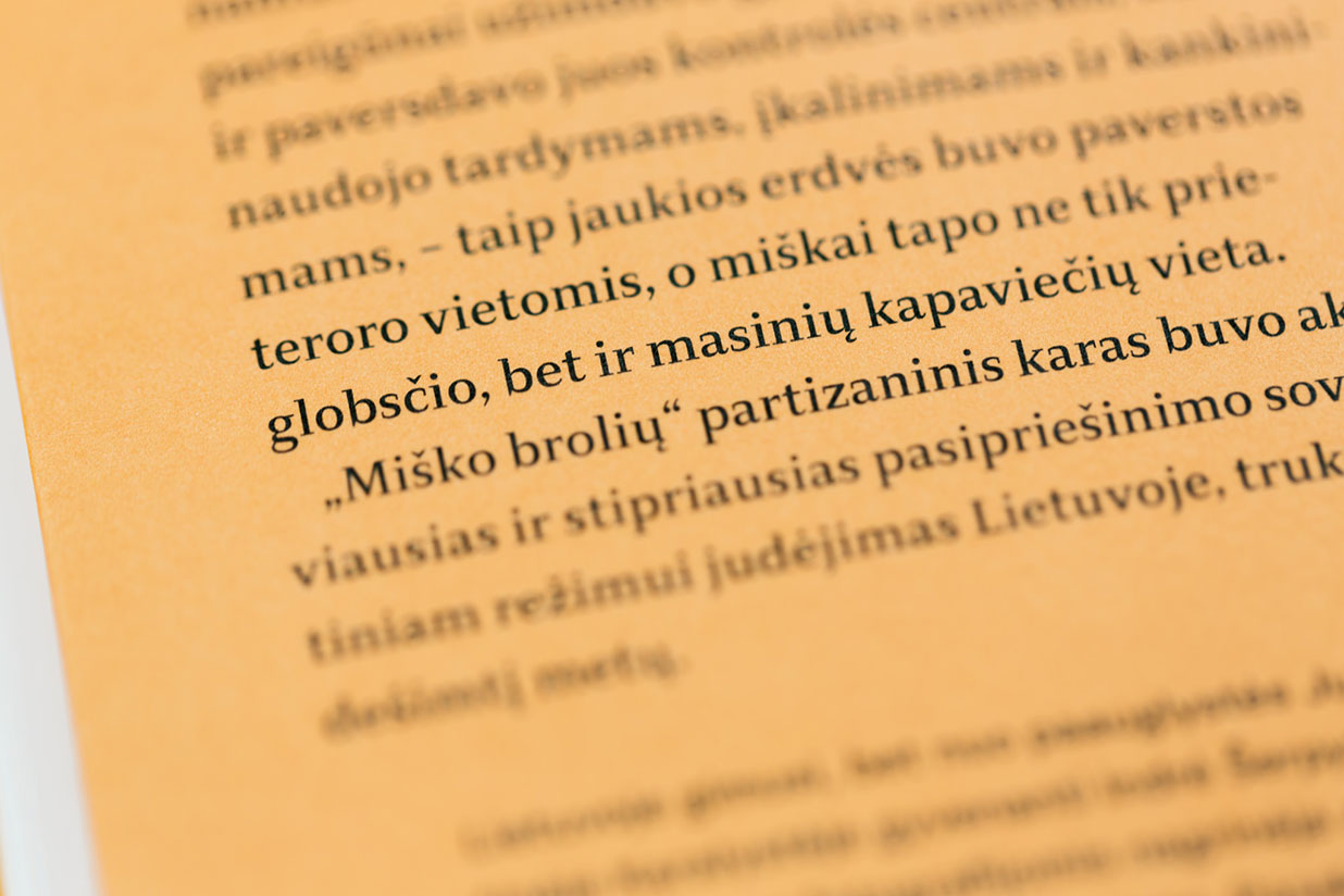
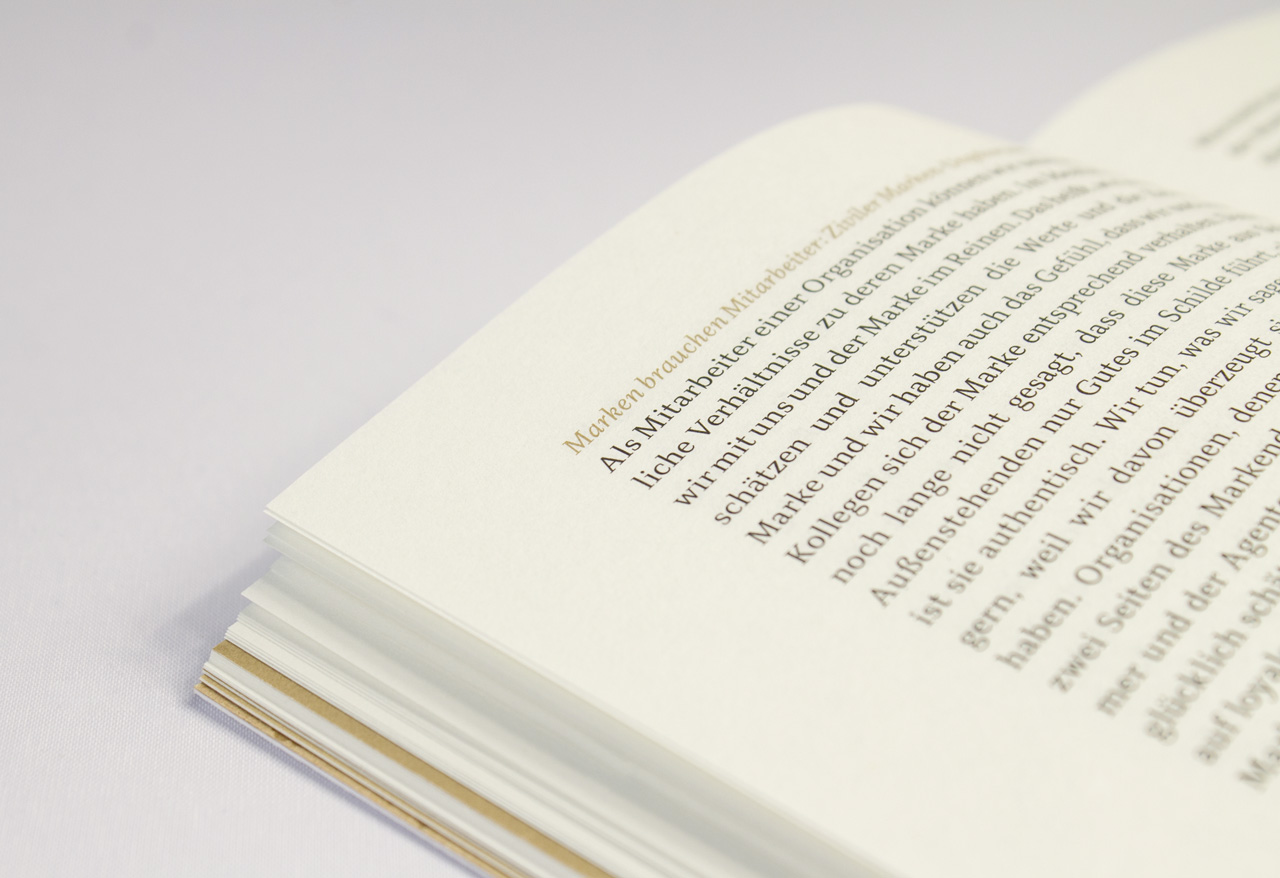
Diogenes
Design Concept
For many serif typefaces the thickness of the serifs and the weight of the thinner (primarily horizontal) strokes correspond. However, when studying ancient roman letterforms, one can see that the serifs are not simply extensions of the strokes, but independent parts of each character. Especially, when looking at the letters E, F, L and T in the image below, we can observe that the contrast between the vertical and horizontal strokes are comparatively low, however, the serifs remain thin and delicate. This was the main starting point for Diogenes. I designed the upper-case characters first, in contrast to my usual way of working. Compared with the subtle horizontal serifs the vertical serifs are slightly stronger. The proportions of the capitals are modern, meaning they are similar in width. After completing the basic forms of the capitlas, I transfered the concept to the lower-case characters. Because of the different structure the concept here is not as visible. This is no disadvantage, since lower-case characters are more important for the reading process. Finally, I would like to add a few words about the name. Diogenes is one of the classic philosophers, but was quite eccentric – just like this typeface.

Detail of the inscription on Trajan’s Column in Rome, AD 113. Source.


