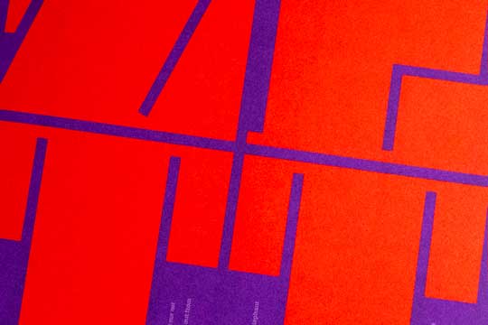
IN USE | October 2025
A to Zett
Typography in full weight — Daisy in print at ZHdK’s magazine Zett.
Read more ...
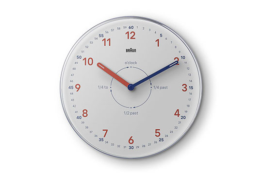
IN USE | September 2025
Custom Timepieces
Type built for function: Braun’s typeface in use on watches and clocks.
Read more ...

RELEASE | May 2025
Unexpected Affection
A minimal site with one question, two answers — and a surprising way to meet Daphne Script.
Read more ...

RELEASE | April 2025
Daphne Script
We are very pleased to welcome a new addition to our Georg Salden Library.
Read more ...

RELEASE | March 2025
A journey around planet earth
Discover the beauty of Planet, one of my favorite typefaces by Georg Salden. Join the journey and see for yourself!
Read more ...

RELEASE | September 2024
Time to swash!
A dedicated minisite showcasing Daphne, a typeface with a calligraphic flair.
Read more ...

RELEASE | September 2024
Daphne
We are excited to introduce a new addition to our Georg Salden Library.
Read more ...

CUSTOM | June 2024
Condensed additions for Braun
We are excited to introduce new additions to the custom typeface we designed for the Braun company.
Read more ...

IN USE | February 2024
Designed to Keep
The history of Braun is explored in a new Phaidon book, featuring our custom typeface designed for Braun.
Read more ...

RELEASE | October 2023
Rolls
A square sans-serif accompanied by a calligraphic italic, creating an exhilarating contrast.
Read more ...

RELEASE | September 2023
Votum
We are delighted to announce a new addition to our Georg Salden Library.
Read more ...

IN USE | March 2023
Quick Short Shots
May I take a photo of the back of your head? Art catalog featuring the works of Jub Mönster.
Read more ...

CUSTOM | October 2022
Custom Font for Braun
We are delighted to announce the development of a new corporate typeface for the Braun company.
Read more ...

NEWS | June 2022
Typefaces are there to be read
Lecture by Ludwig Übele about the great work of type designer Georg Salden.
Read more ...

NEWS | May 2022
Ich bin Georg Salden
A digital exhibition about Georg Salden and the history of teaching type and writing at the Folkwangschule.
Read more ...

IN USE | March 2022
Idep Barcelona
Nice to see our typeface Godfrey used by the spanish art school Idep Barcelona.
Read more ...

IN USE | January 2022
German Council for Sustainable Development
Riga and Tundra used by The German Council for Sustainable Development.
Read more ...

RELEASE | November 2021
Axiom
We are delighted to announce a new addition to our Georg Salden Library.
Read more ...

IN USE | September 2021
Selfless by Hyram
A new skincare brand created by Hyram Yarbro in collaboration with The Inkey List.
Read more ...


RELEASE | August 2021
Videon
Videon, designd by Georg Salden, is now available at LudwigType.
Read more ...

IN USE | July 2021
Plastic, Waste, & Me
A beautiful book about plastic for people aged 12 and over.
Read more ...

IN USE | May 2021
New font guide
Great typefaces at a glance, including Daisy, Godfrey and Polo.
Read more ...

RELEASE | March 2021
I made a list
mylist = ["new", "minisite", "to", "show", "the", "Essenz", "webfonts", "in", "action"]
Read more ...

RELEASE | February 2021
Essenz by Georg Salden
We are delighted to add this beautiful typeface by Georg Salden to our library.
Read more ...

IN USE | January 2021
Slaughters, blood and flesh
The Nitsch Foundation is the official representative of Austrian avant-garde artist Hermann Nitsch.
Read more ...

IN USE | December 2020
Muse App
Muse is a spatial canvas for reading material, research notes, sketches, screenshots, and bookmarks.
Read more ...

IN USE | October 2020
Shadows of the State
The Cold War ended in 1991, but its echoes can still be heard today.
Read more ...

NEWS | August 2020
Happy 90th birthday!
Born in 1930, Georg Salden is one of the major figures in 20th century type design.
Read more ...

IN USE | July 2020
Zurich University of the Arts
Beautiful annual report of the Zurich University of the Arts uses our Godfrey typeface.
Read more ...

NEWS | July 2020
Georg Salden now on LudwigType
Eight classic typefaces by Georg Salden are now available at LudwigType
Read more ...


IN USE | March 2020
Questions for Europe
What does Europe stand for? Where does it begin, where does it end? What do we love, what do we fear? 60 questions from young people, 60 answers from experts.
Read more ...

NEWS | February 2020
The typefaces of Georg Salden
In this talk Ludwig Übele gave a brief overview about the work of legendary type designer Georg Salden.
Read more ...

IN USE | December 2019
Design your own font
Tinkafont is an app to quickly draw your own font on and iphone or ipad.
Read more ...

NEWS | October 2019
The great work of Georg Salden
With a storied career spanning over 50 years, type designer Georg Salden is one of the most significant and diverse type designers of our time.
Read more ...

RELEASE | July 2019
New type release: Niko
Across nine weights and three widths in 54 styles, Niko is a highly versatile typeface designed for excellent legibility.
Read more ...

RELEASE | July 2019
Hello, I’m Niko
I designed a little minisite to show the Niko web fonts in action. Try it, it’s really fun!
Read more ...

IN USE | April 2019
Hessische Theaterakademie
Godfrey is used for the identity of Hessische Theaterakademie, a cooperation of universities and theaters.
Read more ...

IN USE | November 2018
Marat is the new corporate font of Edelweiss Air
Nice to see that the Swiss airline Edelweiss Air uses Marat in all their branding and communication.
Read more ...


CUSTOM | July 2018
Custom typeface for a daily newspaper
The German newspaper Weser Kurier commissioned a new type family to replace a mix of different fonts used across the newspaper.
Read more ...

IN USE | May 2018
Iss was?! Tiere, Fleisch & Ich
63 Questions and answers for all who want to know what eating meat has to do with us and with the world.
Read more ...

IN USE | January 2018
Type in use: Never Walk Alone
Nice use of Godfrey by the great designers of Chezweitz in an exhibition about Jewish identities in sport.
Read more ...

CUSTOM | December 2017
Custom typeface for a Swedish light firm
Based on sketches by swedish designer Peter Sellberg for the logotype, I created a custom typeface for the Swedish light firm Lightab.
Read more ...

IN USE | November 2017
Medium uses Marat Sans
The online publishing platform Medium.com redesigned their site using Marat Sans across the website and app.
Read more ...

IN USE | September 2017
Symbioses – The amazing coexistence in nature
The most beautiful German scientific book of 2017.
Read more ...

IN USE | August 2017
Kakadu in Typographica’s favorite fonts of 2016
Nice to see Kakadu among Typographica’s Our Favorite Typefaces of 2016.
Read more ...

NEWS | May 2017
TYPO Berlin design conference
TYPO Berlin is Europe’s biggest design event. Ludwig Übele gave a talk about legendary type designer Georg Salden.
Read more ...

RELEASE | October 2016
Type Release: Aspen
Aspen is a refreshing and resilient typeface with a distinctive, lively sway.
Read more ...

RELEASE | October 2016
Vote for me!
I made this little minisite to show the Aspen web fonts in use. Discover the typeface by typing your own text. You can also share your customized image on Facebook or on Twitter.
Read more ...

IN USE | April 2016
Type in use: Filmlandschaft Niederösterreich
Helsinki in a book on movies from Lower Austria.
Read more ...

RELEASE | March 2016
Type Release: Kakadu
Kakadus most evident characteristic is its squarish letterforms, which create a firm and dependable appearance.
Read more ...

RELEASE | March 2016
Eat My Type!
Eat My Type is a fun game of classic snake with a typographic twist, presenting the Kakadu web fonts in action. Best of all, you can win my fonts. Try it, it’s really fun!
Read more ...

CUSTOM | February 2016
Custom version of Brenta
The Finnish newspaper Maaseudun Tulevaisuus asked for a custom version of my typeface Brenta.
Read more ...

CUSTOM | February 2016
Custom font for a finnish watchmaker
Sarpaneva is a finnish watchmaker from Helsinki manufacturing exquisite wrist watches. Now they also have an exquisite custom typeface.
Read more ...

IN USE | January 2016
Type in use: Books by Tomas Mrazauskas
Great use of several of my typefaces in the books designed by Tomas Mrazauskas.
Read more ...

RELEASE | November 2015
Type Release: Godfrey
Godfrey is a clean yet unusual sans serif, with straight faces on the round letters giving the typeface a technical and structured impression.
Read more ...

RELEASE | November 2015
Minisite: Type Godfrey!
I made this little minisite to show the Godfrey web fonts in use. Discover places of Berlin, type your own text on signs and buildings, and share your text on Twitter or Facebook.
Read more ...

RELEASE | September 2015
Type Release: Contemporary Sans
Contemporary Sans is a new grotesque type family with a distinct contrast between its horizontal and vertical strokes that gives it a lively and elegant appearance. It comes in 16 weights and styles from very thin to black.
Read more ...

RELEASE | September 2015
Minisite: The Incredibles
I designed this little minisite to show the Contemporary Sans web fonts in action. Discover extraordinary animals and enjoy the Contemporary Sans type family.
Read more ...

IN USE | July 2015
Letters 1957-1985
Diogenes is used throughout this beautiful book designed by Polish design agency Podpunkt.
Read more ...

IN USE | June 2015
Wine labes
Marat is used on this beautiful wine labels for an Austrian winery.
Read more ...

IN USE | June 2015
adevantgarde
Identity of adevantgarde, the 13th international composters festival in Munich, featuring Marat and Marat Sans.
Read more ...

IN USE | June 2015
Copenhagen Designer Outlet
Helsinki used for the Copenhagen Designer Outlet.
Read more ...

RELEASE | May 2015
Type Release: Brenta
Brenta is a new crisp type family with sharp and sturdy forms. It comes in eight weights from very thin to very dark.
Read more ...

RELEASE | May 2015
Minisite: The Daily News
I designed this little minisite to show the Brenta web fonts in action. Discover what happened today in history and enjoy the Brenta type family.
Read more ...

RELEASE | April 2015
Type Release: Diogenes Decorative
Diogenes Decorative is the new ornate sister of Diogenes and contains a great number of swash characters, alternates and separate swashes.
Read more ...

IN USE | April 2015
Von Marken und Menschen
Diogenes in the book “Of Brands and Men” by Andreas Freitag, designed by Sven Ingmar Thies, published by Hermann Schmidt, Mainz.
Read more ...


NEWS | March 2015
Diogenes in Typographica’s favorite fonts of 2014
I’m very happy to see Diogenes among Typographica’s annual Our Favorite Typefaces of 2014.
Read more ...

IN USE | February 2015
Magazine design
Marat and Marat Sans is used throughout this Finnish magazine.
Read more ...

CUSTOM | December 2014
Lettering for Burger King
For Burger King’s christmas special I designed this custom lettering. Commissioned by the Munich-based studio setup GmbH.
Read more ...

CUSTOM | October 2014
MyToys logotype
In cooperation with Realgestalt I redesigned the logotype of MyToys, a distributor for toys and other products for children.
Read more ...

RELEASE | October 2014
New type release: Diogenes
Diogenes is a new typeface from LudwigType. We’re offering a temporary 50% discount on this crisp and elegent serif typeface to celebrate this release!
Read more ...

IN USE | September 2014
Type in use: Helsinki
Booklet for the design graduation show of the University of Applied Sciences in Bielefeld using Helsinki.
Read more ...

NEWS | August 2014
Riga is a MyFonts Rising Star
It’s a great pleasure to see my latest release, the Riga type family among the most successful recent typeface families at MyFonts.
Read more ...

IN USE | July 2014
FF Tundra in Berlin city magazine tip
It seems that FF Tundra is preferably used for editorial. Nice to see the typeface throughout the Berlin city magazine tip.
Read more ...

IN USE | April 2014
Edmund de Waal
I’m very happy to see this book about one of my favorite artists using my Augustin.
Read more ...

IN USE | April 2014
Das Referenz
Das Referenz is a nice Wikipedia reader using designed by Raureif using Marat and Marat Sans.
Read more ...

IN USE | March 2014
Partly Cloudy
The award-winning weather app Partly Cloudy by Raureif uses Helsinki for its interface.
Read more ...

IN USE | March 2014
Global Weather Radials
Global Weather Radials 2013 infographic poster and website designed by Raureif using Helsinki.
Read more ...

RELEASE | February 2014
Helsinki Webpage
This new little webpage shows the Helsinki webfonts in action and tells of the magic of the Finnish winter nights.
Read more ...

IN USE | April 2014
Alltagstauglich
The book series Alltagstauglich, a language course by Hueber press, uses Marat for its body text..
Read more ...

IN USE | February 2014
Type in use: Wood Type Research
Wood Type Research is a blog of current research in wood type design, manufacture and use during the nineteenth and twentieth centuries by Professor David Shields. It uses FF Tundra for body text.
Read more ...

NEWS | January 2014
Interview with FontShop
Since the beginning of this year my typefaces are also available through FontShop. On this occasion I have given an interview, which you can read on FontShop Aktuell (unfortunately in German only).
Read more ...

NEWS | January 2014
What a character
What a Character is a simple site that provides a new way to look at typefaces. The site presents individual characters in an extra-large size, focusing on the beauty and detail of each outline rather than the entire alphabet. Of course, you can see the rest of the characters as well.
Read more ...

IN USE | November 2013
Mind reading by caressing snails
Beautiful use of Marat in this book by Austrian science cabaret Science Busters.
Read more ...

RELEASE | December 2013
Daphne Script
Daphne Script is a new typeface designed by great calligrapher and type designer Georg Salden. Since about 5 years LudwigType works with Salden to digitize and complete his typefaces and distribute them through TypeManufactur.
Read more ...

IN USE | October 2013
Weltmuseum Wien
The Museum of Ethnology in Vienna changed its visual identity and has chosen Marat Sans as its new corporate typeface. Nice to see the typeface used for the logo and all printed and digital media. Check out the museums webpage to see Marat Sans in action.
Read more ...

NEWS | September 2013
Logotype redesign
I redesigned the logotype of Peter Hahn, a mail-order house and fashion boutique that offers mainly ladieswear.
Read more ...

IN USE | August 2013
FF Notebook
Nice and usefull notebooks produced by FontFont featuring FF Tundra.
Read more ...
IN USE | August 2013
Take a seat, please.
Tanja Huckenbeck made this nice seat cushions using Marat.
Read more ...

IN USE | July 2013
FF Tundra in Finnish magazine
FF Tundra is used throughout the finnisch magazine Kodinrakentaja by Sanoma Magazines.
Read more ...

NEWS | July 2013
Yearbook of Type I
Marat and Marat Sans have been selected for the Yearbook of Type, a compendium of contemporary typefaces.
Read more ...

IN USE | July 2013
Characters to wear
T-Shirts designed by Typecache using LudwigType characters.
Read more ...

RELEASE | June 2013
Deutschkurrent
Deutschkurrent is an interesting German script designed by great calligrapher and type designer Georg Salden. Since about 5 years LudwigType works with Salden to digitize and complete his typefaces and distribute them through TypeManufactur. Check also this micropage.
Read more ...

NEWS | June 2013
Interview with Fontblog
Interview with Fontblog about FF Tundra and it’s role in the redesign of the German news magazine Stern. Read the full interview (German).
Read more ...


IN USE | April 2013
Typo Journal
Marat is used for the cover page and body text of the Typo Journal No. 4.
Read more ...

CUSTOM | March 2013
Logotype for news magazine
The german publishing firm Gruner+Jahr asked me to redesign the logotype for the well-known weekly news magazine stern. They also decided to use my typeface FF Tundra for the body text throughout the magazine.
Read more ...

IN USE | March 2013
FF Tundra in Codex 3
Nice to see FF Tundra used in the respected Codex 3: The Journal of Letterforms.
Read more ...

NEWS | March 2013
Computer Arts magazine
Nice to see my typefaces Marat and Marat Sans featured in the British magazine Computer Arts issue 211.
Read more ...

IN USE | July 2013
Peek & Cloppenburg
Peek & Cloppenburg using FF Tundra for their seasonal campaign.
Read more ...

IN USE | February 2013
FF Tundra in use
FF Tundra is used in the book Canada’s Raincoast at Risk: Art for an Oil-Free Coast published by the Raincoast Conservation Foundation.
Read more ...

NEWS | December 2012
Typografische Monatsblätter
My article on the development of FF Tundra was published in the swiss typography magazine Typografische Monatsblätter. On seven pages you can read and see the design process of this narrow-running and extremely legible serif typeface.
Read more ...

CUSTOM | December 2012
Lettering for Burger King
For Burger King’s christmas special I designed this custom lettering including a series of corresponding swashes. Commissioned by interone, Munich.
Read more ...

NEWS | November 2012
Lecture at tga Vienna
Nice that so many people came to see my lecture at the tga Austria in Vienna about my own type design and the work of legendary letter artist and type designer Georg Salden.
Read more ...

IN USE | April 2012
Type in use: Helsinki
Helsinki in a book designed by studio FM Milano
Read more ...

NEWS | April 2012
Novum 04/2012
Typefaces for Readers. Nice to see my type design work featured in the renowned design magazine Novum - World of Graphic Design.
Read more ...

NEWS | October 2011
Letter.2
I’m are very pleased to announce that Marat was selected in the Letter.2 type competition. Letter.2 aims to provide a wide-angled snapshot of the state of typeface design around the globe over the past 10 years.
Read more ...

IN USE | June 2011
Newspaper about physiognomic
Nice use of Marat in this newspaper about physiognomic.
Read more ...

NEWS | June 2011
TDC Award
My typefaces FF Tundra and Daisy has been selected by the jury of the renowned TDC competition to receive the Certificate of Excellence in Typeface Design, and are included in the Annual of the Type Directors Club, Typography 31.
Read more ...
NEWS | May 2008
TDC Award
Marat has been selected by the jury of the TDC competition to receive the Certificate of Excellence in Typeface Design.
Read more ...