Bauknecht
Redesign of the exisiting logotype
Bauknecht, formally Bauknecht Hausgeräte GmbH, was one of Germany’s leading manufacturers of household appliances, and since 1989 has been a brand of Whirlpool Corporation. We were asked to redesign the existing logo and make it softer, more dynamic and feminine. First and foremost, we reduced the harshness of the angular letters by introducing curves. We narrowed the letters to make the logotype more compact and elegant. Finally, we slanted the letters to make the logotype more lively.
Commissioned by Interbrand Zintzmeyer & Lux.

A wordmark is like a signature. The name of the company is the most basic element of its communication. And this name should have a form that reflects the company as best as possible. There has to be a good reason for a symbol, but a wordmark is crucial. In the ideal case, the symbol and the wordmark merge into a unified whole.

Old logo

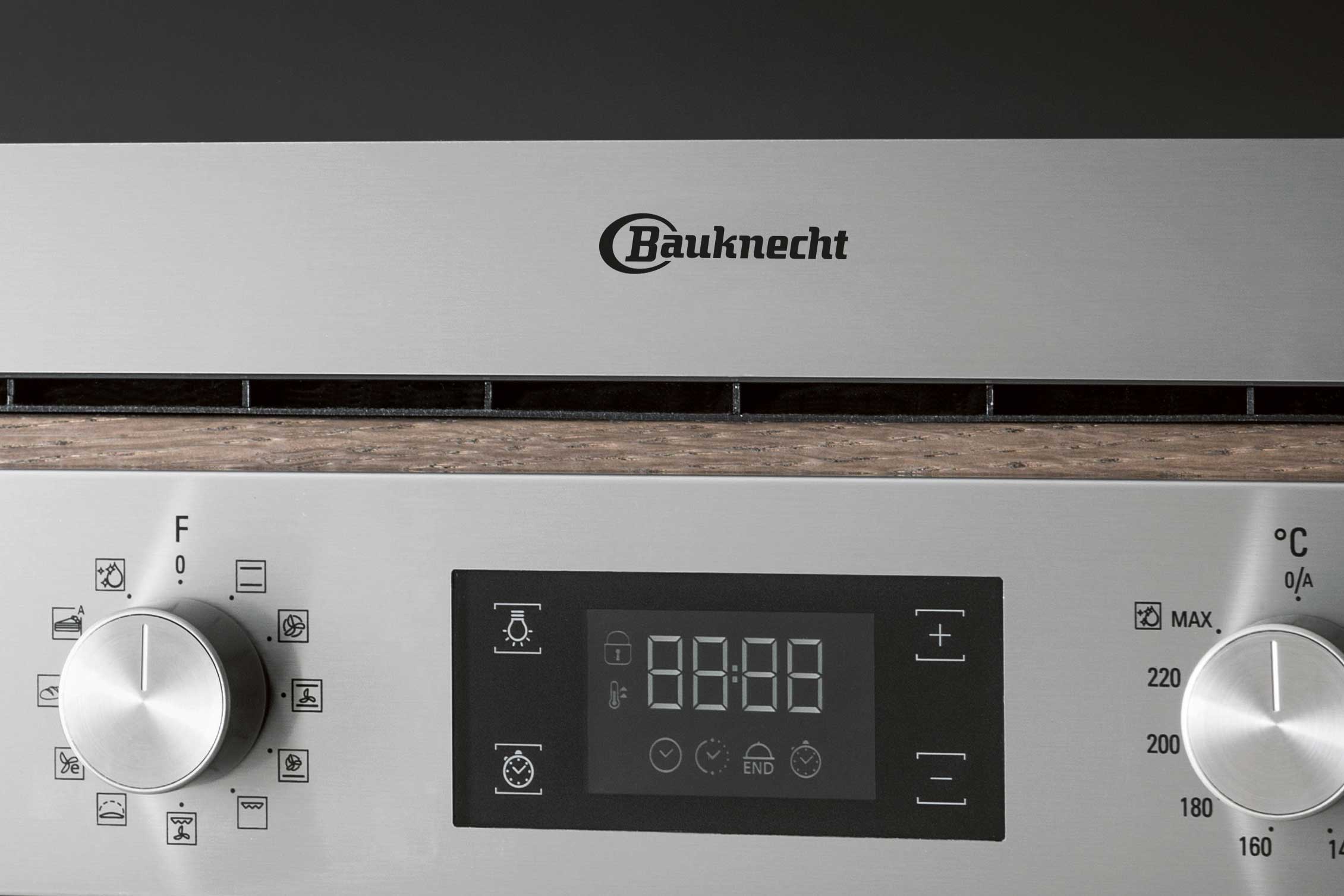
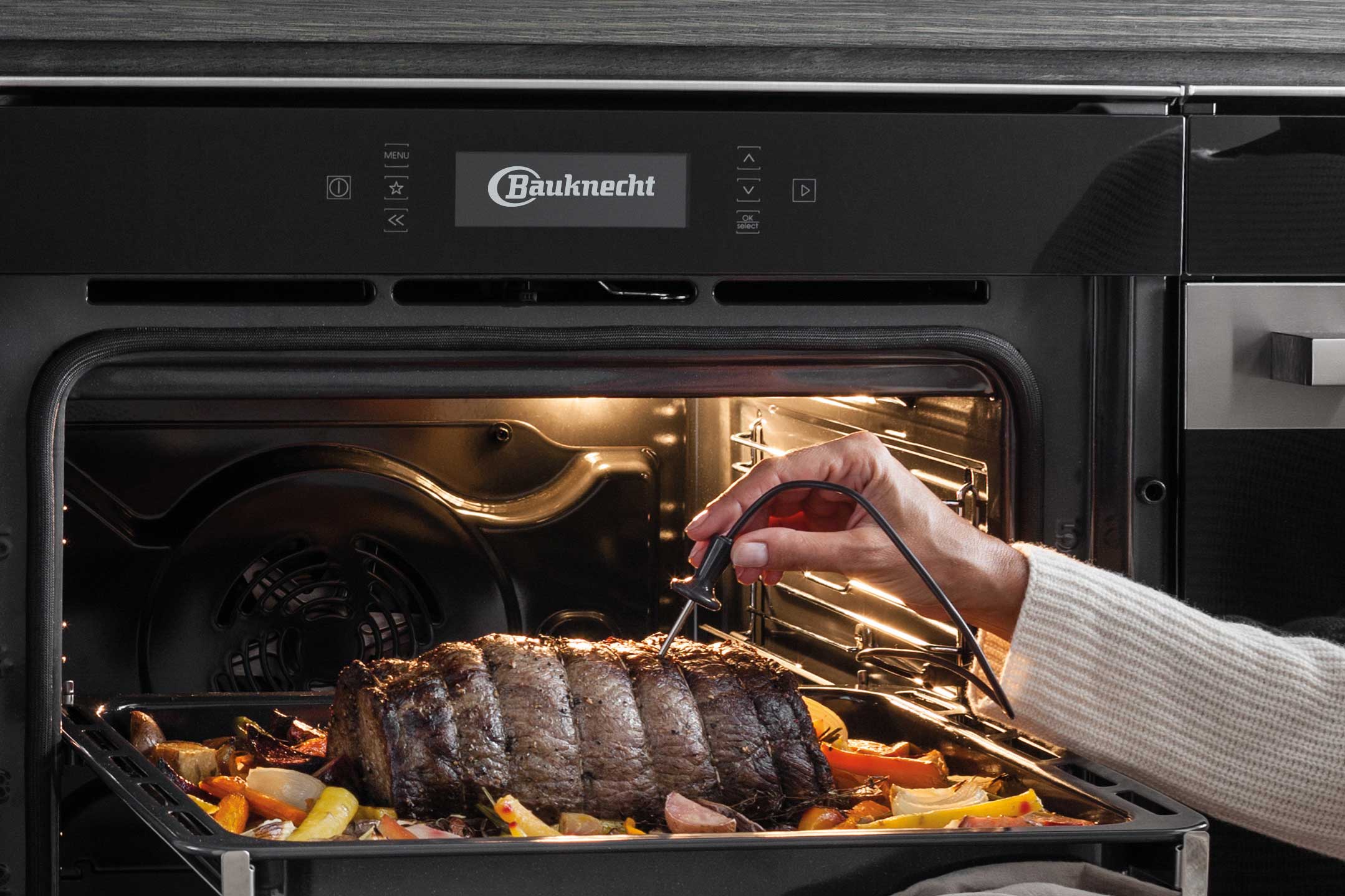
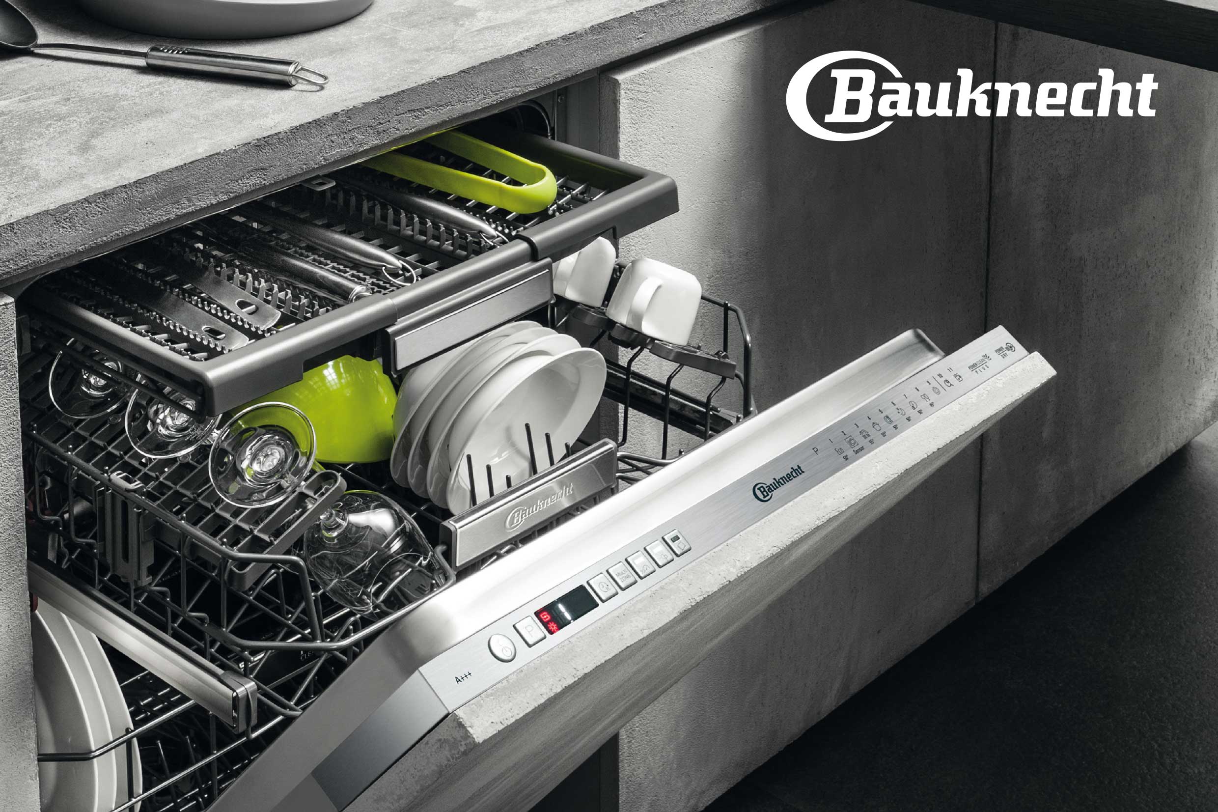
New logo
In the course of revising the brand strategy, the logo was also reviewed and redesigned. The aim was to rejuvenate the brand, which was also to be reflected in a subtle revision of the logo. The letters of the existing logo were very blocky, with hard edges and sharp joints. We narrowed the characters to make the logotype more elegant and better proportioned. In particular, the capital B was too wide and didn’t fit with the rest. We introduced curves instead of hard edges to make the logotype softer, friendlier, and more feminine. The slant of the letters also support the new strategy and reduce the technical and clunky character of the old logo.

Comparison old and new logo