myToys
Logotype redesign for a toy store
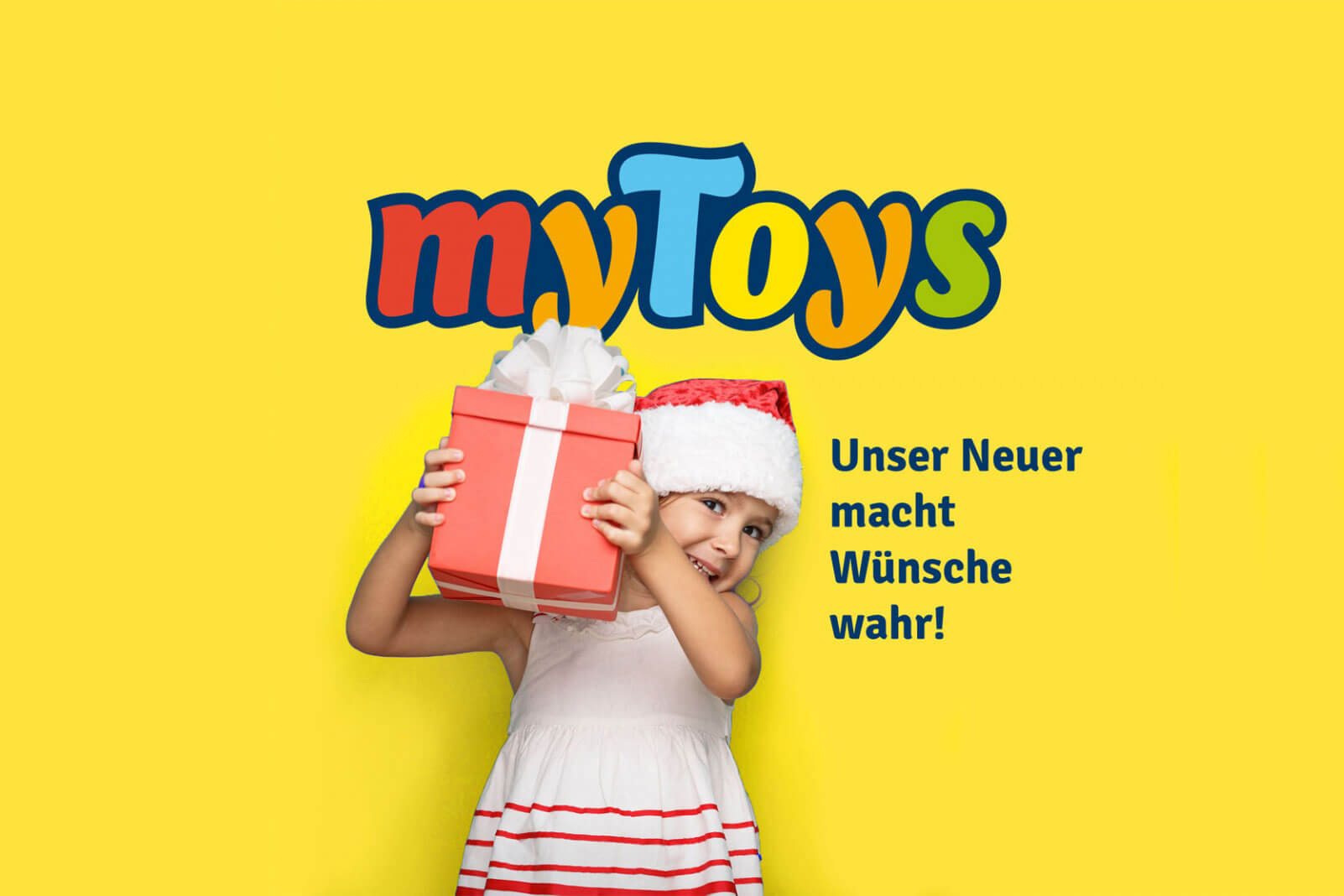
myToys is a distributor for toys and other products for children. The Berlin based design agency Realgestaltt, who is responsible for the new corporate design of myToys, asked me to redesign the companies logotype, make it more distinctive and clear. I simplified the individual characters and gave them a brushlike drive. We decided to add a bolder outline to bind the individual characters together and to make the logotype more useable on images and coloured backgrounds. We also changed the colour slightly.


Old logo
New logo
Designing a distinct and harmonious logotype is not only about designing the individual letters, but also the space between the letters. The old logo is a good example of how a sequence of individual letters do not yet make a convincing logotype. Some letters just touch, others do not. T and y create large empty spaces. The characters seem to float randomly next to each other like balloons. Since each letter has a different color, it is extremely difficult to use the logo on top of an image or coloured surface. Our approach was to redesign the logotype in such a way that it forms one compact shape and could be used easily in as many ways as possible. We removed the bubbly effect of the characters and gave them a more brushlike look. We added an bold outline to the entire logotype, which at the same time creates a dark background. This allows easy placement of the logo on coloured surfaces, patterns or images.

This is a selection from the countless variations we created to find the solution that works best. The client wanted to keep the motley colors of the letters. So we adjusted the colours only slightly to look a little more harmonious, and focused mainly on the shape of the letters and the overall shape of the logotype. Each line shows a different logotype design each with different outlines, backgrounds or shadows. It is also always important to make sure that the logo works well in very small sizes and in black and white.


