Happy 90th birthday, Georg Salden!
Born in 1930 in Essen, Germany, Georg Salden is one of the major figures in twentieth century type design. Much of his work having a lasting influence on type culture, inspiring generations of type designers. On August 28, he will be 90 years old. Happy birthday to a great man and an incredible designer.
When asked how long he has been interested in type, Salden’s answer is as long as he can remember — or, at least, as long as he has been able to write. As a child, he enjoyed writing, starting with the German Sütterlin, then Latin letters. This early exercises in both writing systems may have helped to set the stage for the rich variety of his work.
At 12, Georg Salden discovered boxes containing the writing materials of an uncle who emigrated in 1933, the renowned book designer and calligrapher Helmut Salden. Fascinated by the discovery, he enthusiastically took up nib and ink and reproduced what he had found. After 1945, he turned to the English schools of Johnston and Fairbanks, and by 16 was writing daily pages full of uncial and roman script. As a 19-year-old high school student in 1949, he was awarded a prize from the Ministry of Education for a handwritten book in celebration of the 200th anniversary of Goethe’s birth.
After his study at the Folkwang-Werkschule in Essen he worked as a freelance graphic artist before concentrating on type design. He formed Georg Salden Typedesign (GST) to distribute his types exclusively through a group of typesetters. Supplied both in headline and text formats, GST types offered members an edge in a highly competive market. Salden, whose best-known typeface is the distinctive sans serif Polo, is still working on new typefaces, now in collaboration with LudwigType. Happy birthday, Mr. Salden!


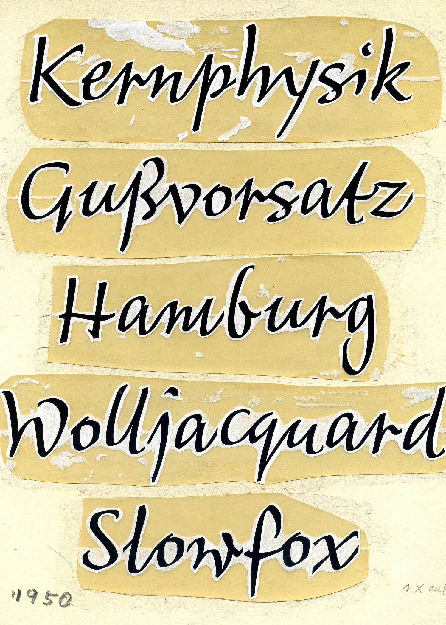
Lettering, 1950.
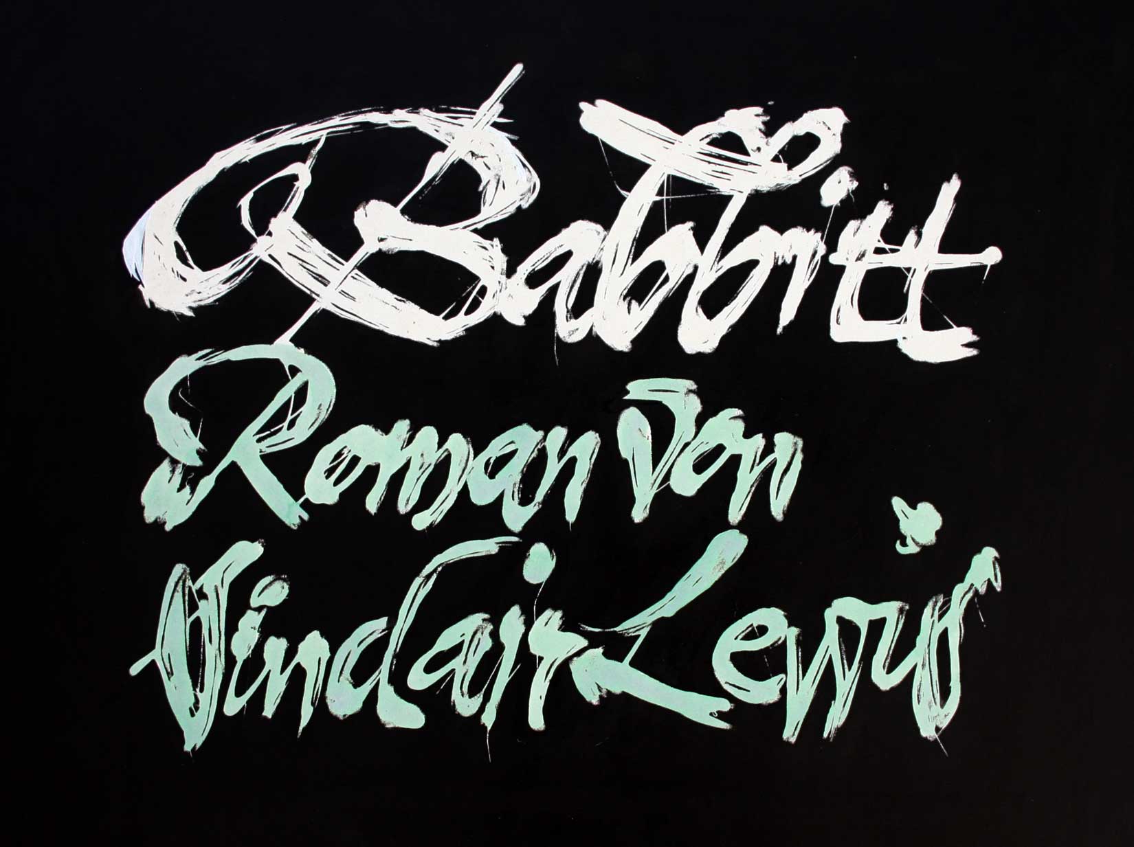
Georg Salden is an excellent calligrapher. However, he is always quick to underline the difference between calligraphy and writing, believing only the latter to benefit type design.
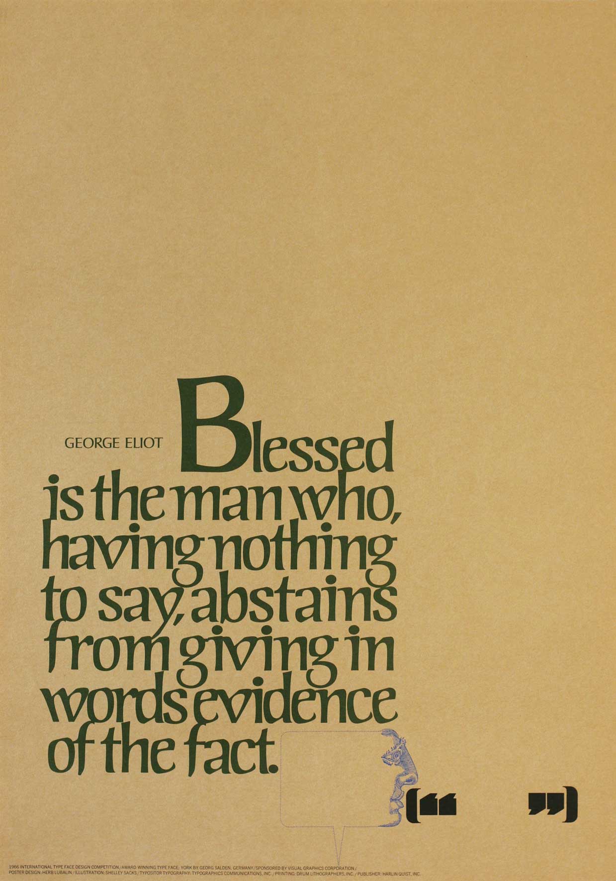
Georg Salden’s first typeface release, York, has a distinctive written character, highlighting how familiar the designer is with written script. York was also his first success, receiving an award at the international VGC competition in New York in 1966. The Poster was designed by Herb Lubalin.
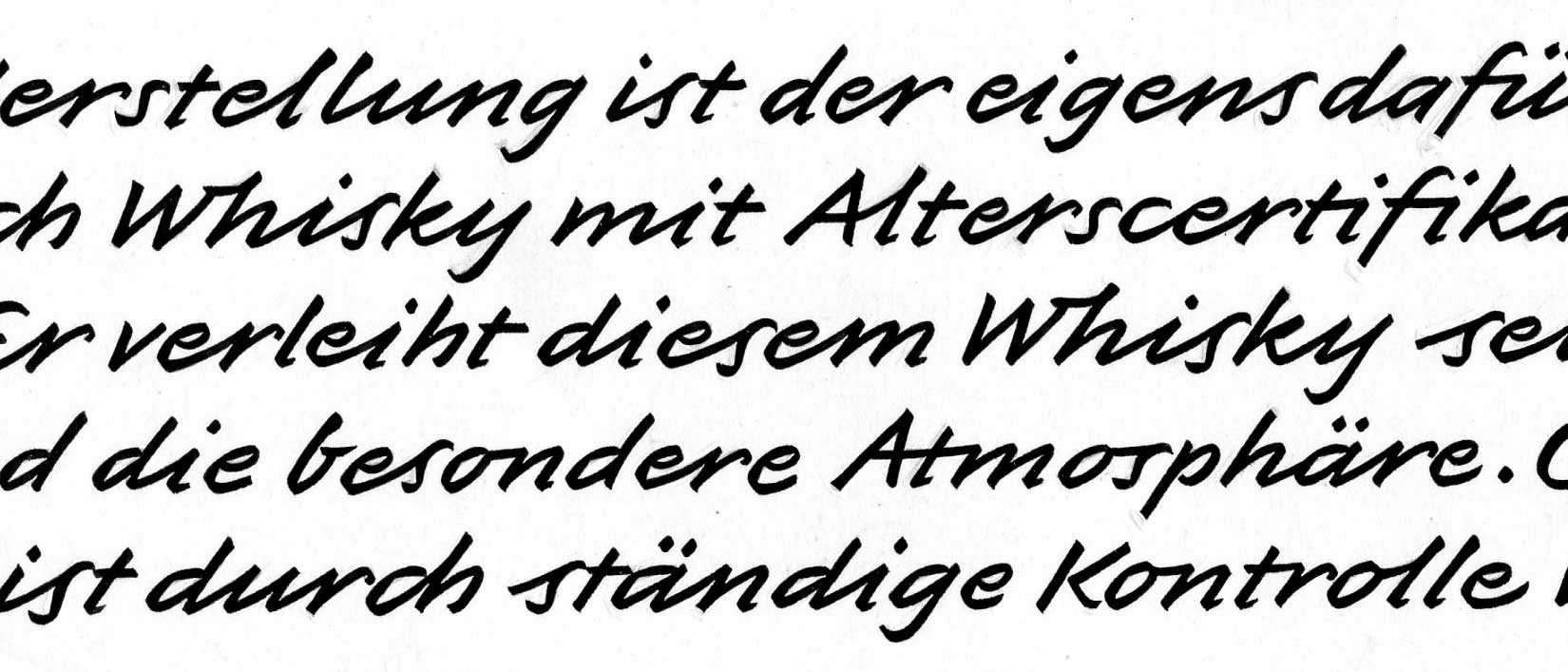
This lettering for a whiskey bottle led 1979 to a typeface called Galopp.
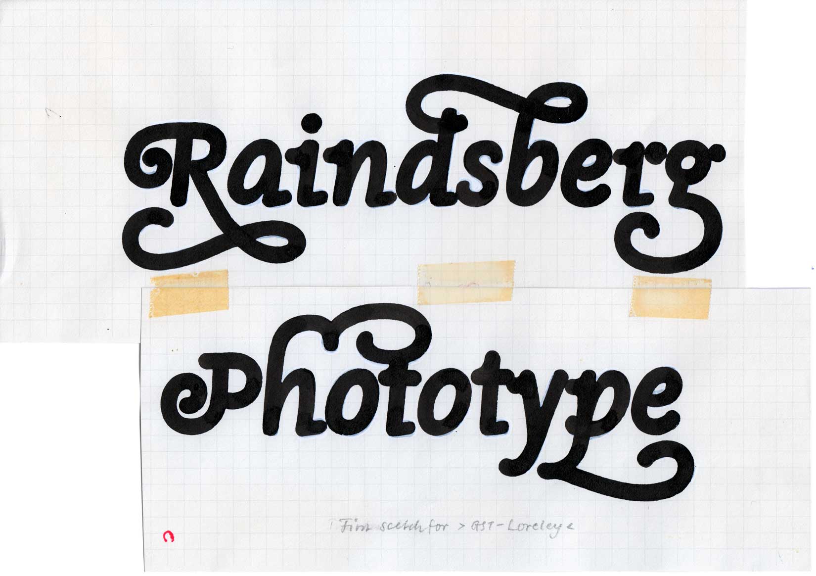
Loreley, 1977
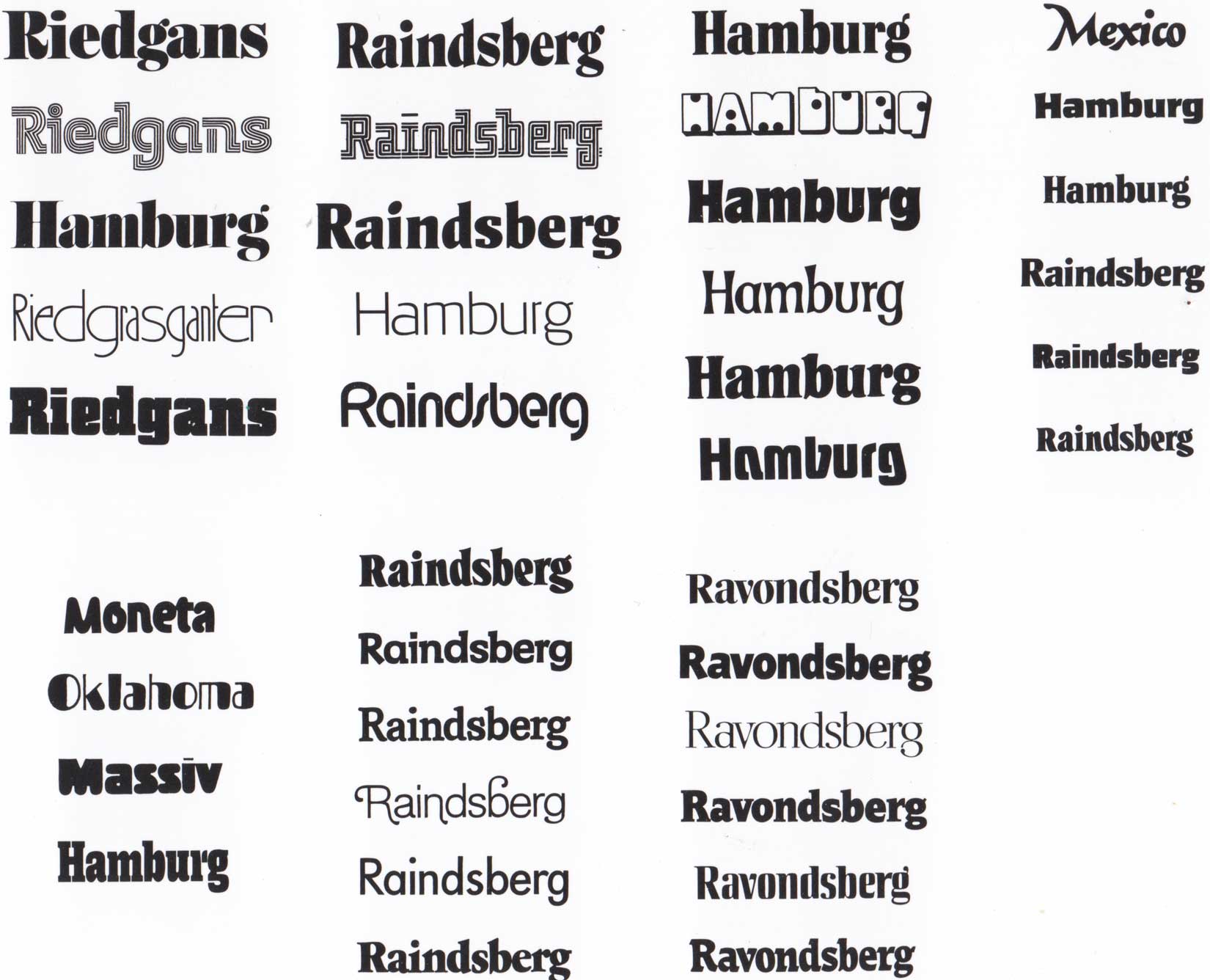
Every month, Georg Salden designed one typeface for the members of the GST Group. He presented various ideas from which the members could choose.
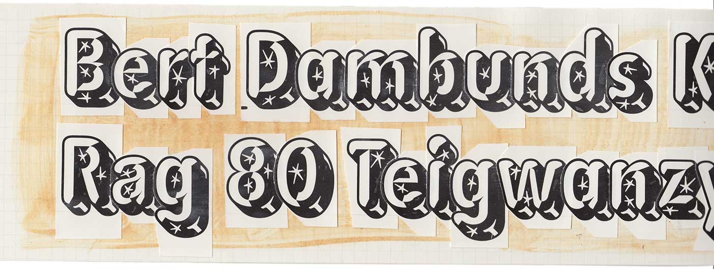
Some crazy effect from the 1980ties.
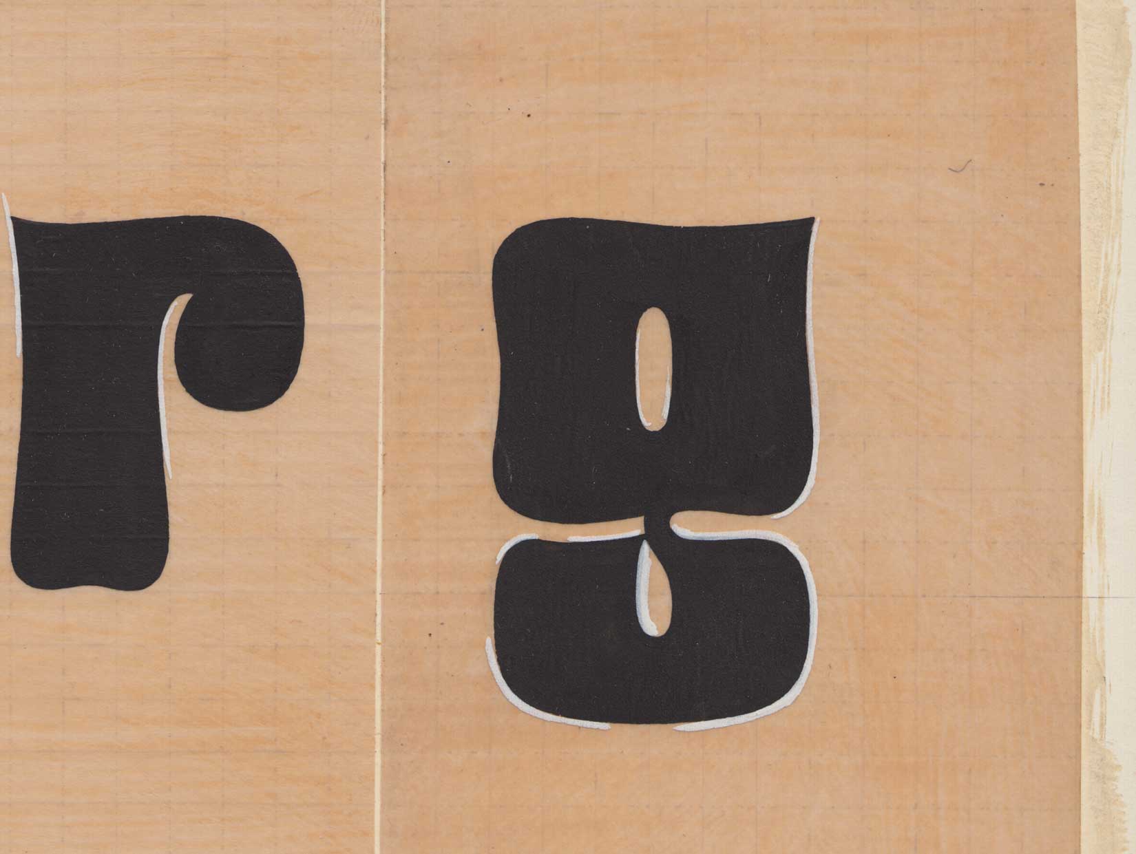
Each character is drawn by the designer’s own hand in a singular, solitary process.
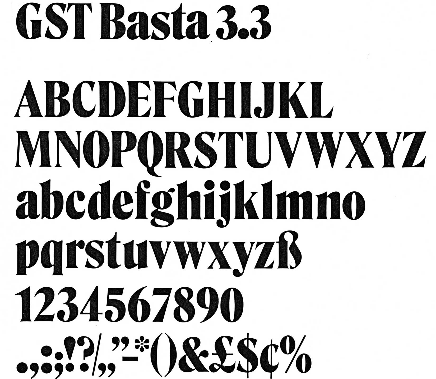
The original GST Basta 3.3 headline typeface from 1972.
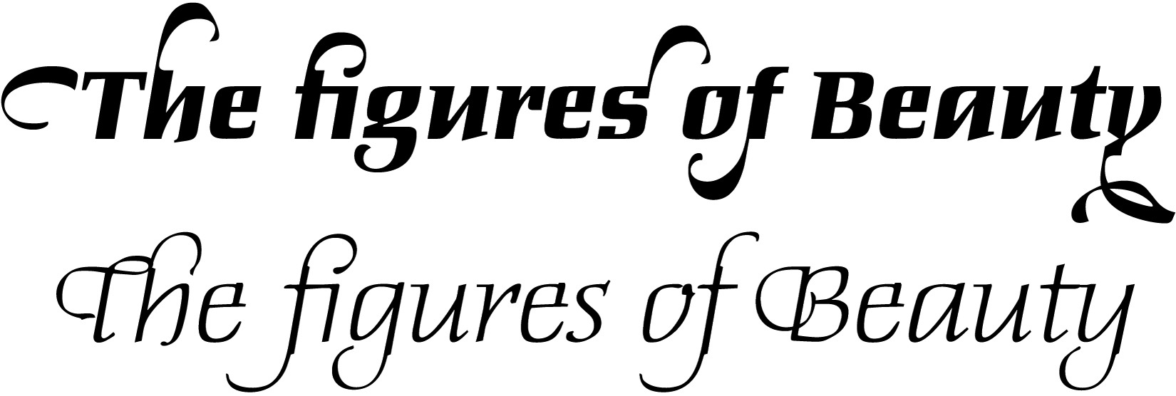
Daphne (top) and Daphne Script (below) typefaces. The swashes of Daphne can be added optionally.
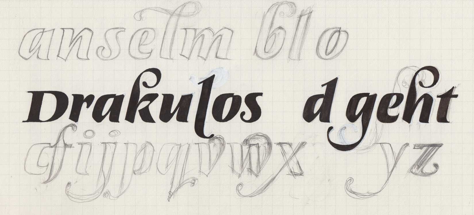
Sketches, 1970.
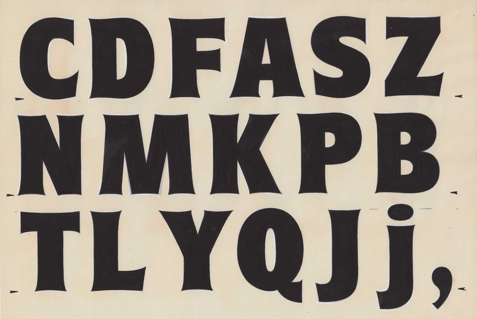
Original drawing of Brasil, 1973.
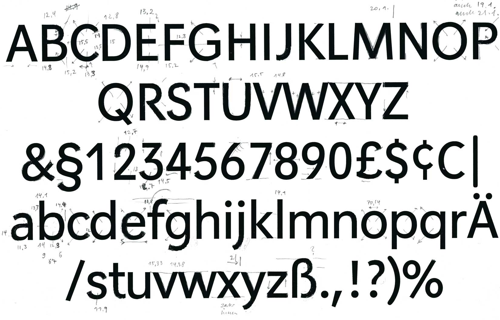
Planet typeface, corrections.
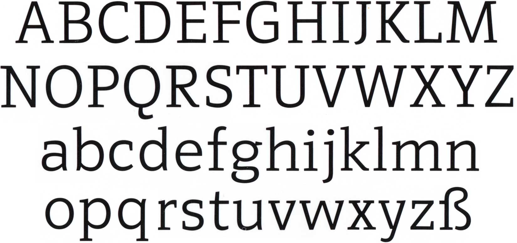
Kant was designed to pair well with Salden’s famous Polo typeface. Not yet digitally available.
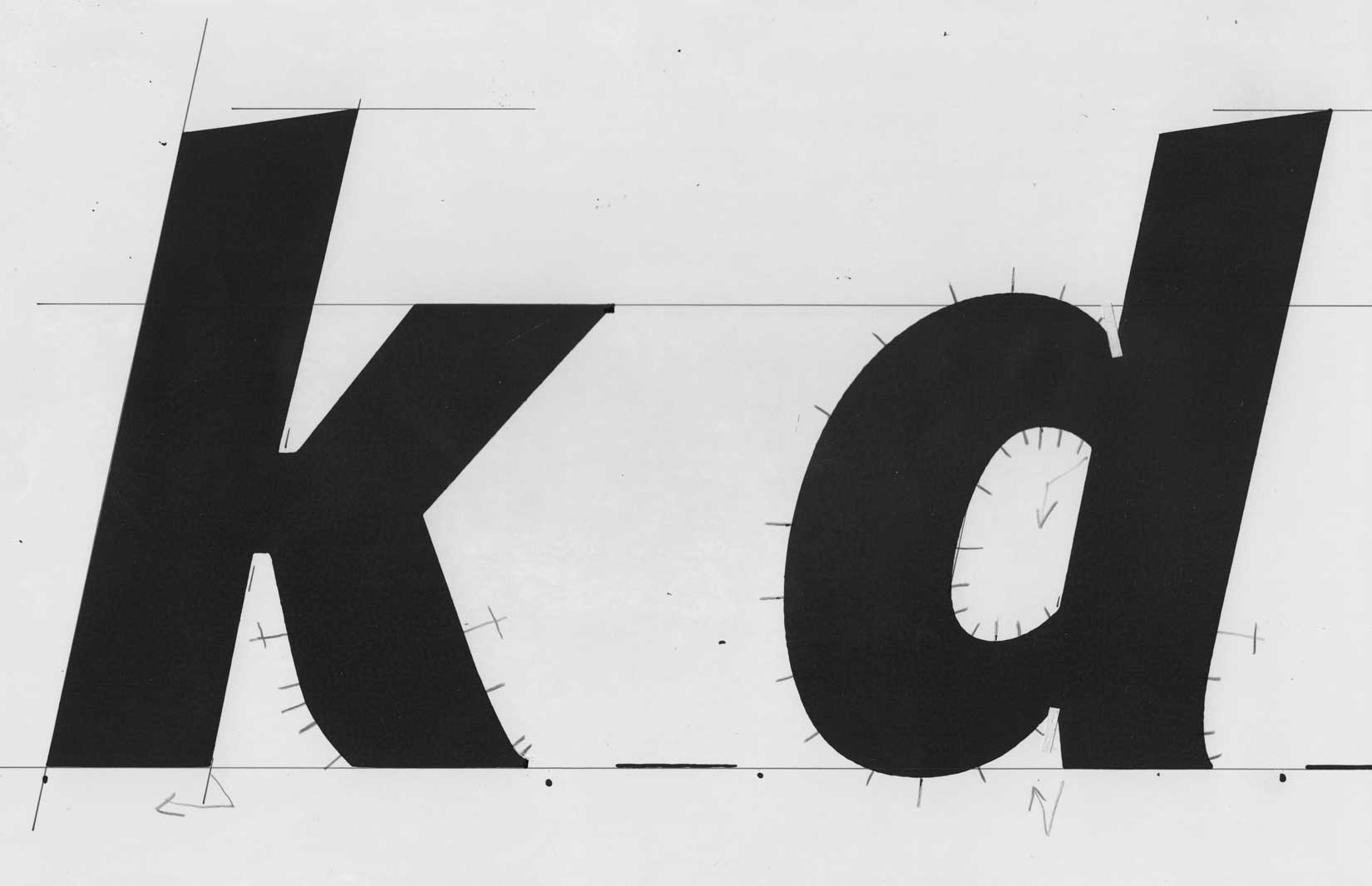
Digitisation template for Polo italic.
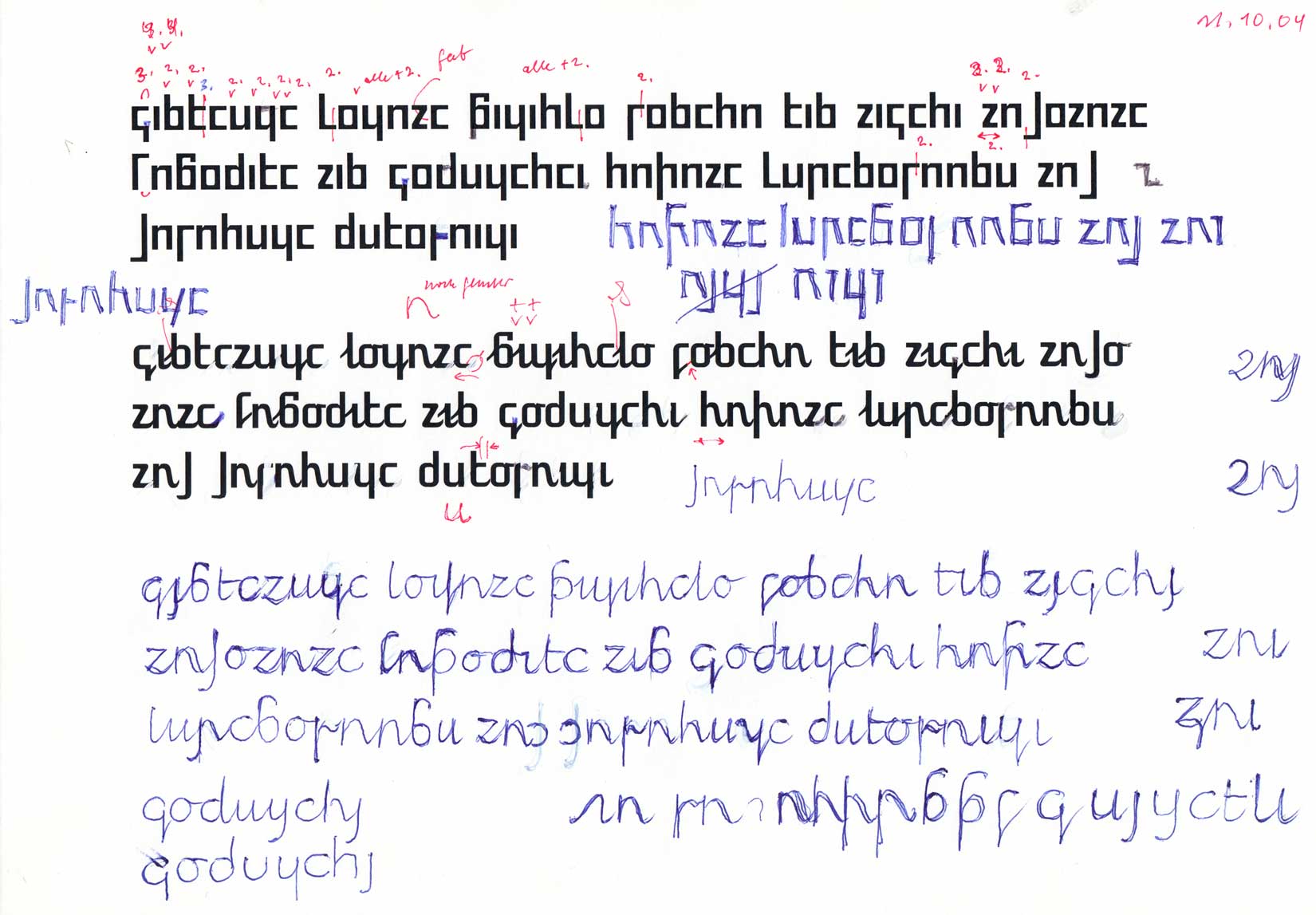
A fictional script for a “world language”, a language for all inhabitants of the earth. Upright and italic, 2004.
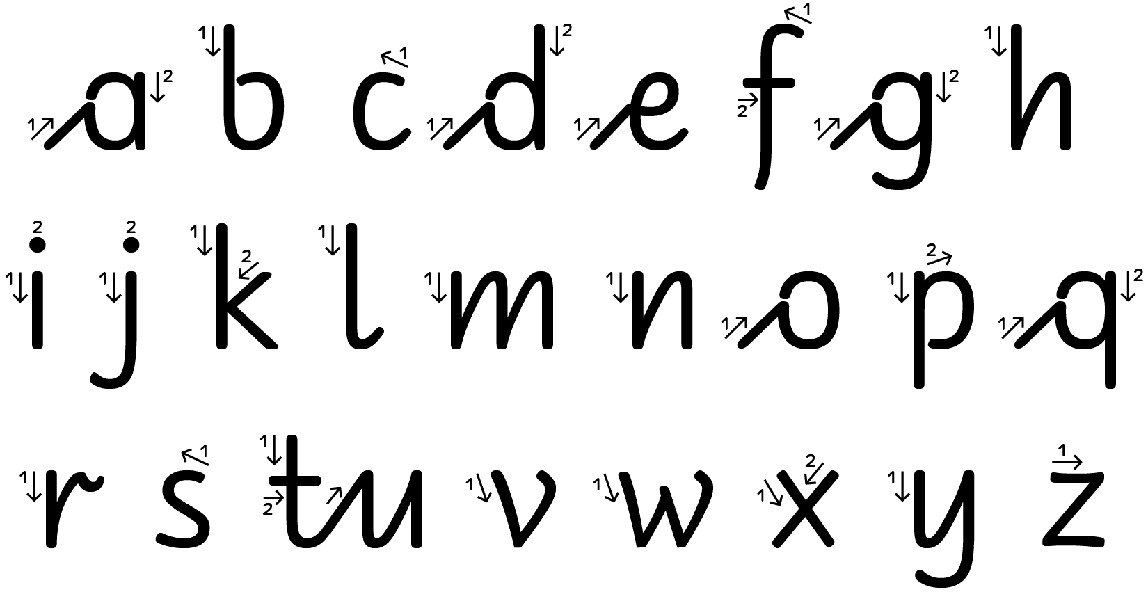
Georg Salden developed his own approach to a beginners script for children. It is called RAN (»Reformierte Anfängerschrift«)