The typefaces of Georg Salden
With a storied career spanning over 60 years and hundreds of original fonts that speak to the aesthetics of an era, type designer Georg Salden is one of the most significant and diverse type designers of our time. Despite much of his work having a lasting influence on type culture, Salden remains relatively unknown internationally – a fact which may be due to his independence as a designer, never having worked for large font foundries.
Salden belongs to the tradition of type greats from past centuries. As a designer, his belief is that good typefaces should contain a balance of legibility, harmony and beauty: “I try to bring clarity and beauty to the font. A clear, beautiful typeface is always legible.” Nevertheless, Salden’s approach is not as traditional as it would seem. Each of his designs is refreshingly new, as Salden finds the idea of borrowing from other people’s work abhorrent. A moderniser in his field, one who pushes the boundaries to new limits, each of his challenges open new type ventures. The designer’s typefaces can most accurately be described as functional: their shapes always arise from the type’s function, and even an initially unfamiliar form is bound to a meaning. Salden’s typefaces are designed in accordance with his own aesthetic and functional principles – never trendy, the fonts are always logically composed, without gimmick.
According to Salden, designing a typeface is a personal recreation of a series of images bound to the archetypal form they have acquired over the course of centuries. Working from pre-formed objects, the designer is charged with giving type a sense of style, a task which requires a capacity for logical and practical thinking. Ever a creative thinker, Salden’s idiosyncratic designs are bursting with character and a sense of his own personality. Starting from scratch, his ideas are conceived through imaginative play with forms, laid to paper through sketches, “out of his hand through the pencil,” as he says.
Each alphabet is an organic unity, one determined by the temperament, understanding of form, and character of its creator. In this, Salden is a perfectionist, revising every form and character until he is satisfied. As a designer, he is distinguished by his belief in strong virtues, ones lost in the passage of time: diligence, perseverance, humility, patience. His accuracy in drawing and sense of balance and harmony in form comes from the designer’s well-practiced skill in calligraphy, graphic design and drawing, and his many years of experience designing typefaces.
The variety of forms of Georg Saldens typefaces is amazing. “I want to make characters that delight more than just me”, he says.
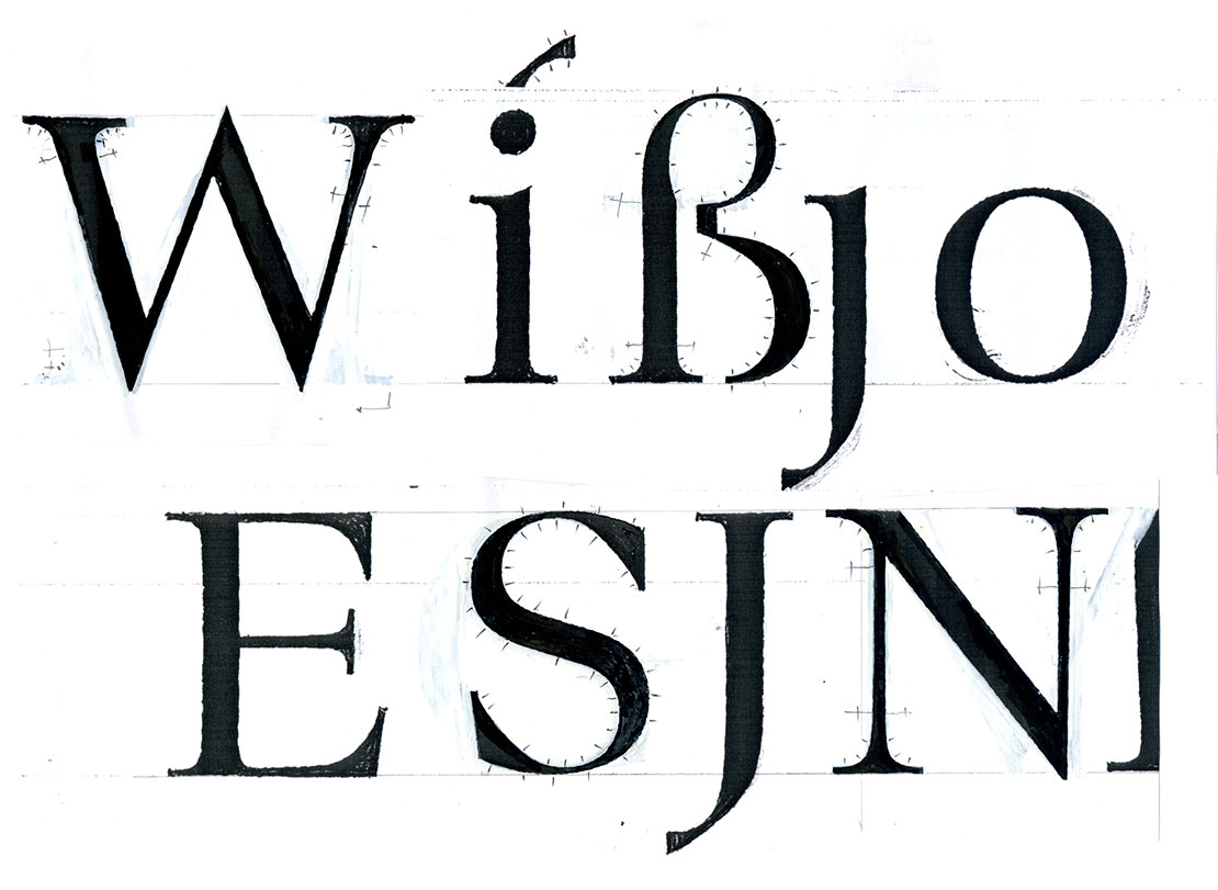
Digitisation template for Essenz typeface, a neo-classical roman typeface, 2005
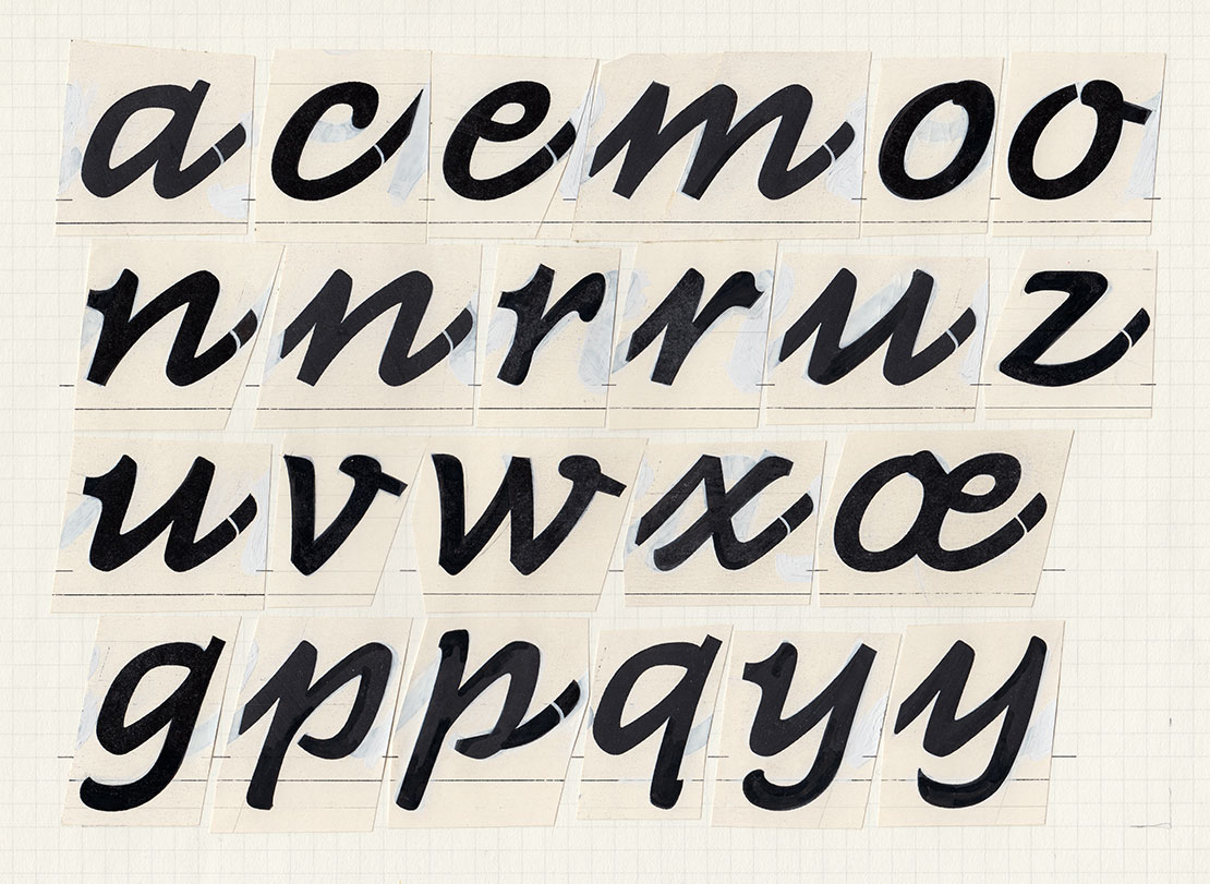
GST-Galopp typeface, 1979
Salden’s typefaces are original without seeking originality: “Originality is part of the work if it is present in me. Seeing as no one other than me works on each character, and I’m always as attentive and devoted to it as possible, my personality will always come into play. However, one can’t confuse originality and showmanship.”
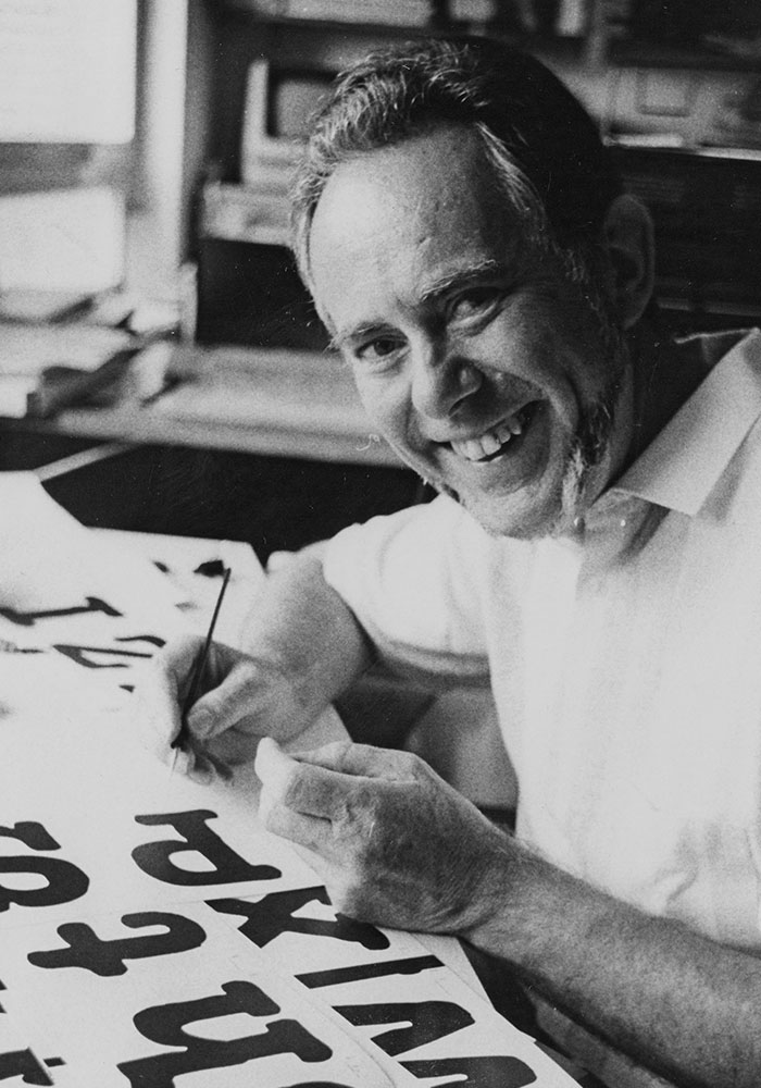
Salden has designed about 40 type families with more than 600 weights and styles – quite an achievement considering that each character is drawn by the designer’s own hand in a solitary process. Looking at Salden’s final artworks, one can only imagine the effort and concentration behind each character. Immaculately created by hand with ink and brush, these drawings seem to have been printed. Each of the 90-year-old designer’s typefaces is a pleasure to behold, simply looking – just right. In the typefaces, Salden’s strong sense of natural harmony and movement is visible, with creative hard work behind every character. What seems simple and playful on the page is developed through tremendous patience and accuracy. The development of a new typeface takes months, as Salden focuses on the harmony of each character, ensuring that they don’t lose their balance in the coexistence and cooperation of the typeface. “You have to live this consistency, it has to be inside you,” he says, speaking of his work philosophy. “You have to look and compare until what you do meets what’s inside you, your feelings.” Where the layman sees a flawless design, Salden sees even the bumps, glitches and inconsistencies in the proportions of the interiors and the ascenders and descenders, in the curves and stroke widths, creeping inside each character in order to explore every last detail until it is perfectly consistent.
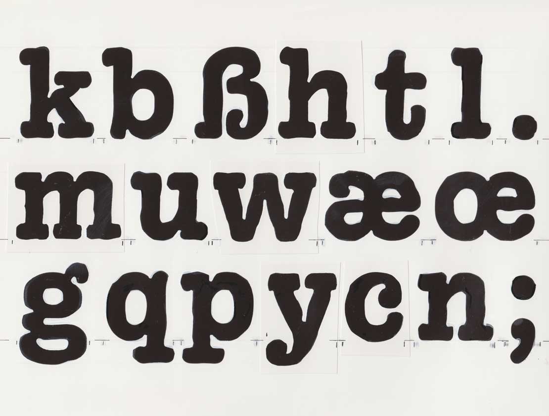
All typefaces are drawn by hand.
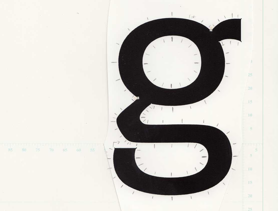
Polo, designed in 1972, is Salden’s most popular typeface, characterized by its open ‘g’.
For Salden, legibility is a typeface’s primary design principle. He makes great demands of his designs: “Typefaces should not be the realization of a crazy design idea, but able to be used for many tasks. Typefaces with characteristics that don’t seem tired after a few weeks of use, which are functional, create nice word images, and have a certain technical robustness. They must possess all the good qualities which good metal typefaces have excelled at through the centuries, but generally make use of the greater freedom of the new techniques.” To Salden, expressiveness and legibility aren’t opposed – in fact, quite the contrary. His typefaces have personality, telling a unique and clear story regardless of the text’s content. Salden says, “One should not try to make typefaces expressive. You shouldn’t have to think about it. It’s like a walk, where you go here or there because you imagine it may be beautiful.”
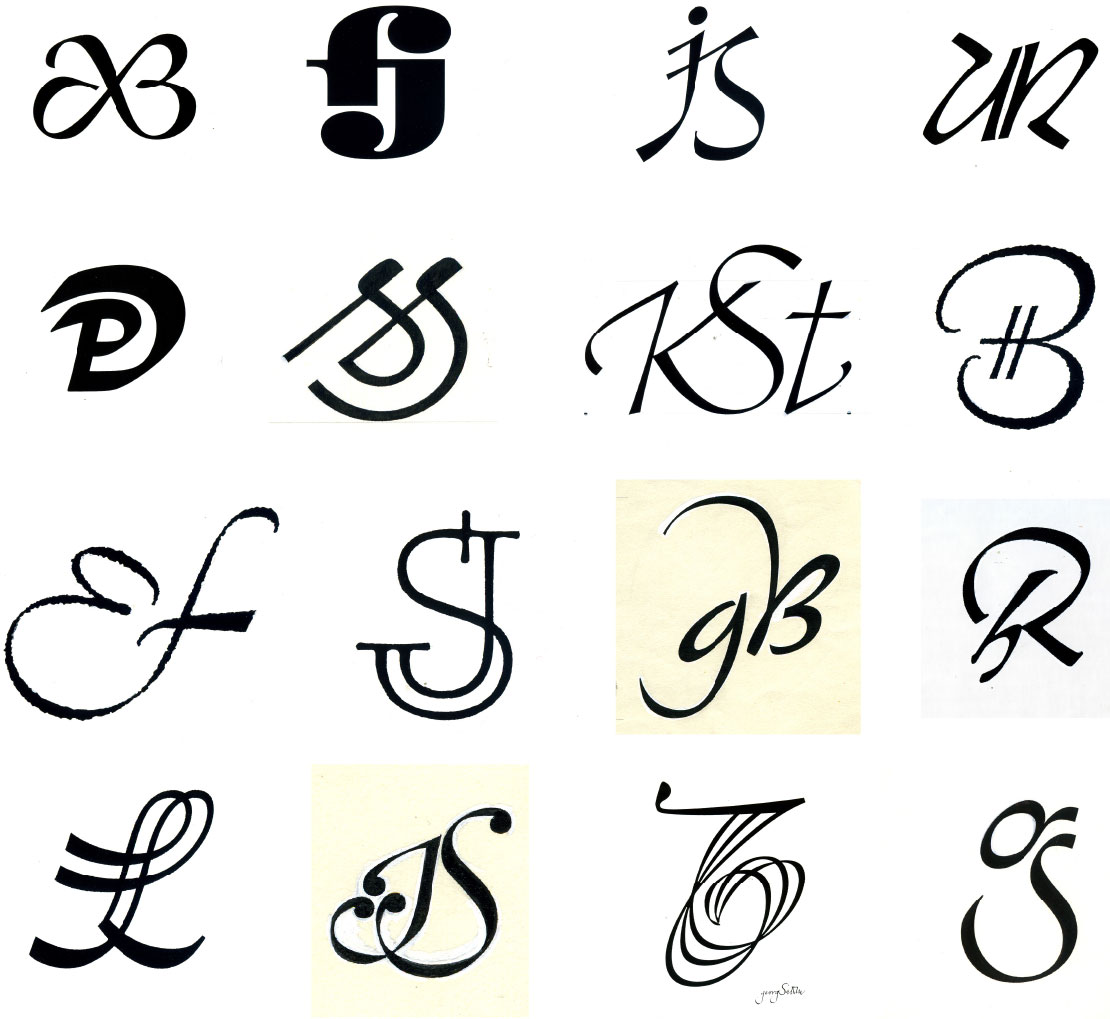
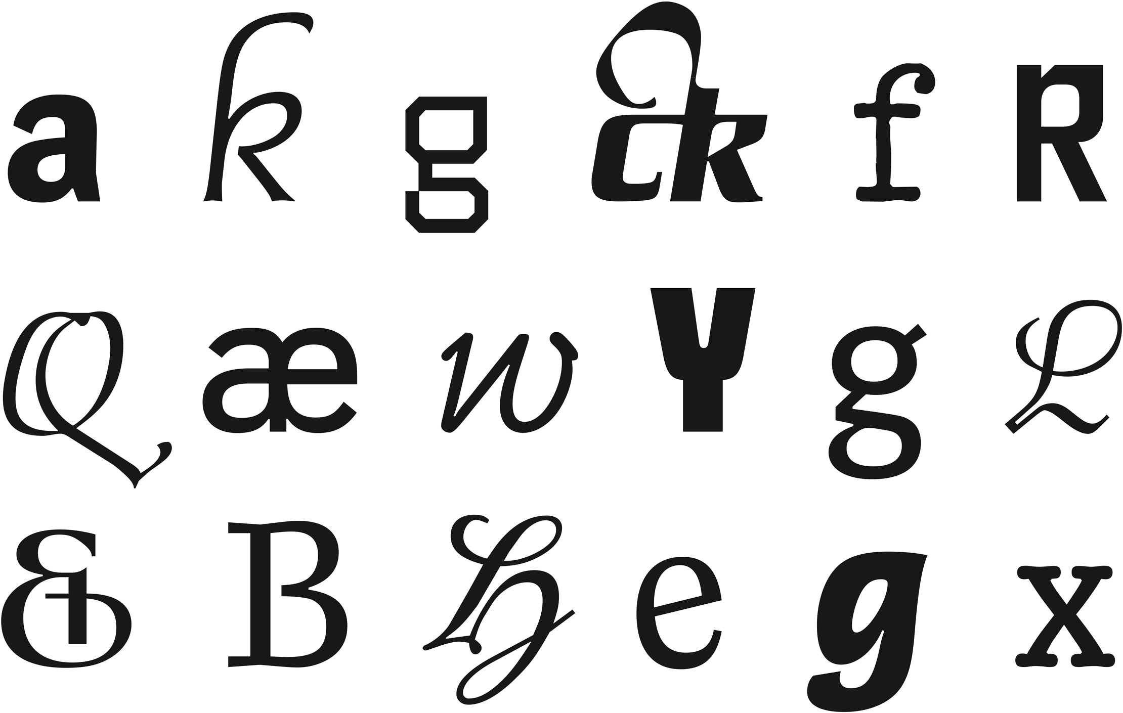
A small selection of the many monograms drawn by Georg Salden.
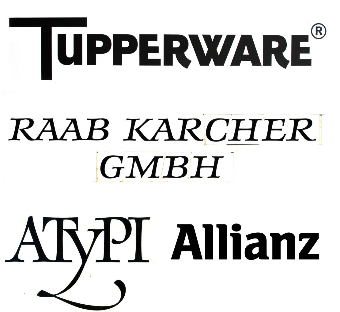
Logotypes
The designer is the product of a time in which each character had to be written or drawn by hand, with corrections meticulously finished with a brush. Weeks, if not months, of work went into every font before they could be produced as a template for phototypesetting, a feat that is hard to imagine today. This may be the very reason that Salden recommends a slow, patient and manual work process, particularly in type design: “Experience doesn’t come through a computer, but by using pen, ink and brush. New ideas come from your head, your hands, and your efforts.” Of course, Georg Salden doesn’t underestimate the benefits of working with computers, but rather, “it does not lead to creative, strongly readable alphabets. A power failure should not interrupt the continuation of our type culture.’
Since 2008 Georg Salden collaborates with LudwigType to make his extensive font library available digitally. We are honored to offer his typefaces now on LudwigType. We start with eight typeface families and will add more typefaces to our font library in the future.


Axiom is a curious grotesque with a distinctive character.


Basta is extremely legible in small sizes, with a large x-height and narrow proportions.


Brasil was originally designed as a headline typeface in 1973 and was expanded as a text family in the mid-1980s. Georg Salden drew on his calligraphic experience when designing this typeface. Although Brasil belongs to the sans-serifs, the contrast and movement correspond to a true Antiqua.


Carree is an unorthodox typeface for an unorthodox use.


Dalli is a lively, handmade script with clever ligatures.


Daphne, a typeface with a calligraphic touch.


Daphne Script, a gentle script full of grace and vitality.


Essenz is a modern neo-classical roman.


Gordon is a rounded slab-serif with an italic full of verve.

Magnet is coming soon.


Planet is a fresh alternative to the inflationary geometric fonts and a real workhorse of a typeface.


Polois a pioneering sans serif, and Georg Saldens most popular and influential typeface.


Rolls has strong and angular forms with a gentle and zestful italic.


Tap was designed to mimic the style of old typewriters.

Turbo is coming soon.


Videon is an experimental typeface which consists of only straight lines.


Votum is a friendly and extremely readable all-round typeface.

Zitat is coming soon.