Augustin
Design Concept
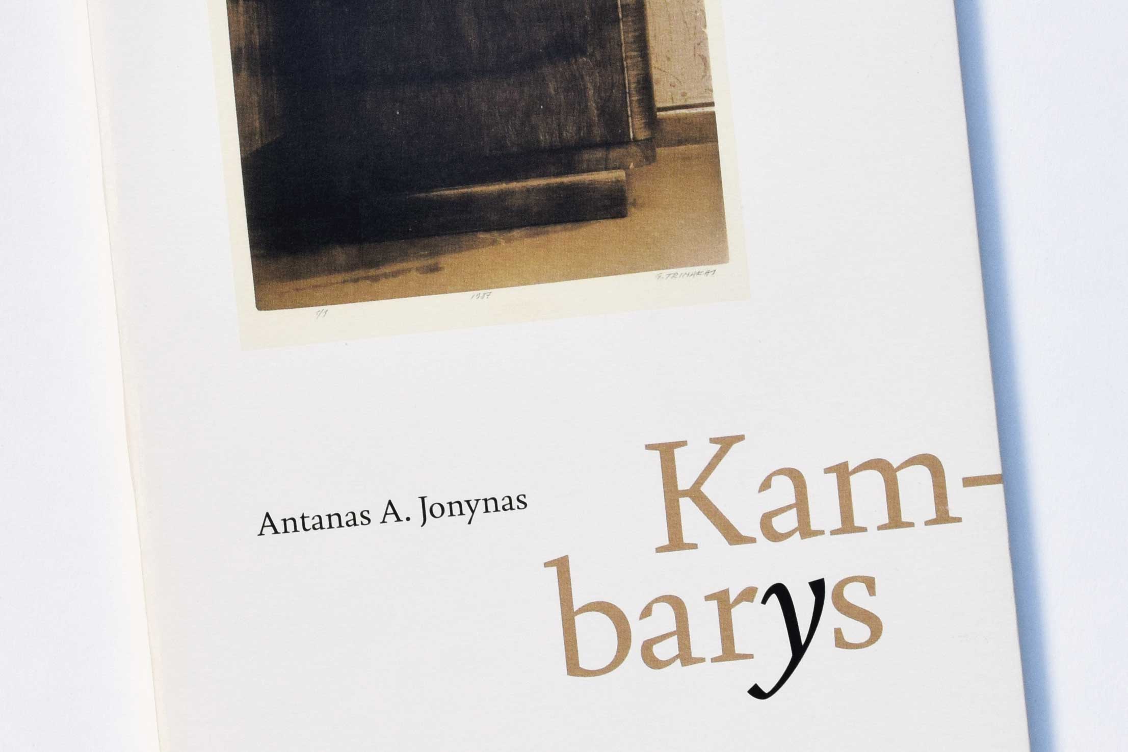
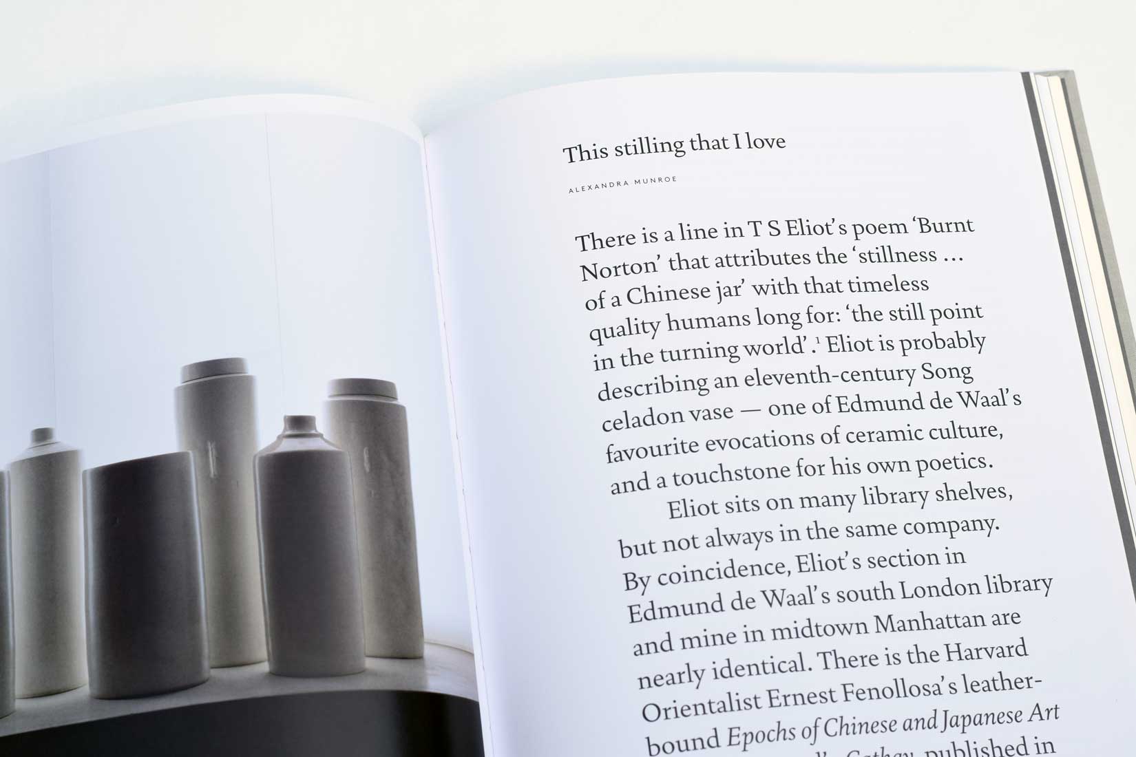
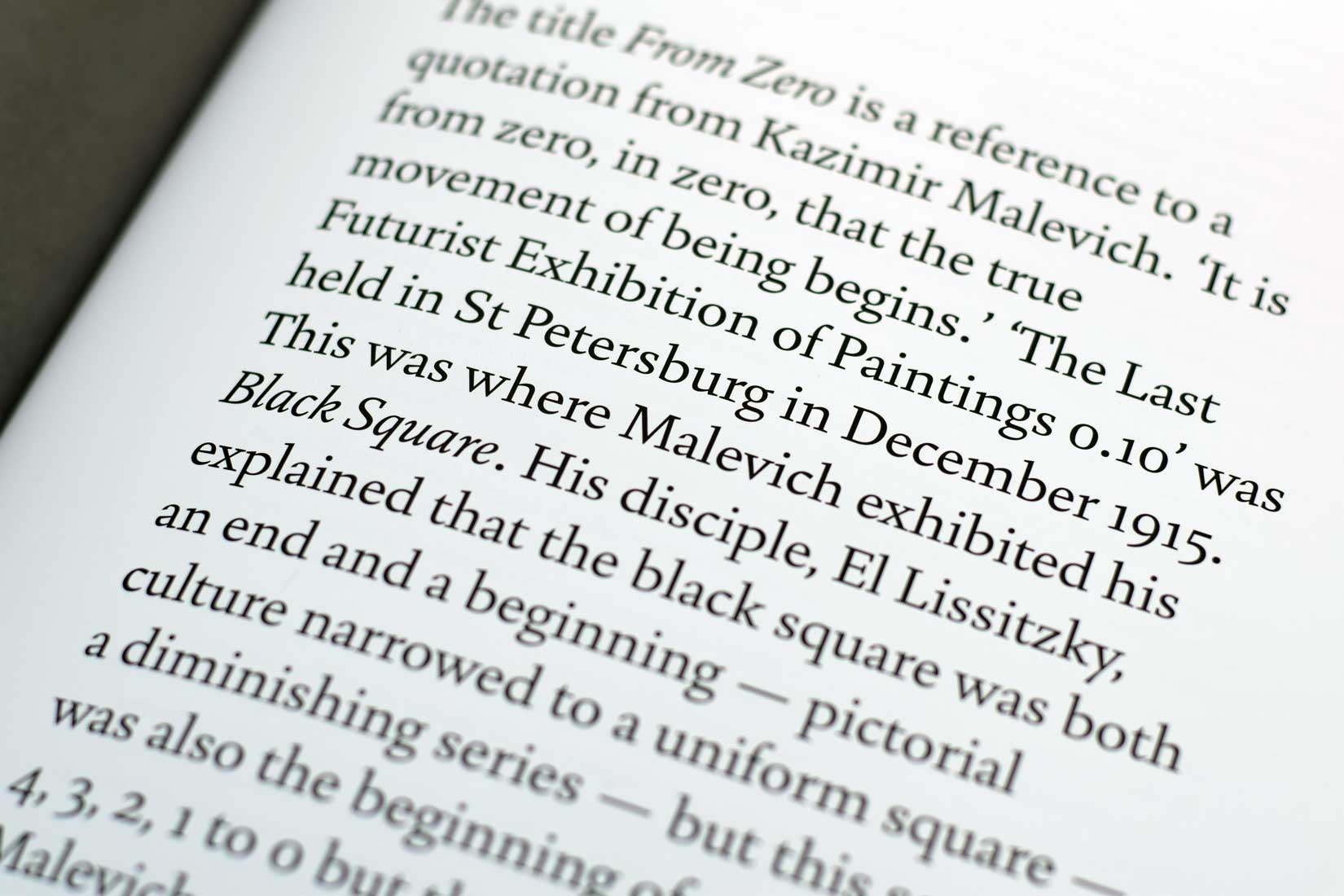
The origin of Augustin lies in research of the letter forms of the Renaissance, designed at the end of the 15th century in Venice. It is quite amazing, that so few years after printing became established on the Italian peninsula, typefaces of great beauty arise there. One of the greatest early printing masters was Nicolas Jenson, a Frenchman who brought the »Roman« type to an early perfection. I’m not and never was interested in doing exact typeface revivals, rather my own type design evolved from the study of the old letter forms. Augustin is a mix of round and warm letter forms (see R, b), unexpected edges (see a, c), and clear and straight forms (see k, serifs). But after all, Augustin is a legible typeface for text, with a balanced rhythm and harmonious forms. Just as Jenson would have done it.


