Carree
The wide range of variations in Georg Salden’s typeface designs is evident not least in the very technical Carree. Salden has repeatedly emphasised how important the written script is to him. As an excellent calligrapher many of his designs derive directly from the written form. Nevertheless, he is not afraid to break away from it radically. For Salden, printed type is not subject to the conditions of handwriting. It can be designed freely, following its own rules, which have evolved over the long history of printing. The goal is optimal legibility, and for all his joy in experimentation, Salden always makes sure that his typefaces remain legible even in small sizes.
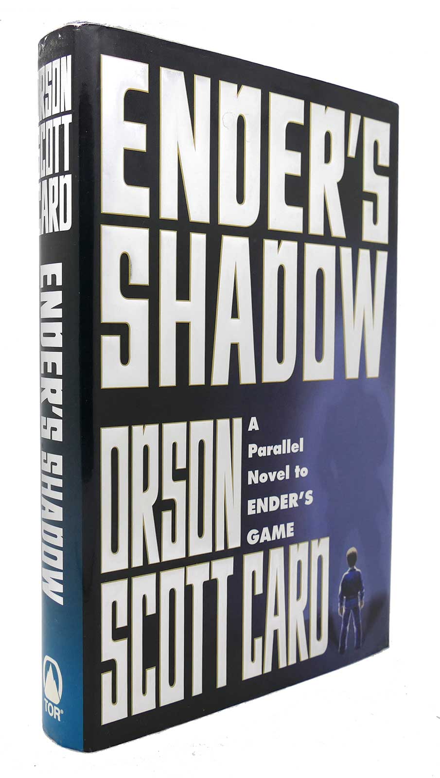
The outer corners of Carree are angular and the inner corners are round. Further characteristics are the oblique incisions (for instance at B, G, U, a, b, g and n) and the oblique terminals at J, Y, j and y.
There is also a contoured version.
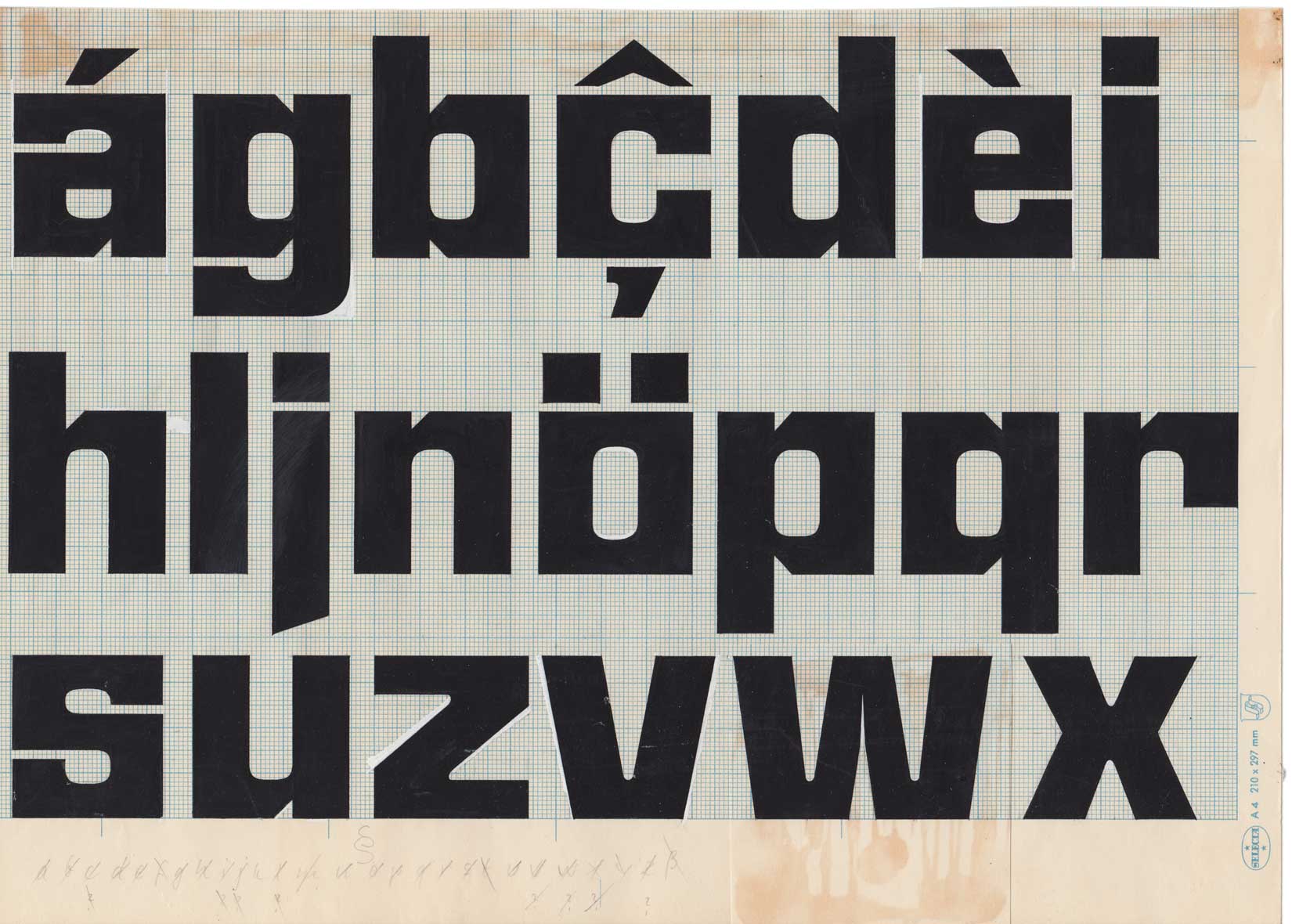
Carree is a further development of Georg Salden’s typeface Angular, which he designed in 1973 and was then published in four weights by Visual Graphics (VGC).
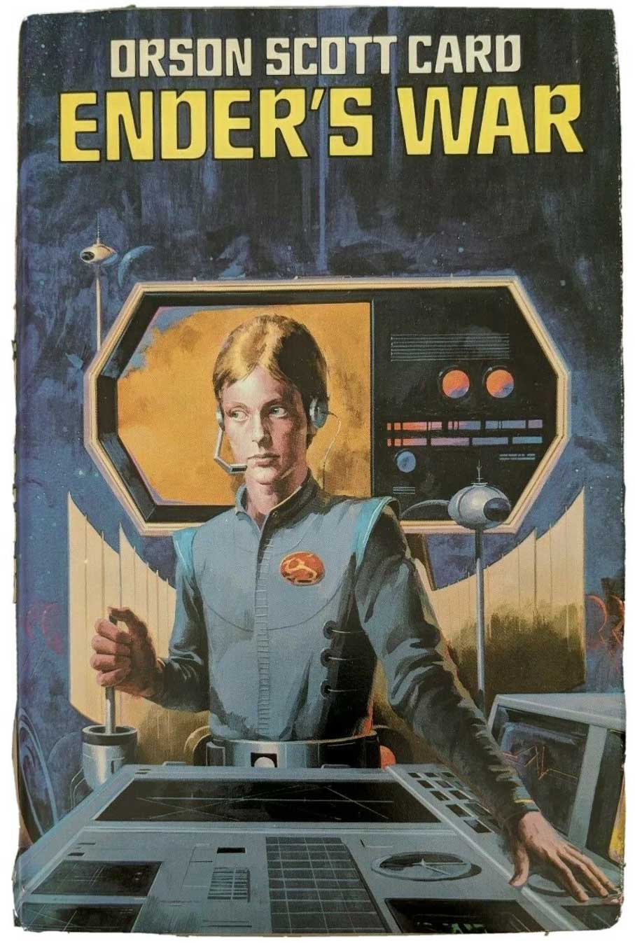
Examples of Angular in use.


