Essenz


Essenz is a neo-classical roman, which does not, however, emulate a historical form. Its originality is shown in many details. The serifs have a lively form and flow softly into the supporting strokes. Rational symmetry is avoided – the figures are open, but stand close together. There are two types of numerical digits, but unfortunately no small capitals as yet. It is intended for typographical tasks for which casual solutions are not sufficient.


Single Font
Entire Family (10 Fonts)

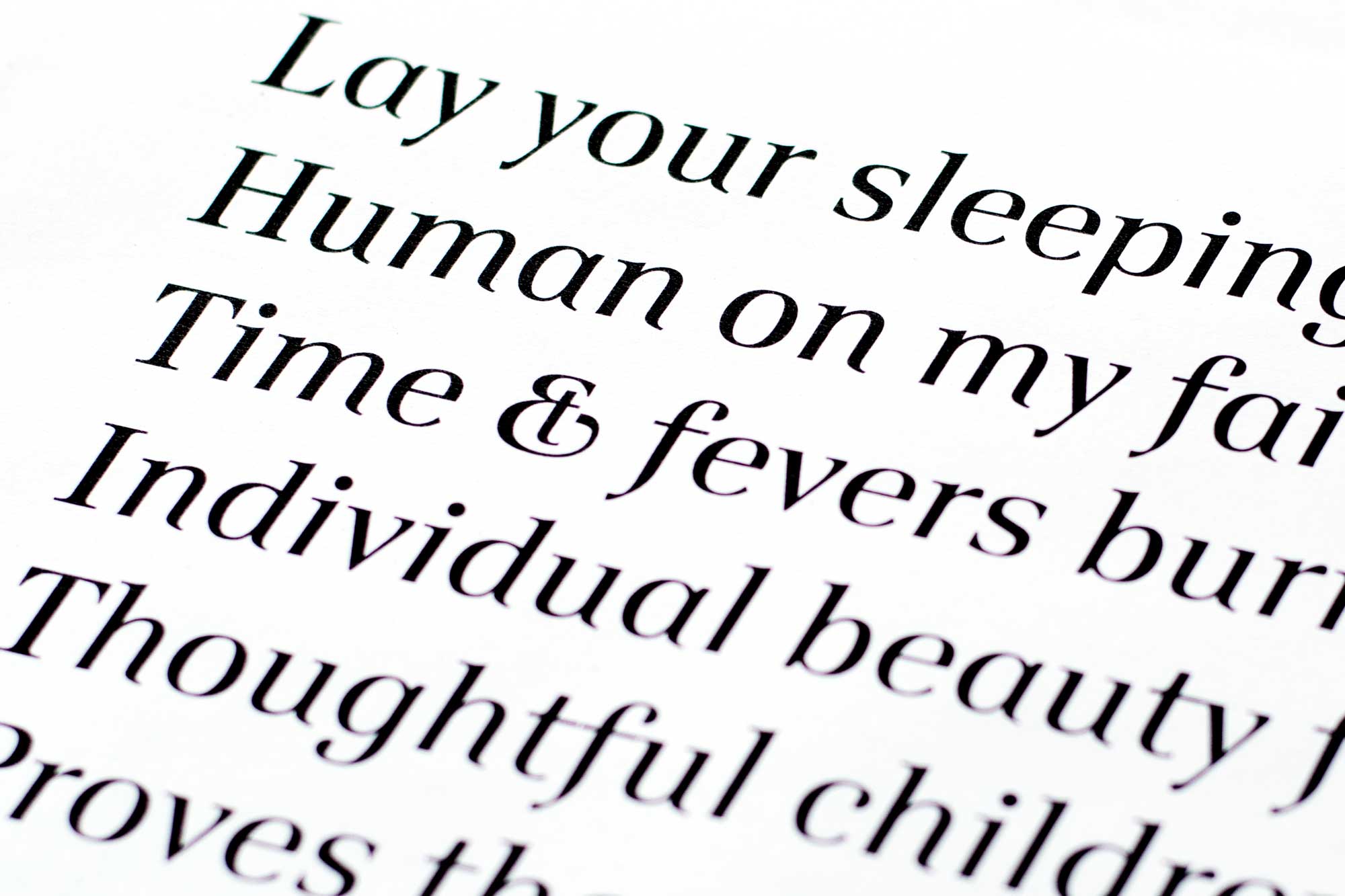
Influences of writing can be seen at the joints of the shoulders (for example at b or n) and the open gaps of B and R. Note also the upper serifs (e.g. i or n) and the drops of a or f.

The italics are relatively wide and have calligraphic forms such as the downward strokes on m and u.

First sketch by Georg Salden from 1999.

A more detailed drawing of Essenz by Georg Salden.