Marat

Design Concept
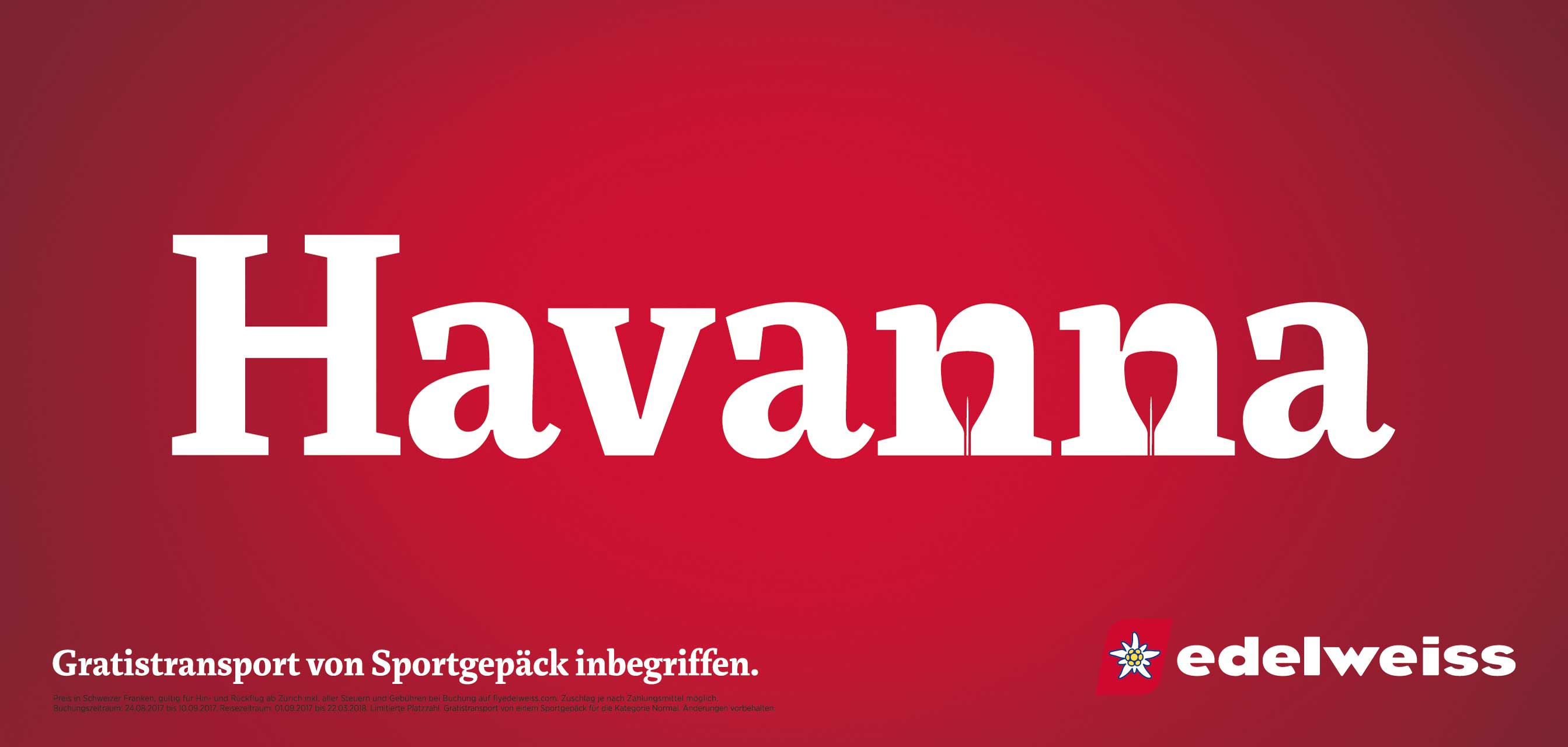
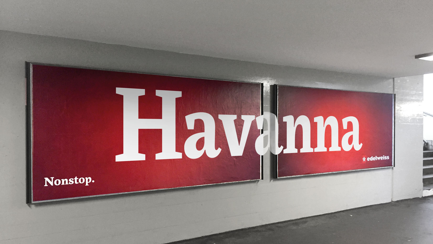
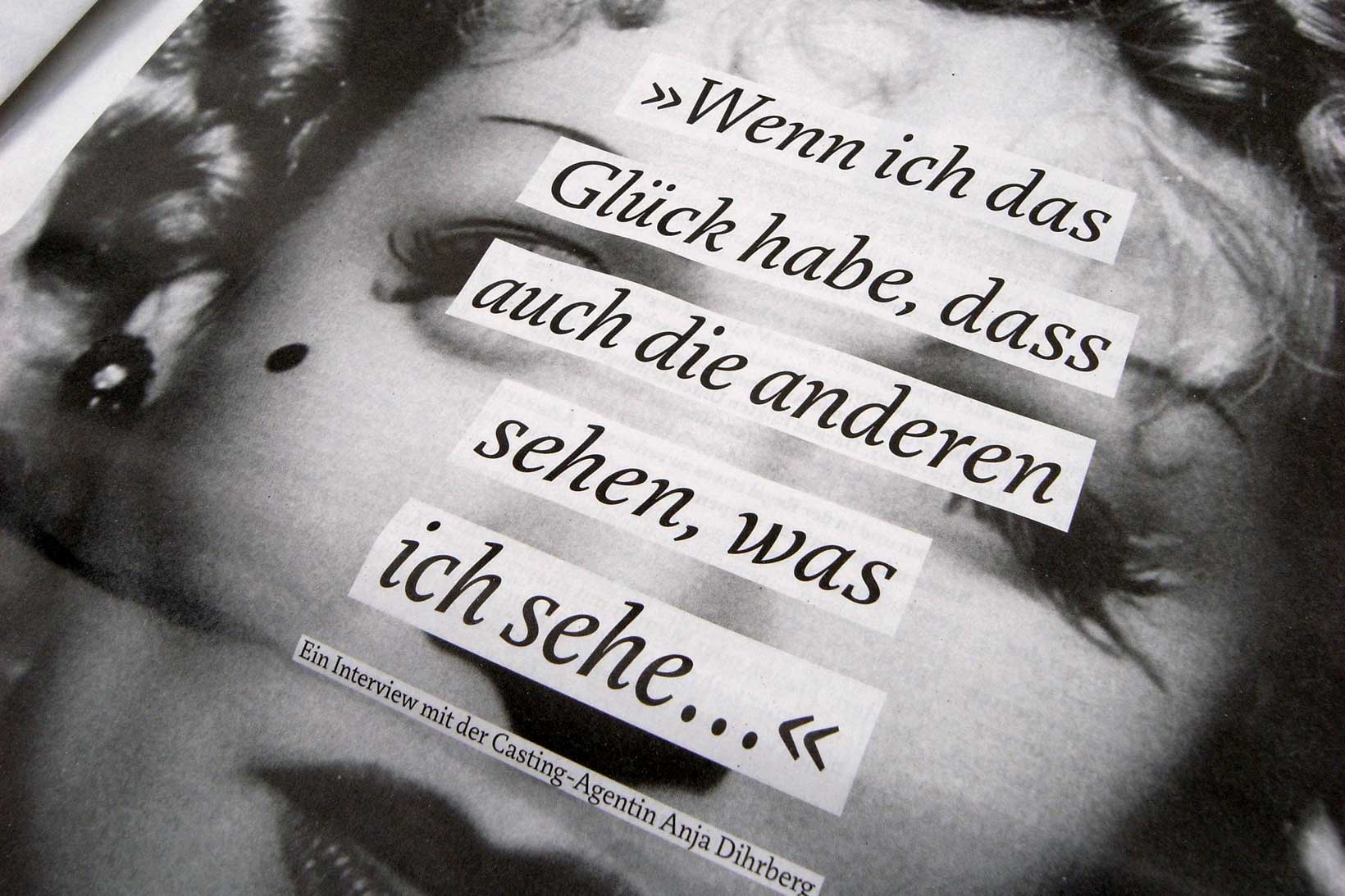
Although originally conceived as a magazine face – with strong serifs and open character shapes for good legibility in small sizes, and compact letter forms optimised for narrow columns and tight headlines – Marat evolved into a comprehensive family for general use. With their vertical stress and round forms the letters lend a soft and friendly appearance to the text. This specific construction also allows the letter forms to become extraordinary bold but still stay lively and readable, as can be seen in the extra bold display version Marat Fat.
[...] Marat’s strong personality left me skeptical when I first saw it. But the more I used it, the more I realized that I didn’t have to worry: its lovely and eye-catching details only emerge at larger sizes. Its upbeat, engaging and accessible sensibility quiets down enough to let the design be even, legible, and very pleasant to read when set at text sizes. This ability to present highly effectively at both small and large sizes is something I have noticed in many of my favorite type designs. Read full Review by Eben Sorkin.

Characteristic details: Strong and clear serifs, rounded stem heads, deep ink traps, rounded legs.

Marat’s ‘f’ is designed so that its hook disappears completely in the stem of a following character with ascender. For other problematic characters an OpenType feature automatically replaces the regular f with a more narrow version to avoid collisions with following characters.

The specific construction of Marat allows the letter forms to become extraordinary bold but still stay lively and readable.
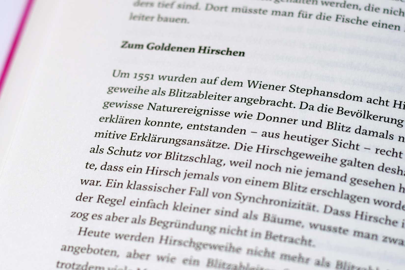
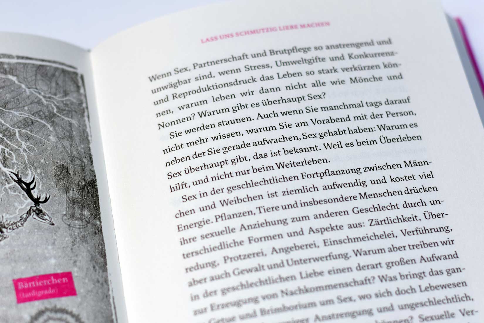
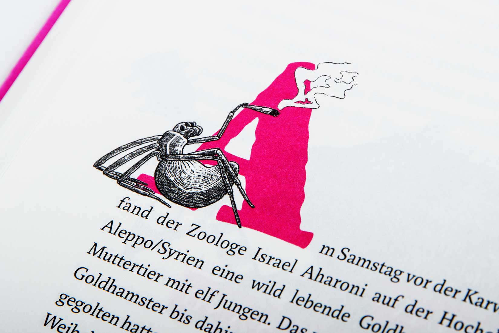
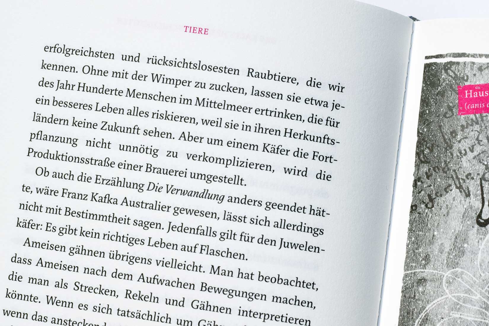
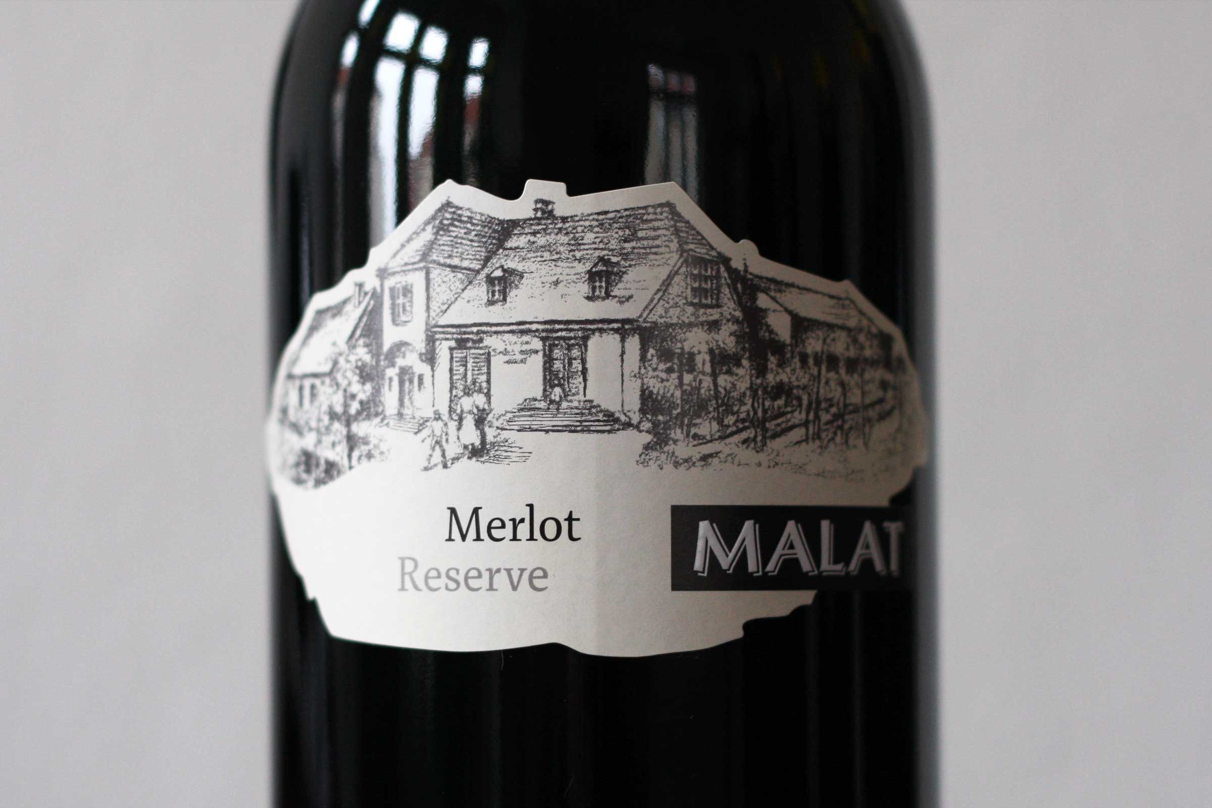
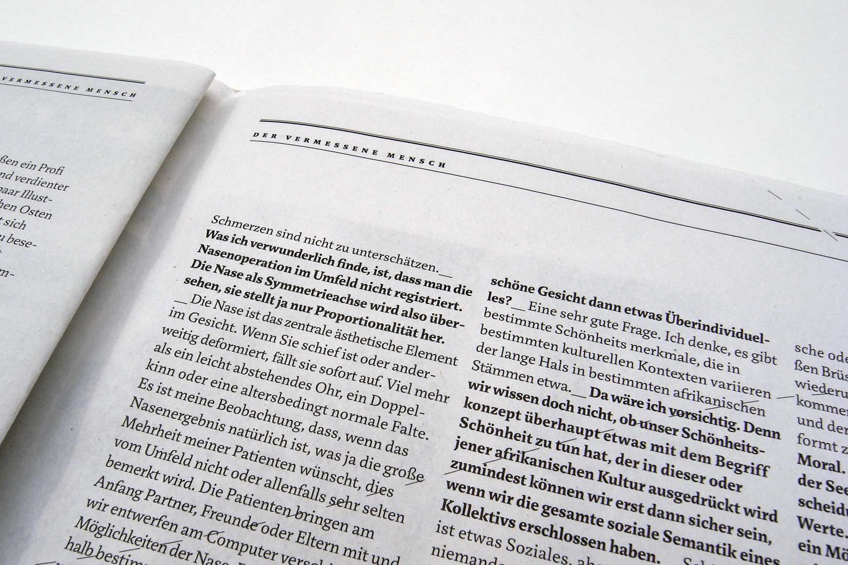
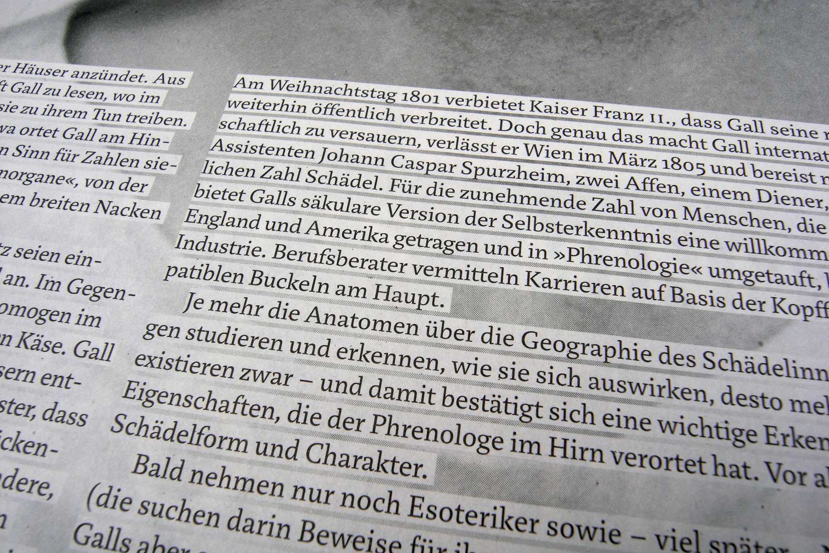
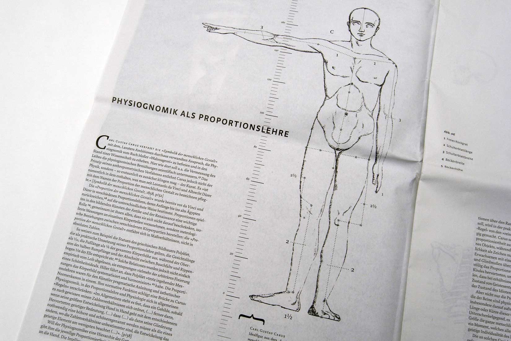
In Use