Videon

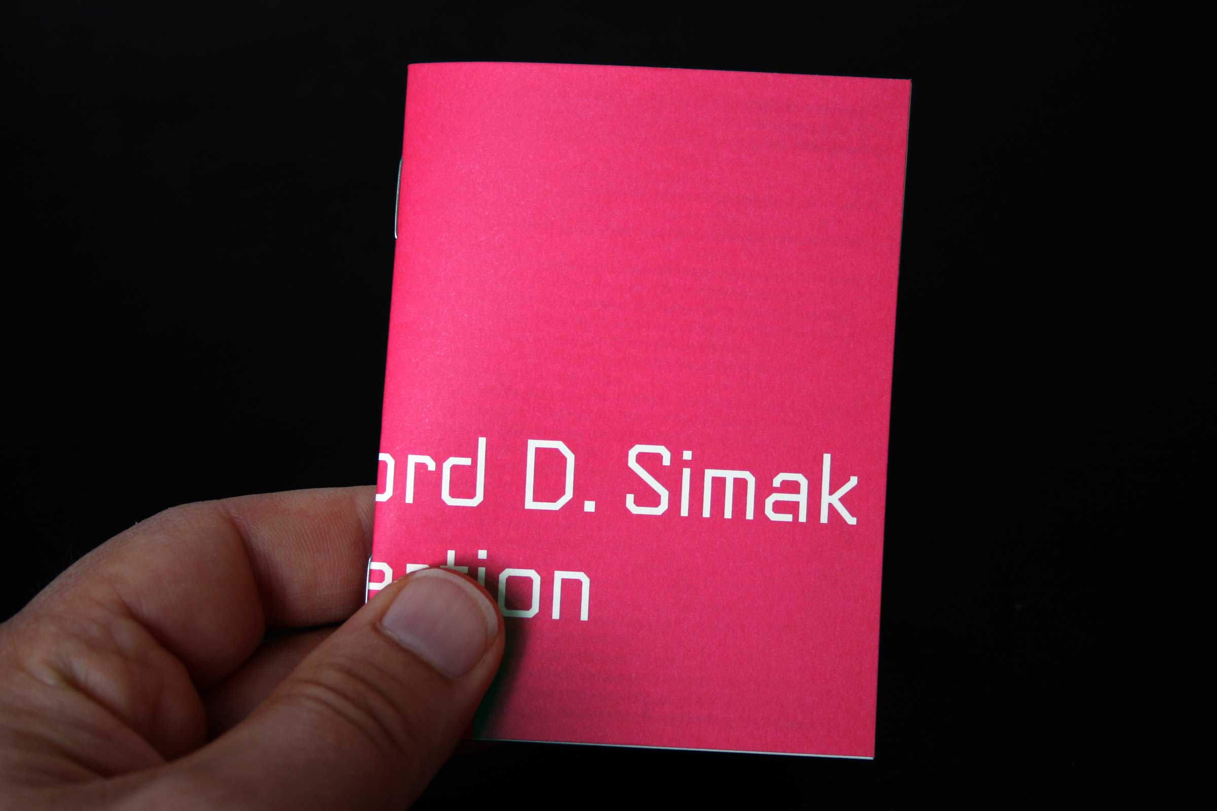
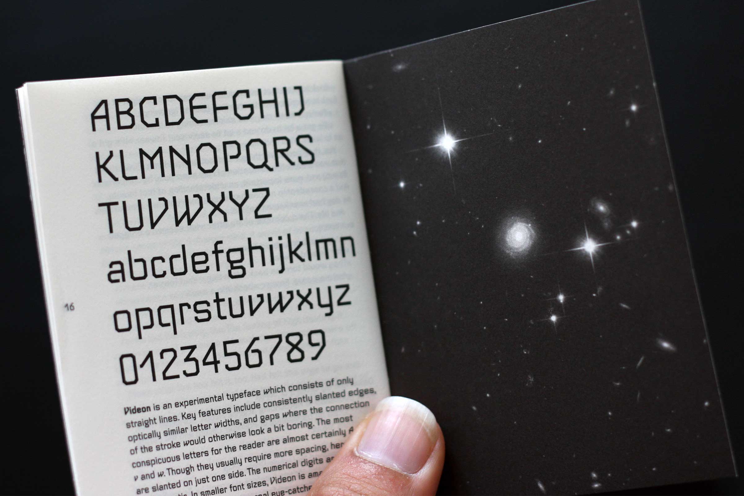
Original drawing by Georg Salden. Videon is based on an orthogonal grid, without any round forms. Designed in 1981, it was inspired by the aesthetics of teletext and early pixel fonts used for video games.
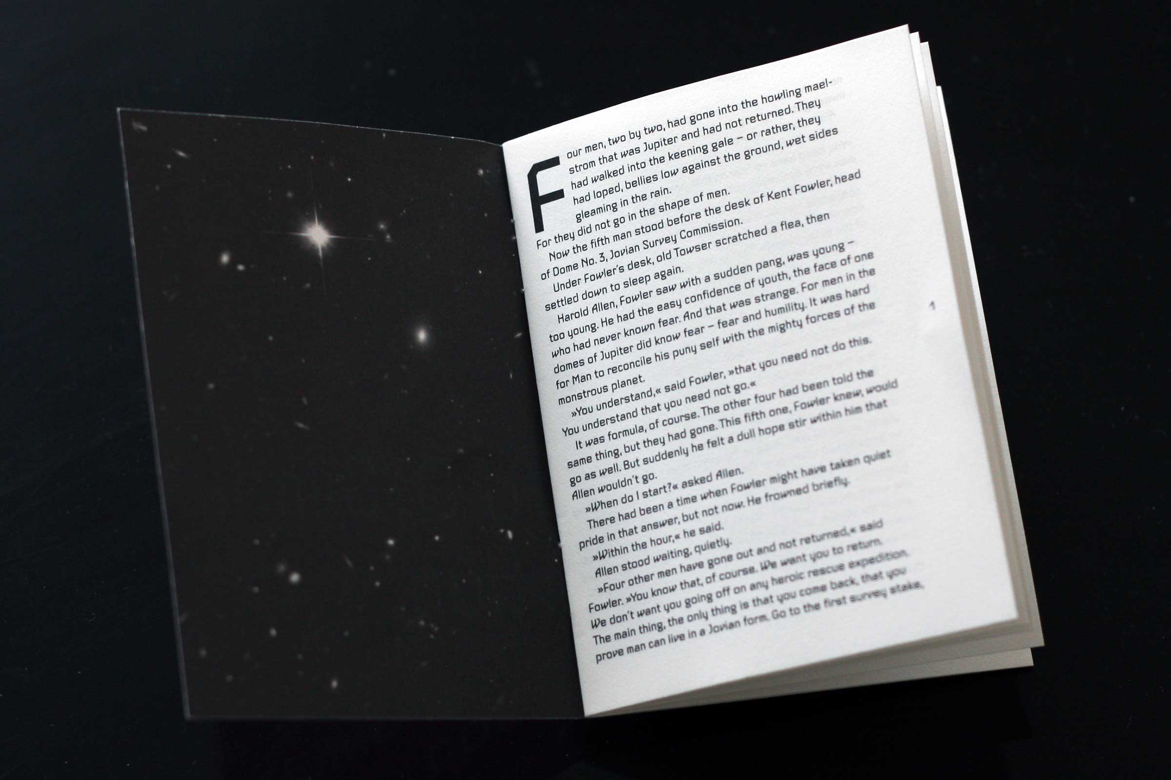
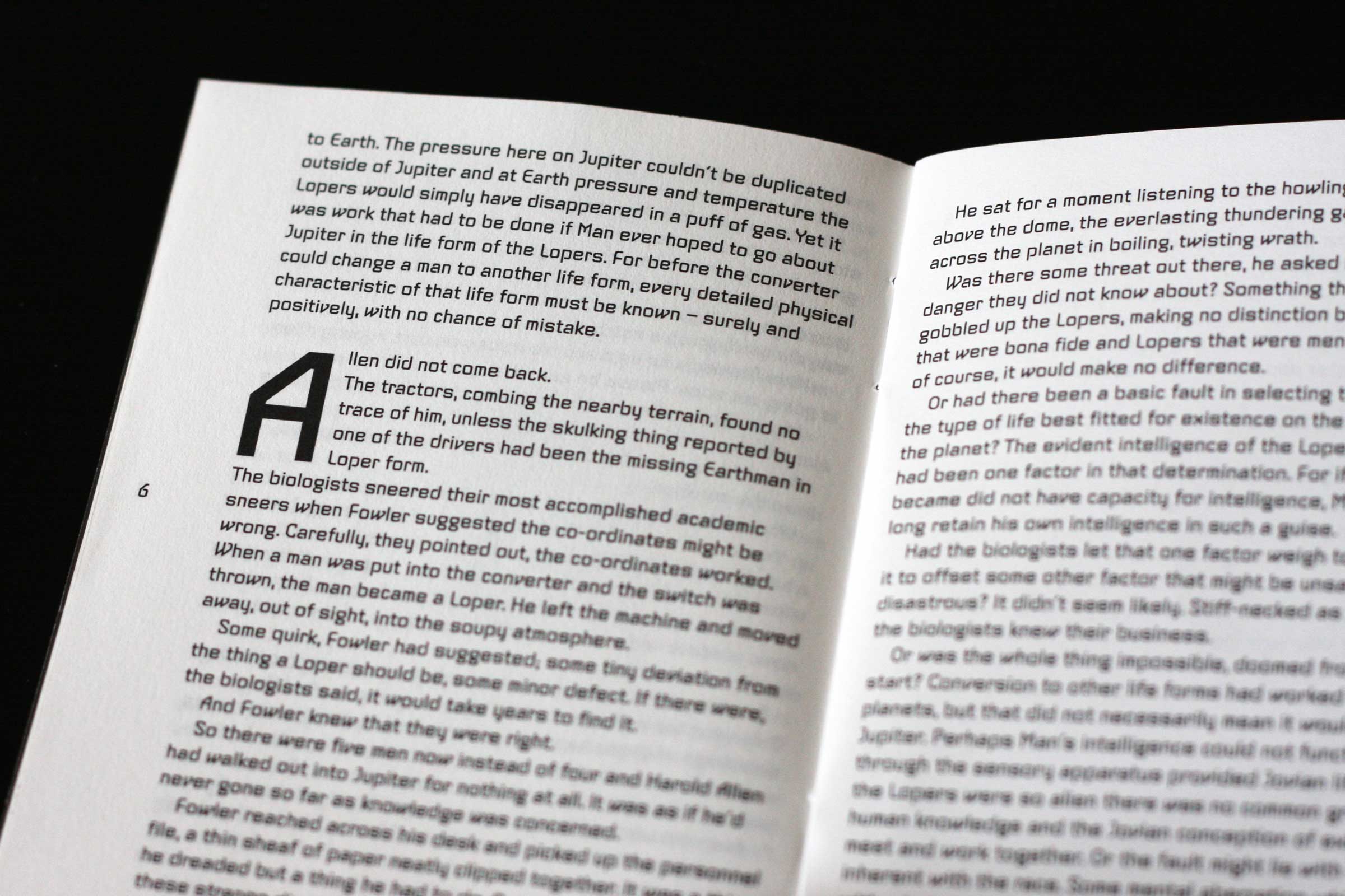
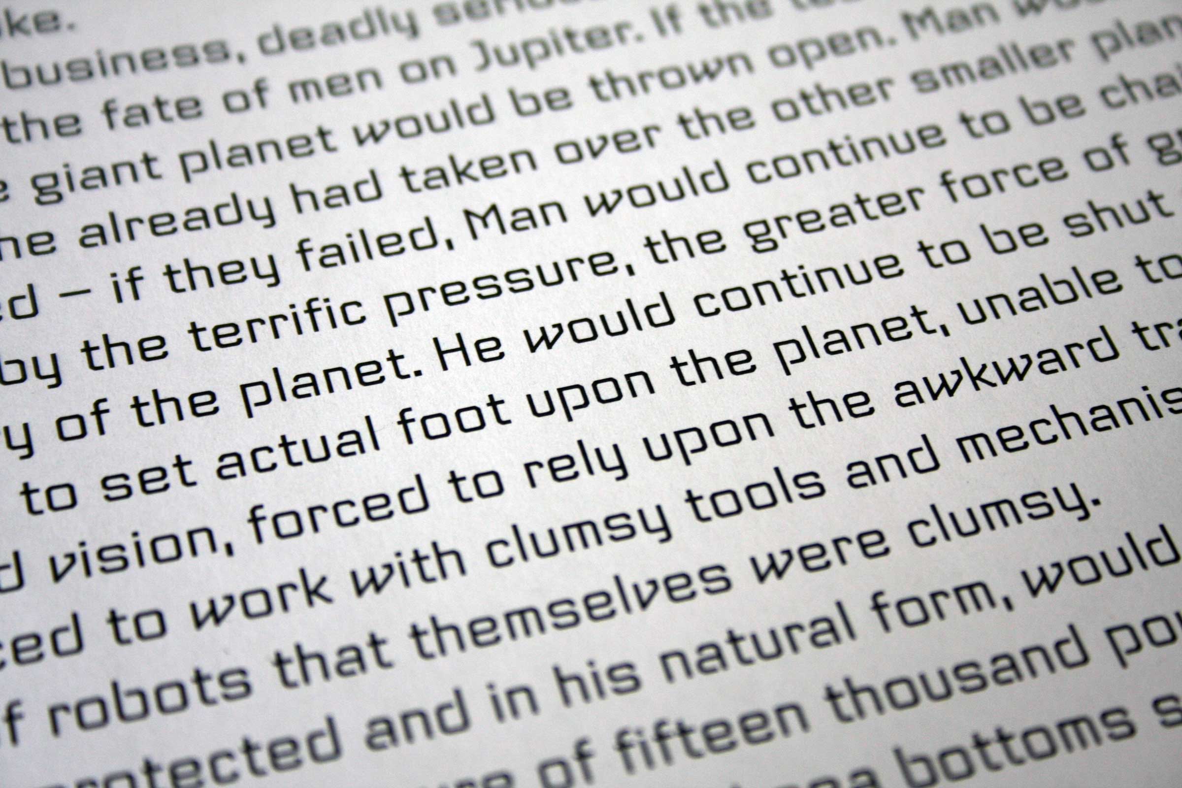
Although Videon consists only of straight lines, the typeface has a remarkable variety of forms. However, despite the experimental form, Salden always makes sure that his typefaces remain legible even in small sizes. This also applies to this font. It is amazingly legible and in larger font sizes a real eye-catcher.
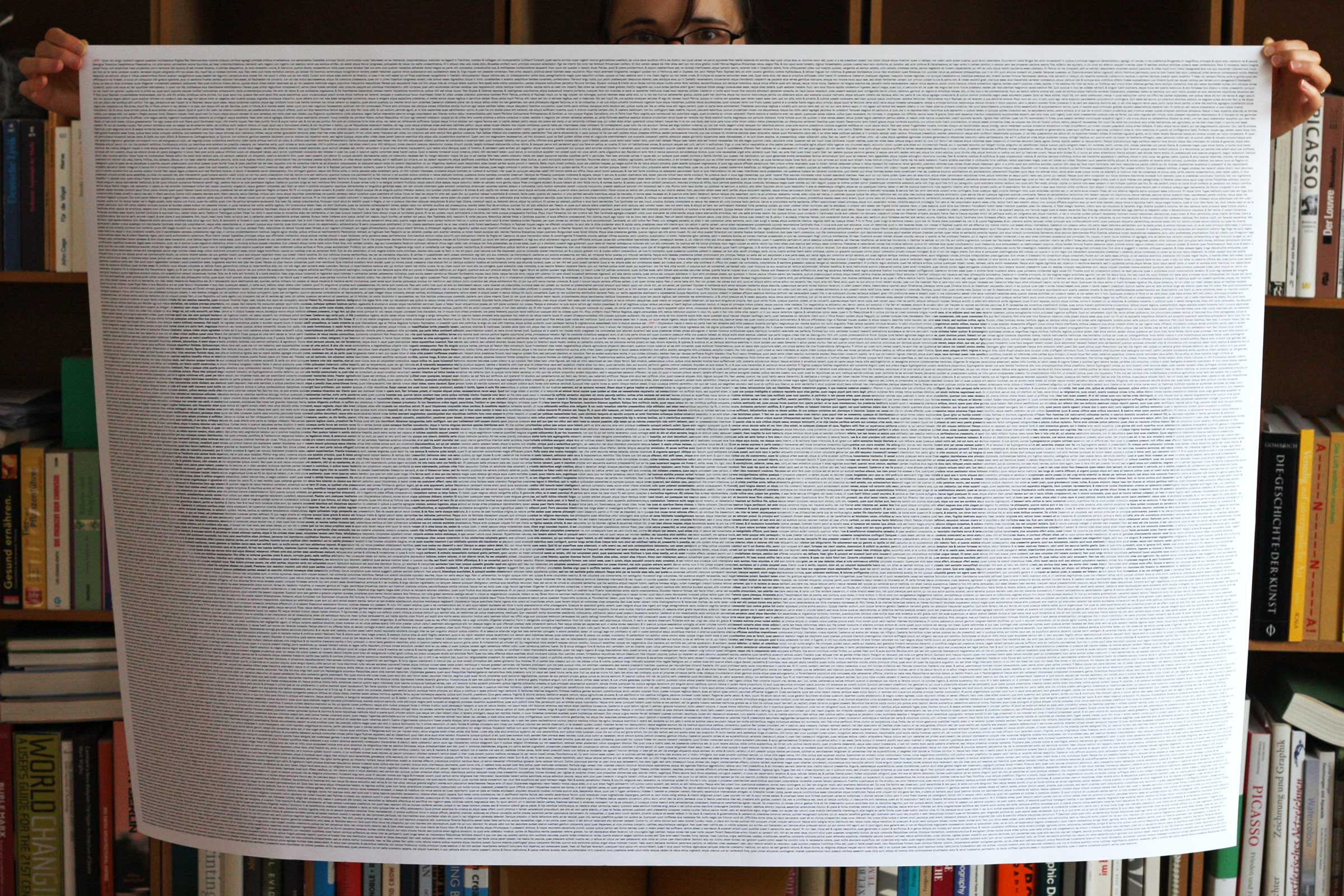
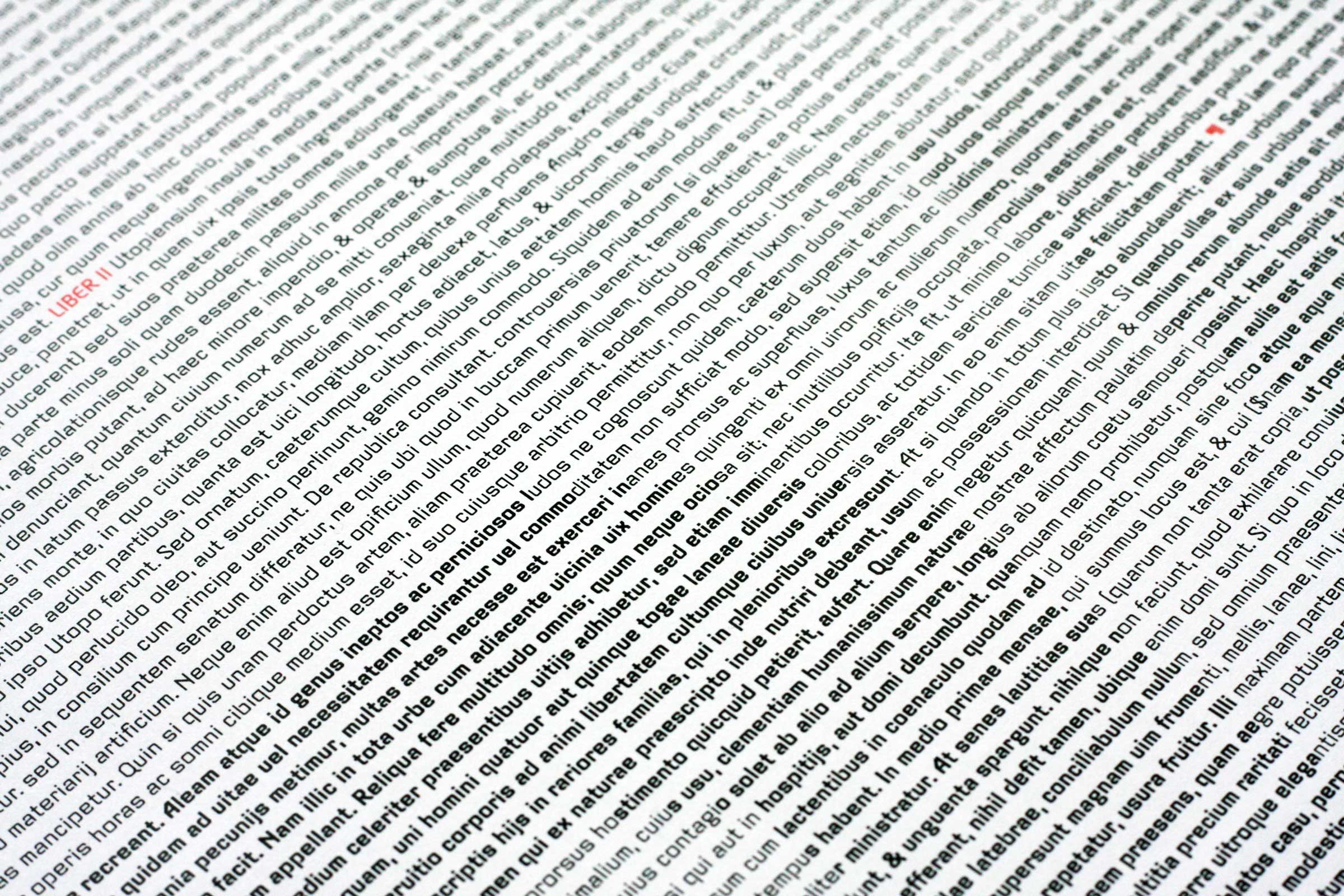
Surprisingly, Videon is very legible in small font sizes.

